I woke up at 5.30 am to go for my cycling practice yesterday.
On my way there, I was pushed this Prepare for 2024 – Martin Pring’s Expert Insights on the Equity Market on YouTube.
Turns out to be a rather nice video so I shared some of the charts he presented. Martin has been in this for a long time. I still have his book on technical analysis as a reference book.
In this video, Martin just share what the data is telling us. Here is his summary:
- The post-2009 secular bull could be in the early stage of reversal. There are signs but because they are very long-term they are not confirmed yet.
- #1 is important because the secular trend determines the character of the primary trend.
- The primary trend indicators are pointing north. There is quite a lot of upside potential still.
- US economy is experiencing escape velocity, which means the economy is becoming a self-sustaining recovery recovery.
Secular trend may be turning but long term trend looks to be good. I don’t know how you can connect with this and if you cannot connect with this, this may not be suitable info for you.
I appreciate that Martin uses some really long-term, inflation-adjusted charts, and as long-term investors, we can appreciate where we are from a long-term perspective. Secondly, what changes things is prices but we are viewing prices through different lenses.
The general question we should ask is based on prices, momentum, aggregate psychology, how is the environment like?
We could be topping out very long-term in a trading range rather than just an abrupt turn top.
There are two different kinds of secular tops. There is a trading range top and an abrupt turn top.

This is an inflation-adjusted chart going back to the 1900s. We can get an idea about the long-term direction of the prices with a very long-term price oscillator. Not a good timing tool.

It will be quite amazing that tops will alternate like what Martin said.
Using Shiller PE/10-year Yield
Another long-term chart but this time, we layer the long-term equity valuation (Shiller PE) against the long-term bond valuation (10-year yield).

One way to use the indicator is to draw a trend line to give us an idea if equity valuation is reaching a high point relative to bonds. But that stopped working after 2010, lol.


The other way is whether the Shiller PE/10-year Yield violates the trend and what we see in the second chart is a potential violation of the trend but so far long term prices are not following yet.
Why Recessions are Important
There are bear market caused by slow downs and those caused by recessions. The bear market caused by recessions are more severe and are price corrections that caused more distress.
This may be why so many of us watched recessions. Martin calls the bear caused by economic slow down to be burglars and those caused by recessions to be bank robbers.


Those bank robber falls tend to fall on secular bear markets during periods of excessive inflation or deflations. It is important to note that the fear is not inflation or deflations but… when does it get excessive and whether you could spot them.
If we layered a PPO indicator with this very long-term chart, it shows a secular bear market could be underway.
We May Be in the Stage Two of the Business Cycle
Now, we move on to a more long-term/intermediate-term stage of analysis.
Martin Pring likes to look at the stock market as a function of the real economy as there is a link between the two. The stock market should forward-price what happens in the economy.

Martin explains that bonds, stocks and commodities bottom out or top out at different phase of the business cycle.
- Bonds (B on the chart) would usually bottom out first. Fed will adjust the liquidity with the money supply when the economy does not do well. The bond yields fall and current bond prices will adjust accordingly.
- Then the stocks bottom out (S).
- Then commodities bottom out (C).

Different asset class do well at different stage and Martin thinks we are at stage two of the business cycle, which tend to be the most bullish for stocks. If we recall bond has not done well and commodities have not done well currently.
I kind of disagree with Martin that all business cycle is like this but I can reason that there should be a repeatable cycle to the business and the difference between each is how long or how short they are.
Pring Turner Stock Barometer is Bullish

Martin slaps six indicators together to create his Pring Turner is a stock barometer which helps us tell how bullish equities are. The barometer is above 75% in the green area of the charts.
Martin cautions that this doesn’t tell us we are going to have a good stock market because the barometer is only as good as the latest data and trend.
Pring Turner Recession Caller Indicates Recession Unlikely

Martin presents a derivative of his recession caller. There is likely to be an recession if the caller goes below the recession line. We can understand why it is so tough to call a recession if we look at how flat the line was at zero in this chart!
Martin tells us that the indicator failed in 1966 (the black arrow) where the indicator weaken but not enough to classify as a recession.

The other point of this indicator is that it also tells us when we reached escape velocity or when the recovery is self-sustaining. Escape velocity is reached when it crosses above the zero line. That means the recovery probably has a long way to go and on a long-term basis, this is probably a good place to purchase.

This chart zoom in on the previous and we can see that the indicator nearly went below but turned up. This looked so similar to 2003 turning up and those of us like Kyith who lived through that period will know how long that ran.
If this sticks, we have a lot of time left in this recovery.
Stock/Commodity Ratio Does Not Look Like it Is Peaking
In the business cycle section, Martin explains that stocks do well before commodities in a typical cycle. So we can create a stock and commodity ratio to tell us where we are at the stages.
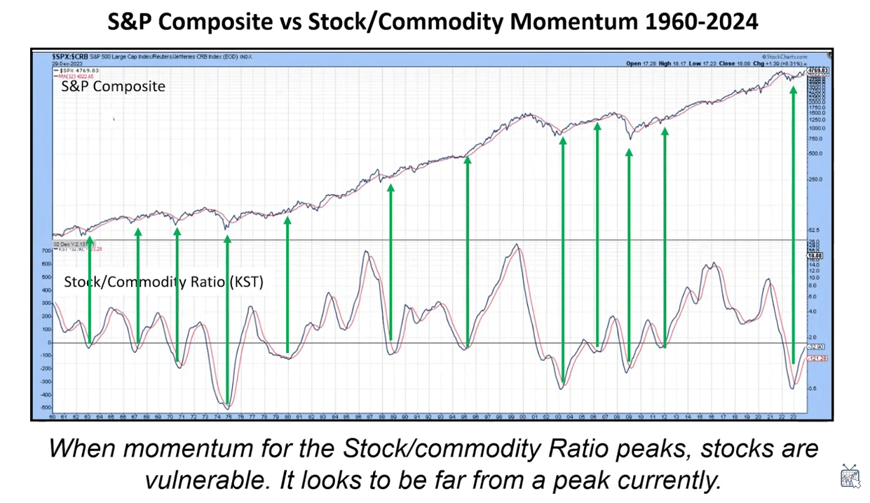
Martin took the momentum of the ratio to form a KST oscillator (KST = Know sure thing). Currently it is just below zero which means it is sometime away from a sell signal.

The Sell Signals are less reliable.
Inflation-adjusted Liquidity Looks to Have Bottomed Out
Martin charts out a different form of market liquidity indicator with the rate of change (ROC) of the real M2, which is an M2 adjusted for inflation (M2/CPI).
In order to get a bear market, you need a squeeze in liquidity, which means the rate of change turns downwards.

When the rate of change goes below -5, there is a real squeeze and often indicates the rate of change has gotten too drastic.
Which is where we are now.
This is a very long term chart.
What we should appreciate also is that we seldom see such a long-term chart related to M2 money supply and gives us some perspective how things are like in the past.
Blended Stock, Bond and Commodities Momentum Indicator Looks Positive
Martin slaps the momentum of all three asset classes together to create a momentum indicator called the Financial Velocity Coppock Curve:

The bottom of the curve usually coincide with recessions (red highlights) and a great opportunity to buy stocks. There are failures such as the green-dotted arrows.
While the secular trend looks to be turning, indicators seem to show the primary trend is ok.
Inverted Dividend YIeld Model Indicates Buy
When the stock market goes down, the dividend yield of a stock goes up.

When the dividend yield turns, that is when we get a buy signal. Martin say that this is one of the most reliable indicators going back to the 19th Century to give good consistent result. What I notice is we seldom get big long term whipsaws at the turning.
The indicator has a long way to turn negative, which indicates we have some time to run.

This table pits the buy & hold against when the Div KST is bullish or bearish since 1874.
The Contrarian News Letter Indicator is Bullish
Investors Intelligence monitors the newsletter writers and tries to find out whether the writers are bullish or bearish from what they read. This is often used as a contrarian indicator and have worked pretty well.

Martin took it a step further by using 50 and 180-week moving average to generate buy signals. Circle indicates false signals. When it is a bullish signal, it tends to follow by a long term bull market.
The other thing to notice is how bearish the newsletters as an aggregate got and usually these coincide with long positive runs.
Global Momentum Indicator Shows Global Market May be Bottoming

Martin layers short, medium and longer-term momentum to create his Special K indicator to detect where we are in the cyclical nature of the Global Markets. Momentum currently is not weak or strong but if we draw trendlines, it does look like momentum may be ramping up.
Financial/S&P 500 KST Indicate Bullishness
We can also appreciate the health of the market by taking a look at certain important sectors relative to the general market.

Martin took the Financial sector divide by the S&P 500 to create a momentum KST indicator.
Here is the Vid
Martin explains that he started 2023 being rather bearish because that is what the data tells him but the indicators became more bullish in March of 2023.
He does caution that based on his experience, these indicators would shift the picture accordingly.
Do what you will with this info.
If you want to trade these stocks I mentioned, you can open an account with Interactive Brokers. Interactive Brokers is the leading low-cost and efficient broker I use and trust to invest & trade my holdings in Singapore, the United States, London Stock Exchange and Hong Kong Stock Exchange. They allow you to trade stocks, ETFs, options, futures, forex, bonds and funds worldwide from a single integrated account.
You can read more about my thoughts about Interactive Brokers in this Interactive Brokers Deep Dive Series, starting with how to create & fund your Interactive Brokers account easily.
Kyith is the Owner and Sole Writer behind Investment Moats. Readers tune in to Investment Moats to learn and build stronger, firmer wealth foundations, how to have a Passive investment strategy, know more about investing in REITs and the nuts and bolts of Active Investing.
Readers also follow Kyith to learn how to plan well for Financial Security and Financial Independence.
Kyith worked as an IT operations engineer from 2004 to 2019. Currently, he works as a Senior Solutions Specialist in Insurance Start-up Havend. All opinions on Investment Moats are his own and does not represent the views of Providend.
You can view Kyith's current portfolio here, which uses his Free Google Stock Portfolio Tracker.
His investment broker of choice is Interactive Brokers, which allows him to invest in securities from different exchanges all over the world, at very low commission rates, without custodian fees, near spot currency rates.
You can read more about Kyith here.