There seem to be some turbulance in the market recently and I wonder if this is just a run-in-the-mill market indigestion or if this is something bigger.
Most of the readers are buy-and-hold investors, and what is on your mind may be whether there is something major on the horizon. Last year, we had a very strange year and many of us will be wondering what kind of year we will have this year.
I think we might have a year where there are some indigestion. This means that some areas will continue to do well, other areas that didn’t do well will have their turn to shine.
Indigestion do not mean a big fall in price. It could very well mean that we went nowhere.
The US and China Microcap Did Well to Start the Year
We have a strange start of the year where we experience a huge run in US Microcap stocks.

The strange thing is that we also experience the same thing with the China small tech companies.
Since the start of the year, the Kraneshares CSI China Internet ETF made 16.3% and the iShares US MicroCap ETF made 24.1% and we just completed 2 months.
I do not have another chart here, but in that chart, it will show that this 2-month move in MicroCap equals the growth of the MicroCap over the past few years.
In contrast, the performance of S&P 500 and Dow Jones Industrial Average was much muted, but nevertheless, they did well.
The poorest performer happens to be the Nasdaq, who did very well last year.
There are many “sub-stories” in the markets. I find that if we can have a market where certain segments do better than the other segement.
Certain segment that did better and now not do so well.
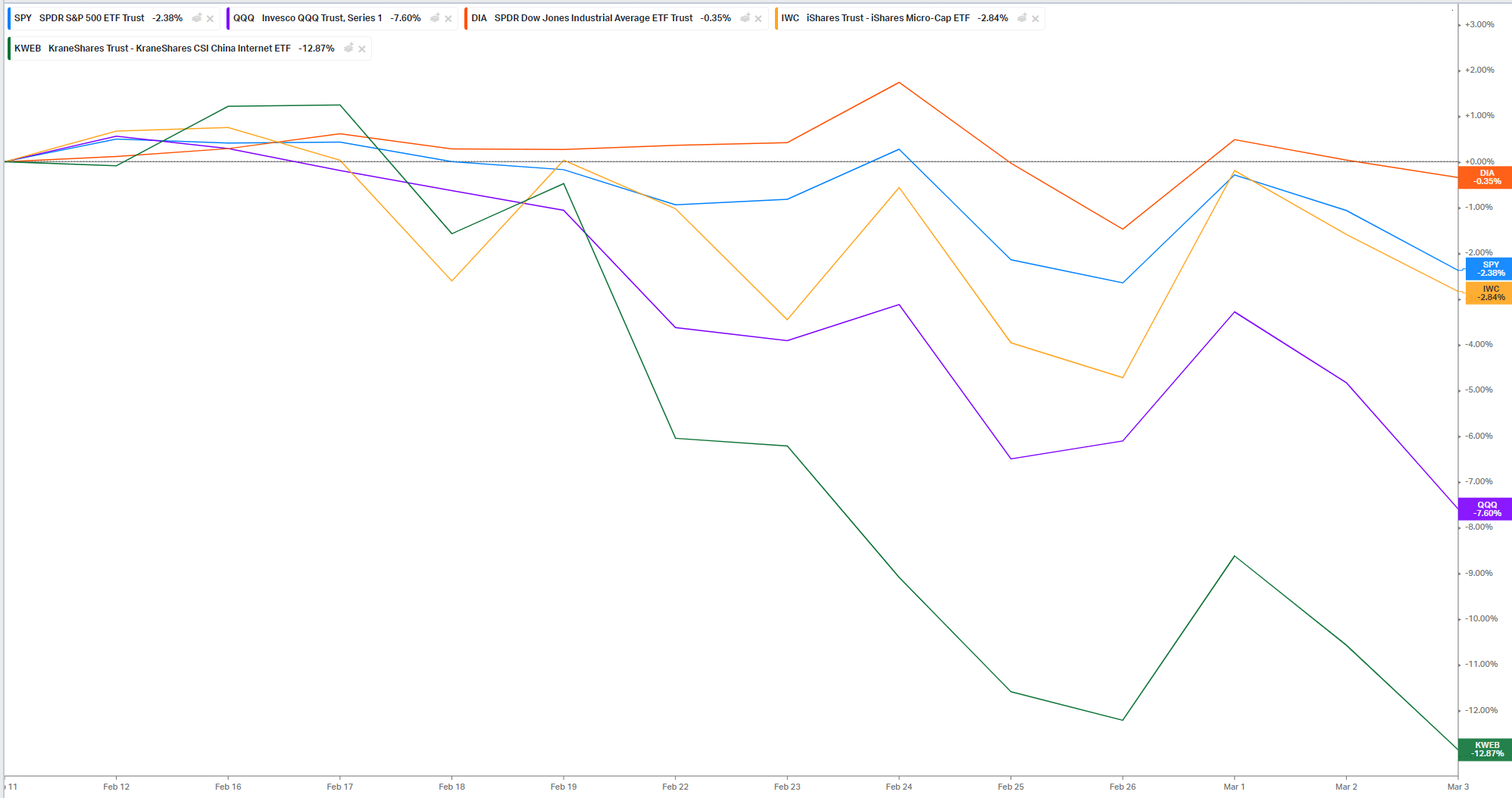
The perfromance chart above shows the performance of the indexes/index ETF from the highs on 12 Feb.
While the US Microcap had a good run, their correction have been much muted as the Dow and S&P 500.
Rather, we seem to observe that there are some rotation out from the technology plays that did very well last year.
U.S Large Cap and Small Cap Value Doing Better than Growth
The chart below shows the performance of the large-cap growth and value ETF (iShares Russell 1000 Growth ETF and iShares Russell 1000 Value ETF) versus the small-cap growth and value ETF (iShares Russell 2000 Growth and iShares 2000 Value ETF)
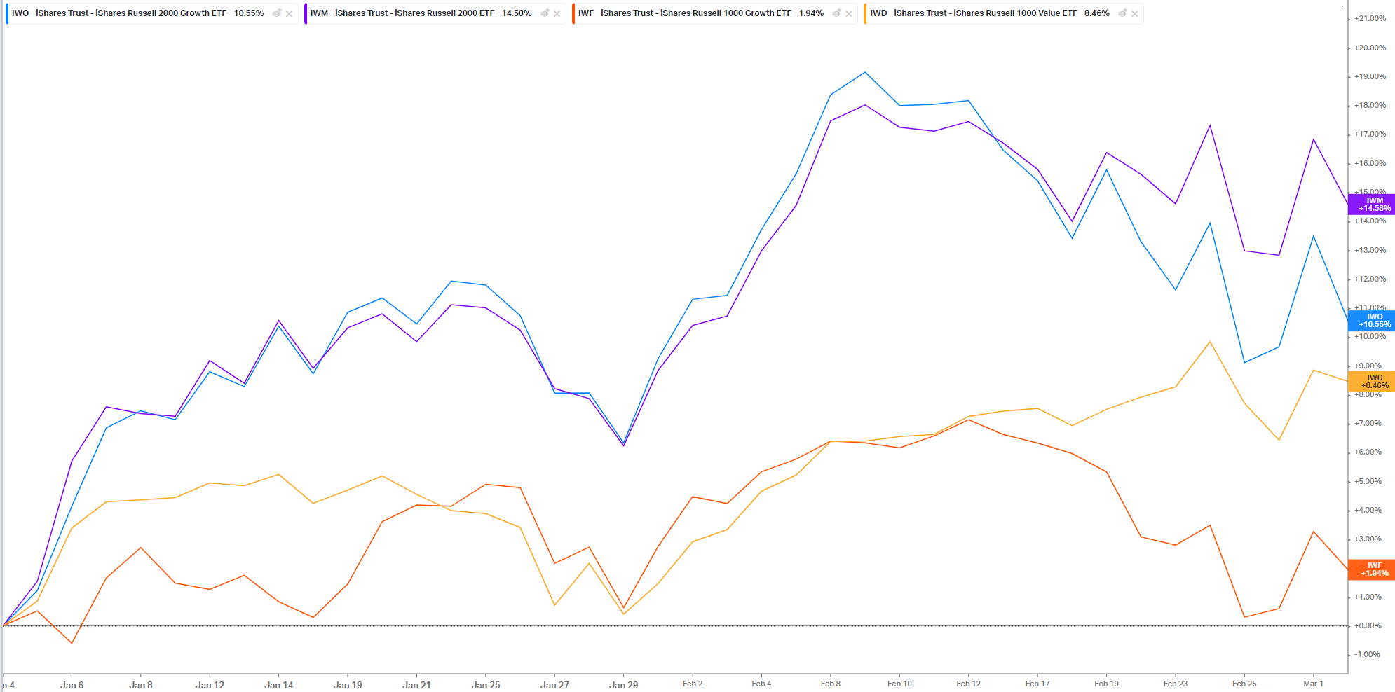
Both the small-cap ETF gave greater than 10% returns since the start of the year, while the iShares Russell 1000 Value ETF continues to do well.
We are starting to see some deterioration in growth relative to value performance.
This is what we call the “Value Premium” showing up.
Longer Term Small Cap and Value Premiums
The ETF Portfolio Strategist have a couple of charts that show the long term underperformance of the small premium and value premium:
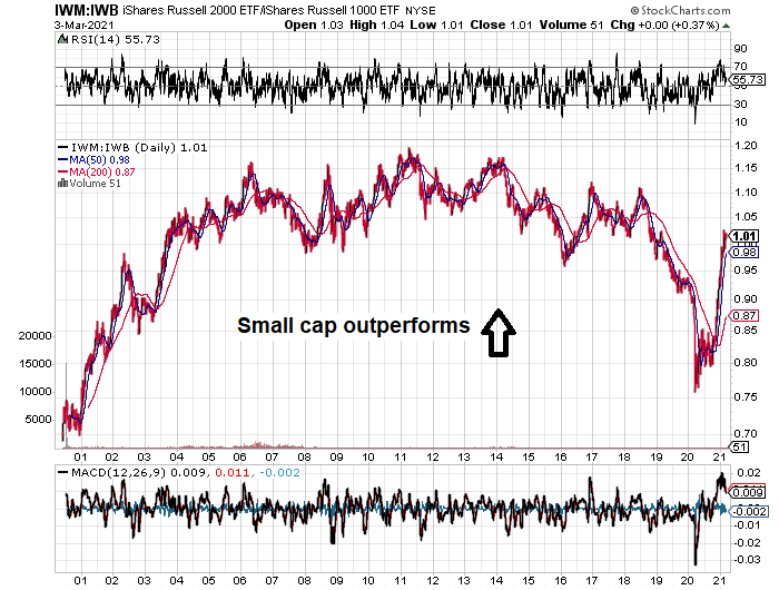
This chart shows the Russell 2000 divide by the Russell 1000. Basically 2000 of the smallest US companies divide by the 1000 largest.
If it is trending up, it means small-cap did better than the large-cap. This has been the case from 2000 to 2006 and then basically there was no premium.
2018 to 2020 was a funk period as large cap did better.
But we are observing some massive, massive rebound in this short 2 months.
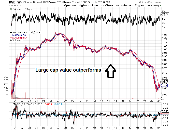
Value hasn’t done well since the peak of the GFC. You can see from Russell 1000 Value divide by Russell 1000 Growth. It has been downtrending.
Do notice as well that hear and there , there were small uptrends in 12 to 14, 16-17 and 20 to 21 where the value premiums appeared.
Would this be another false dawn for value? I think we might need to see if this time it could break the trend line.
These are not the only few value versus growth porn charts.

There is how well growth did versus value at different capitalization levels. And then the relationship stalled for 8 to 9 months.
The Health of the Equity Trend.
In general, I picked out that between bonds and equities, in terms of the crowd’s appetite, they still favor equities over bonds.
This was observed from various sources.
All-Star Charts explained that the stocks versus bond ratio have always been a good indicator of the crowd’s appetite between these two traditionally low correlation assets.
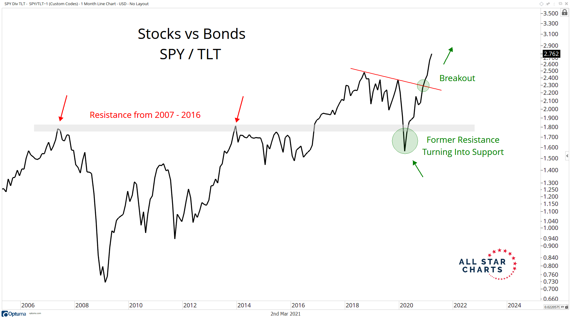
The technical analysts found possible areas of weakness in the ratio of S&P 500 divide by the 20+ Year Treasury ETF in March last year.
Right now, the market clearly favors equities.
Another All-Star Charts article shows us that the credit markets might let us in where there are signs of weakness.
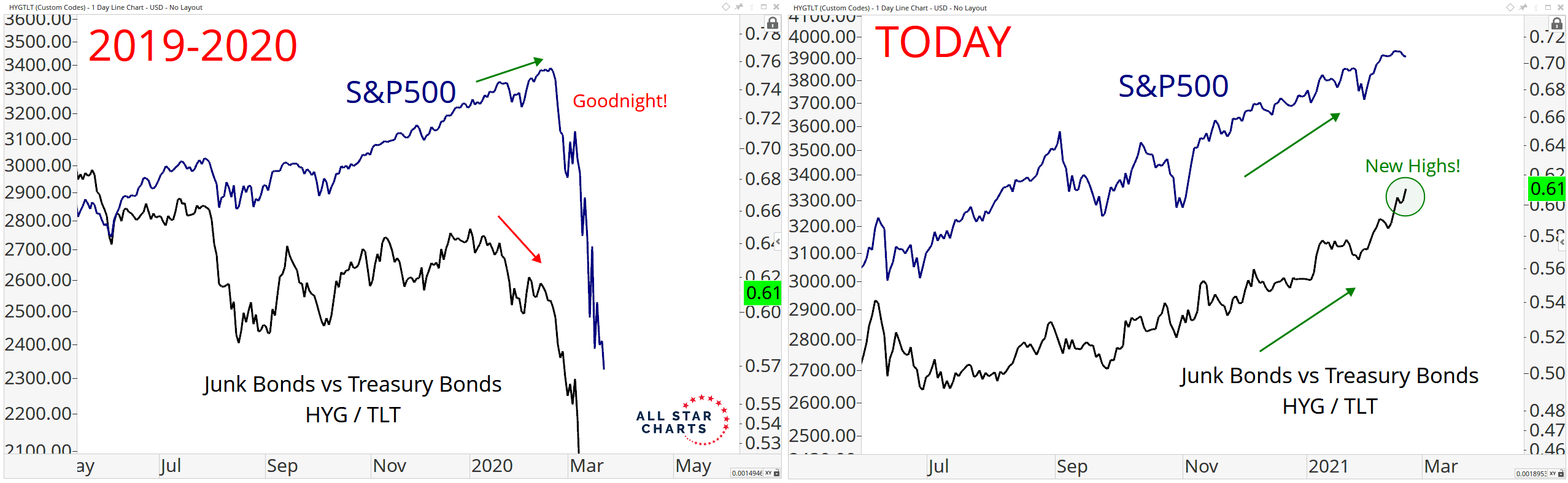
Taking Junk Bonds divide by Treasury Bonds show us the appetite for more risk in the credit market versus safety.
Entering 2020, there was divergence between this HYG/TLT ratio and the S&P 500. We notice this is not present currently.

The interesting thing is that Chris Kimble showed this strong performance of the Pimco Junk Bond ETF doing pretty well on this day where markets are in a bit of distressed.
The junk bonds are more correlated with the health of equities than bonds. A rise in 10-year Treasury would worry them less.
Next, the number of stocks that are above the 50 day moving average. This indicates to a certain extent, how broad based is the participation.
We should see a large number of stocks generally are above their moving average. This will show that the recent move up or down is not concentrated to a particular section.
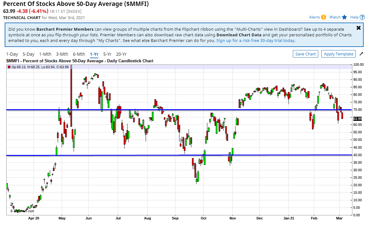
Generally if the percentage of stocks are above 70% it is very very healthy. If it drops between 40% to 70% , it is a warning for the market.
If that is below 40% it is bad news.
We can observe we were flirting below 40% in October. Currently, the number of stocks in the S&P 500 that is above the 50 day moving average is going down.
I wonder what we will see if this is the Nasdaq instead.
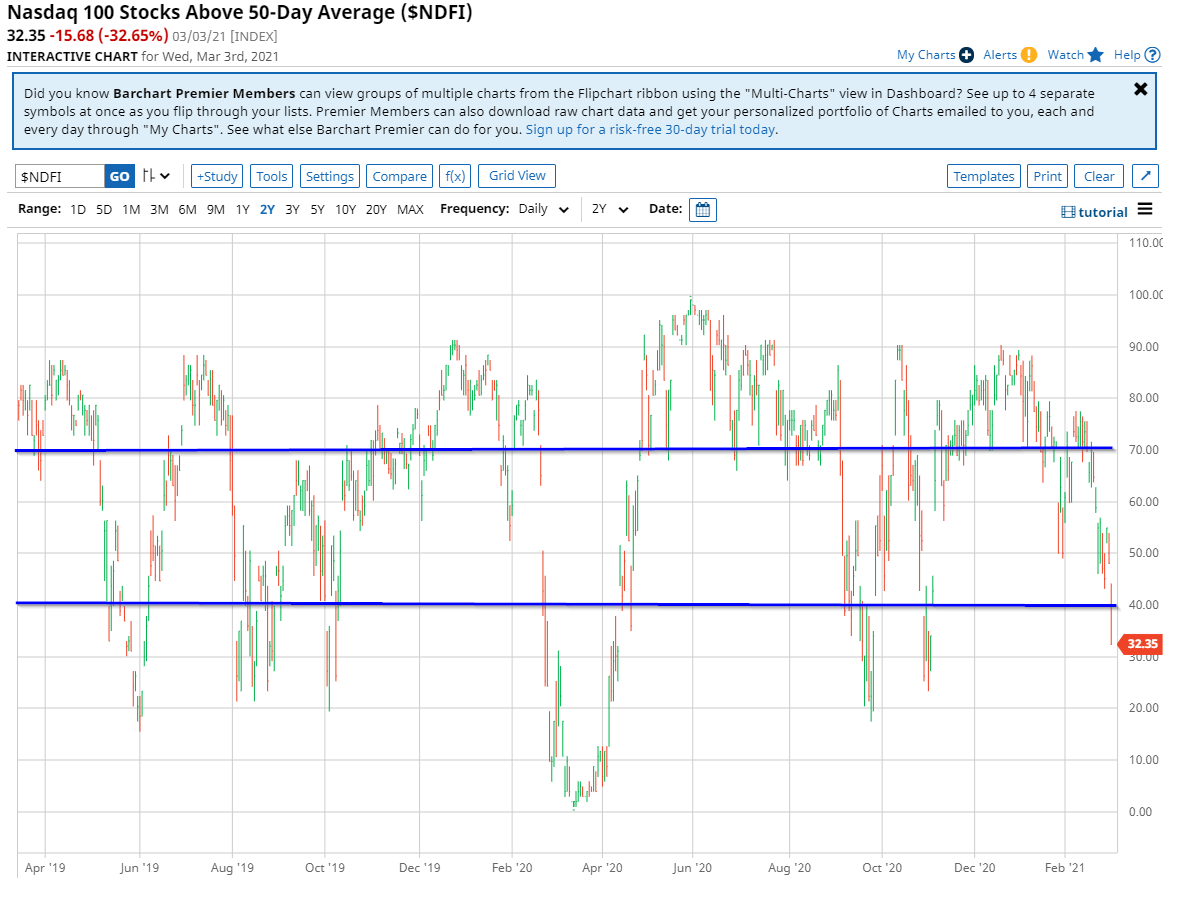
I managed to locate this. Looks like we are in for a rough time.
If you are find a time where sentiments are not good, where things are getting beat down, this would probably be the time. Unfortunately, the time to risk manage is over.
Other than High Yield to Treasury, Stocks to Treasury ratios, there are a few traditional indicators that show the market is going into a defensive stance:
- Japanese Yen
- Gold
- Consumer Staples
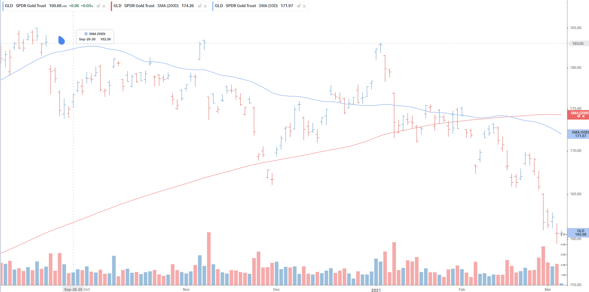
Gold is in a downtrend even in these 3 days when the Nasdaq got wacked.
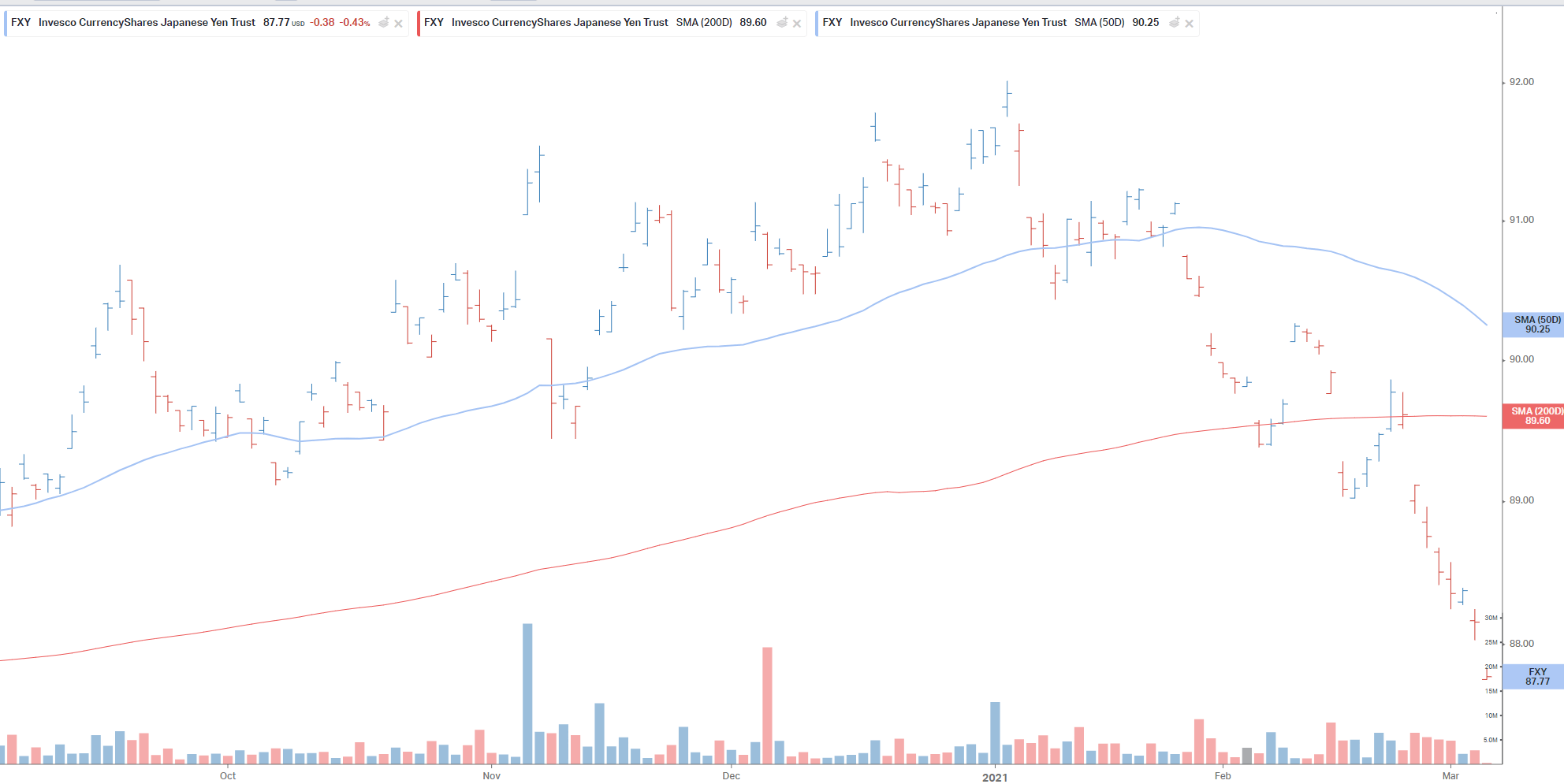
The Japanese Yen ETF is in a persistent downtrend with no bids as well.
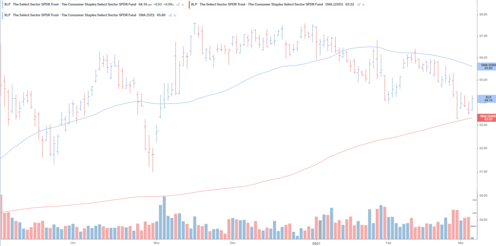
The consumer staple ETF is the only one that did well but even then, its pretty muted.
With the onslaught in the Nasdaq, we are not seeing money flow into treasury, consumer staples, gold, Japanese Yen.
The Value Related Sectors
There are certain sectors that have been in the dumpsters for a while:
- Commodities
- Financials
- Energy
- Europe
If you mention them, not many can get excited over them versus the FAANGS or ARK ETFs.
The price of financials have been “trapped” for nearly a decade since the financial crisis and they struggle to break free out of it.
Think of this as the tech sector after the Dot Com bubble.
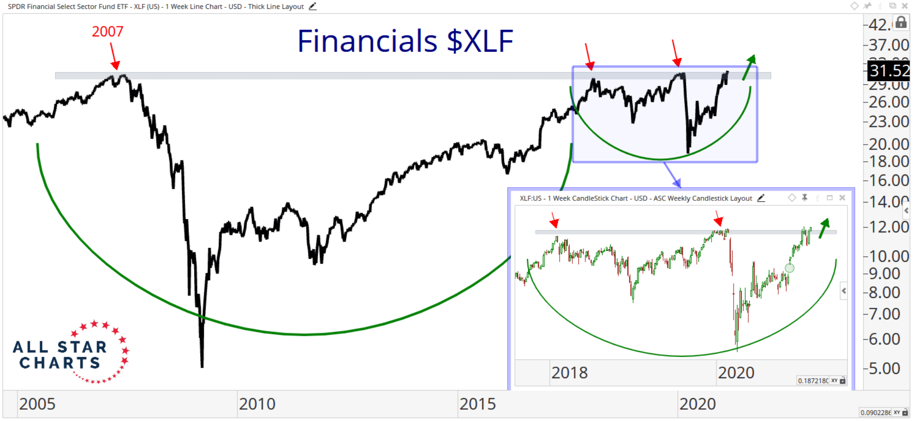
But in recent weeks there seem to be some promising headway.
Here is how financials look as of 26th Feb:
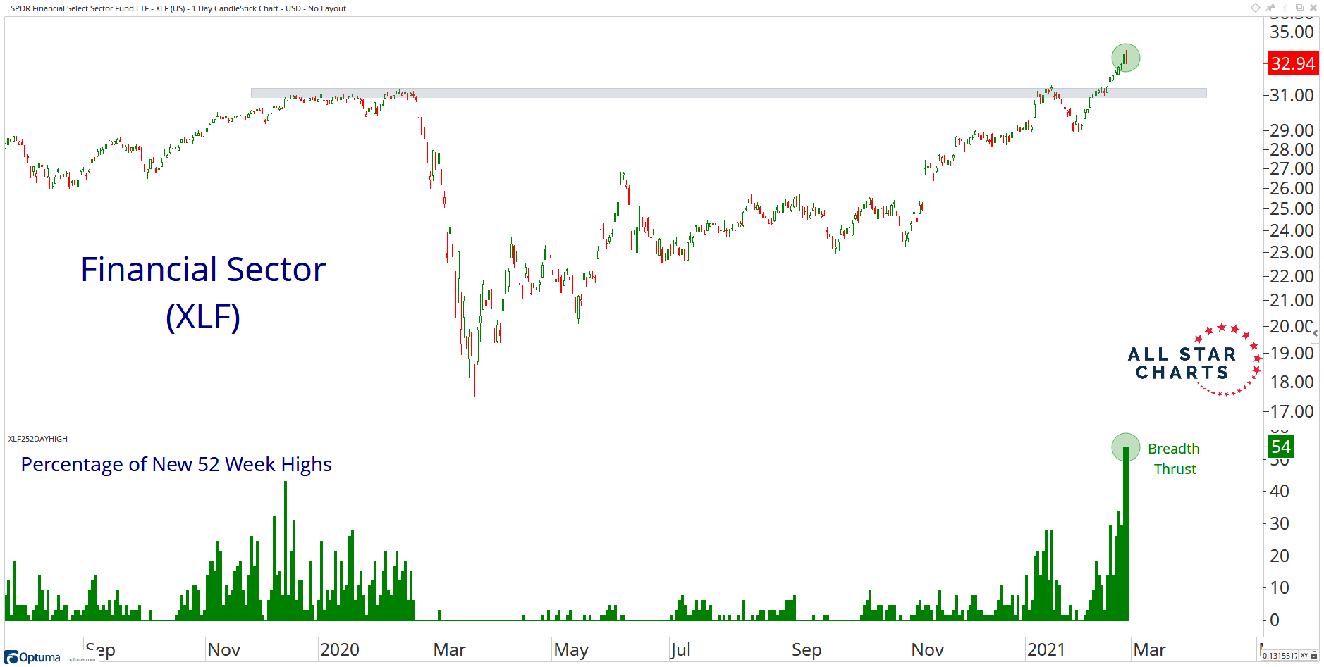
According to All-Star Charts, very strong breadth trust is a common characteristic of early-stage bull markets and is strong confirmation of the massive base breakout that just occurred in Financials at the Sector level.
While the US financials seem to have broken out of multi-year consolidation , the global financial sector are not out of the woods yet.

There is still work to be done. If you take a look at the value indexes, you would realize that the financials are a big component.
European banks make up a large component of their main country indexes, which explain the poor performance.
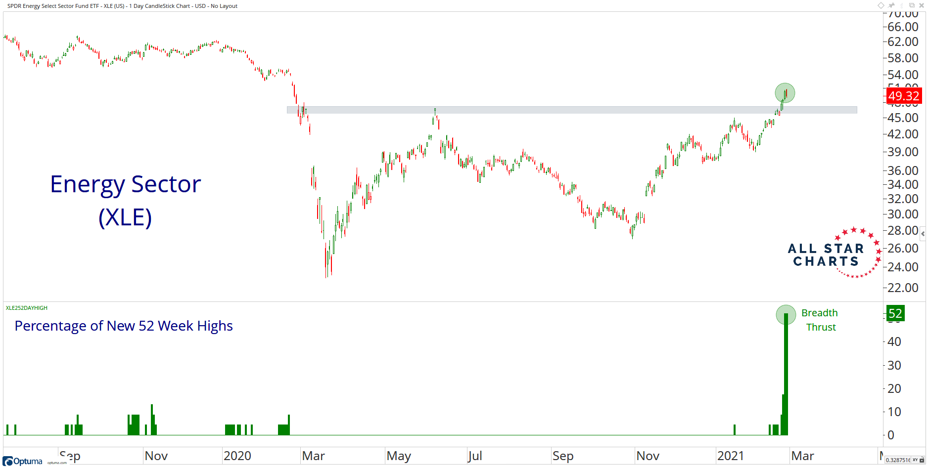
We can also see the same strong performance in the energy sector:
Divergences in the Nasdaq
Generally, All-Star charts see that in general, equity markets are rather healthy.
Except maybe for one area the Nasdaq:
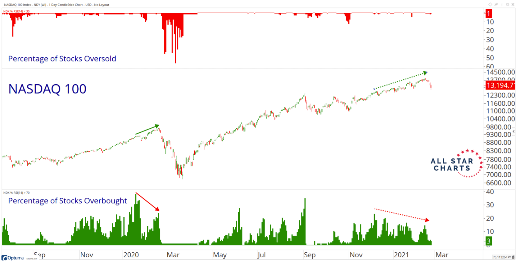
Technical analysts like to refer to a weakening in certain breadth indicator when the main prices are still heading up as divergences. These divergences warned of testy times ahead.
Taken as a whole, most index indicators are constructive while the Nasdaq is the opposite.
The Weakness of the MAGA (Microsoft, Amazon, Google, Apple)
With the exception of Google, the rest of these large caps, together with other large cap tech companies such as Adobe have been consolidating for a while.
All-Stars Chart put out an article today bringing to our attention their weakness:
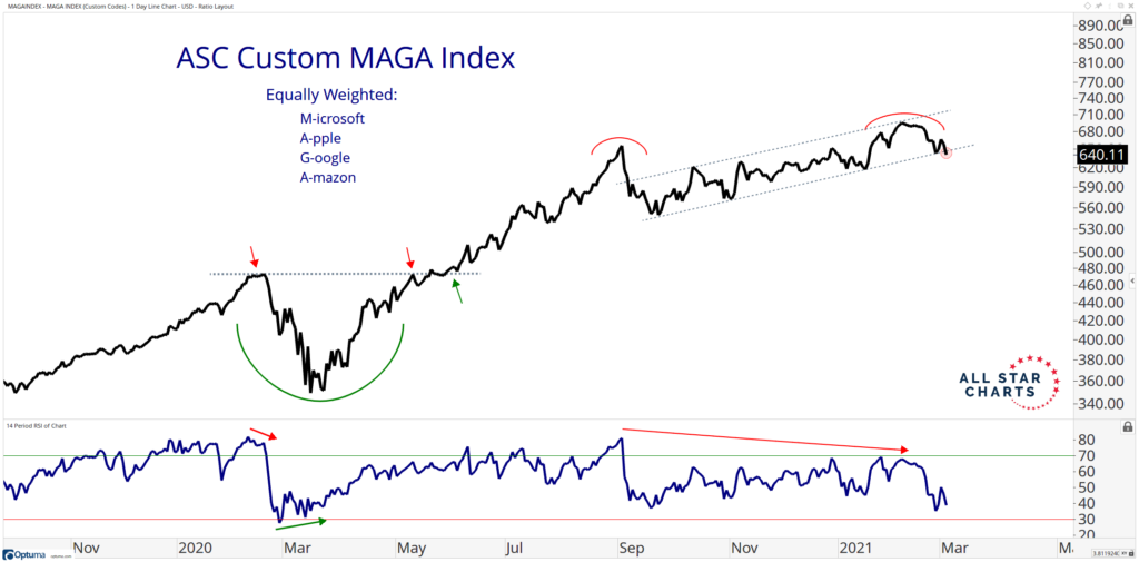
The chart above shows an equal-weighted index made up of the 4 large component of the US stock market.
There are signs of some negative divergences.
Here is how some of the individual component look like:
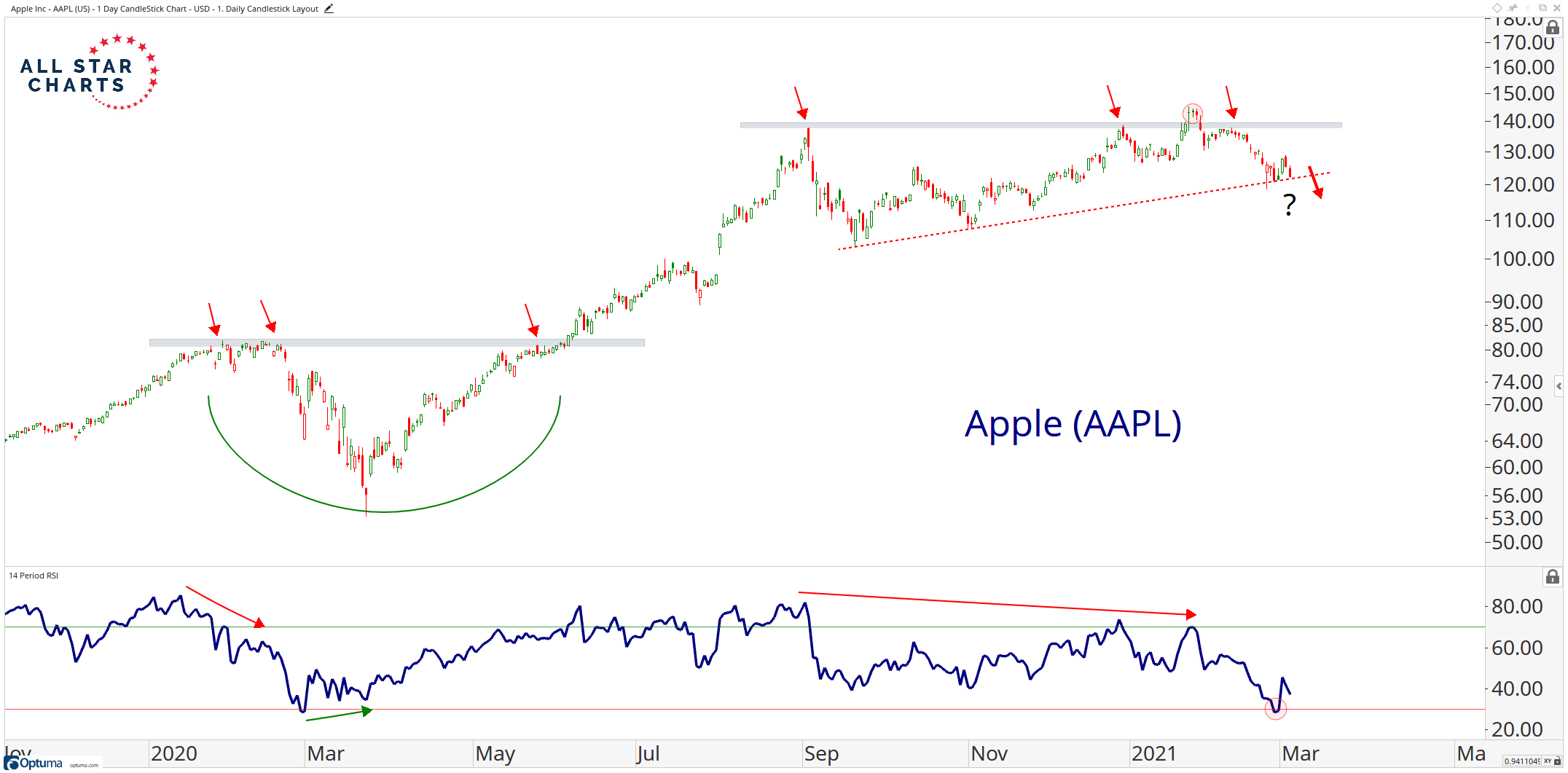
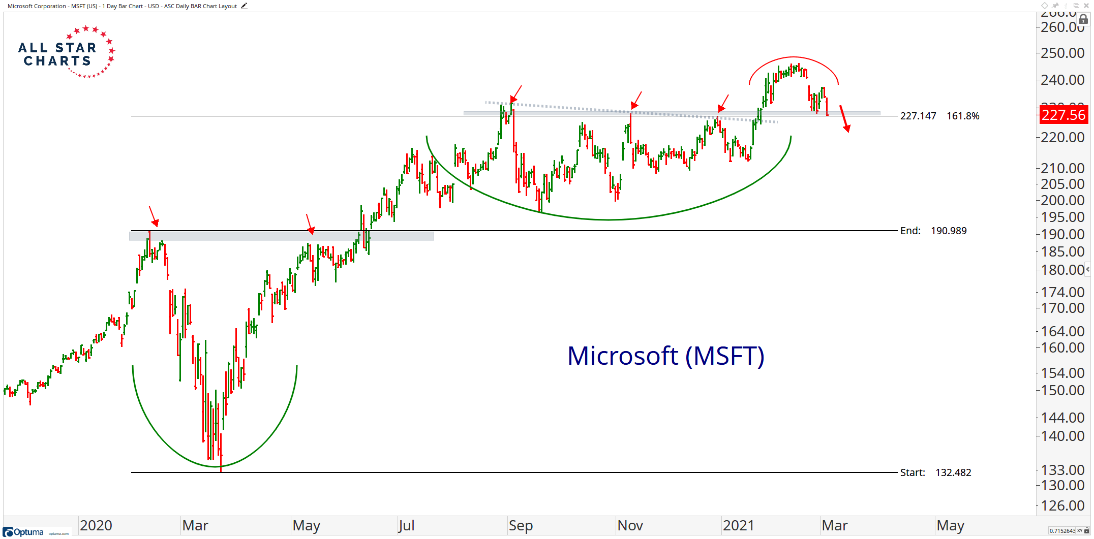
Microsoft was doing well breaking out from a long term funk but how will it go from here?

Tesla have not been this weak for some time.
The implication of this is that these stocks are large components of market cap index. If this weakness persist, it will weigh on them. The other smaller companies of the index will have to do the work.
My friend Alvin Chow of Dr Wealth has a point when he describes market capitalization weighted indexes as momentum index, just not super juiced up like the USA or World Momentum Factor index. This is because stronger companies grow stronger and became larger, takes control of the index. (the momentum index, just go out there and overweight and pick the stocks that did well for the 6-month and 12-month basis, adjusting for volatility)
Still Waiting on International Stocks to Do Better than the United States

If we plot the Vanguard International Funds divide by the S&P 500 we can see that for nearly a decade, international stocks have not done well.
Feels to me we are not seeing signs of things changing.
Market Returns after 10-Year Rates Went Higher
Lastly, I seldom remember increase in interest rates killing the market. I think the FED can kill a good market by raising rates too fast, too much.
But that is usually late stage.
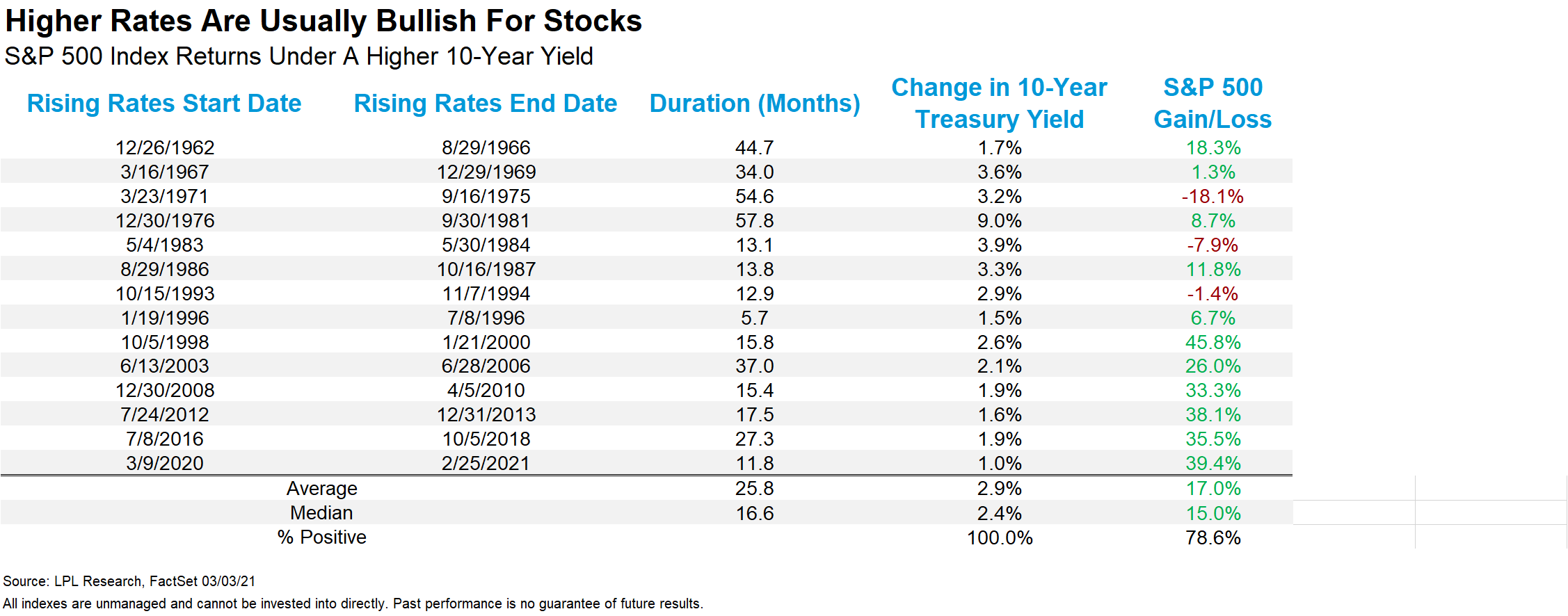
Here is a tabulation of past rate rises. Majority of them have been favorable to the markets.
Summary
If you ask me, I think the market is pretty OK.
The industrials and the financials have just gotten out and don’t seem to be in excessive overbought condition.
We just have various segment of excessive speculation.
But if you ask me, I am not sure if this growth of no-profit kind of companies that populated the Nasdaq index is over.
These value, small, quality/profitability and momentum premium (read my introduction to Smart Beta article) comes and go. And while the value driver has not shown up for a while, we might also get a situation where we cannot tell if value outperforms growth.
However, the weakness with the major large-caps such as Apple, Facebook, Microsoft is worrying in that they formed a large part of market capitalization indexes such as the MSCI World and S&P 500.
I think some of the tech businesses are really good businesses we use in our corporate or personal lives. But I can also see a scenario that they do real good in our lives yet the market didn’t price them accordingly for sometime.
Walmart is an example that I remember.
For those looking for outperformance but wish to still remain international, you could opt for the IWVL, which is the MSCI World Enhanced Value Factor UCITS ETF or other factor indexes which is not so Market Cap Weighted. I will personally lean closer to the IFSW or MSCI World Multifactor UCITS ETF to be more balanced.
I have referenced a lot of charts. The way I frame these kind of price chart reading is that a large part of the prices you see are fundamentals but there is also a part where the prices exhibit the collective psychology of the participants.
Chart analysis is a way of deciphering the behavior of the crowd. It is not 100% accurate. It is accurate until it is wrong. However, as longer term investors concerning about longer term risk management, it might enable us to detect where all things are still OK or that we should be more cautious.
I invested in a diversified portfolio of exchange-traded funds (ETF) and stocks listed in the US, Hong Kong and London.
My preferred broker to trade and custodize my investments is Interactive Brokers. Interactive Brokers allow you to trade in the US, UK, Europe, Singapore, Hong Kong and many other markets. Options as well. There are no minimum monthly charges, very low forex fees for currency exchange, very low commissions for various markets.
To find out more visit Interactive Brokers today.
Join the Investment Moats Telegram channel here. I will share the materials, research, investment data, deals that I come across that enable me to run Investment Moats.


Do Like Me on Facebook. I share some tidbits that are not on the blog post there often. You can also choose to subscribe to my content via the email below.
I break down my resources according to these topics:
- Building Your Wealth Foundation – If you know and apply these simple financial concepts, your long term wealth should be pretty well managed. Find out what they are
- Active Investing – For active stock investors. My deeper thoughts from my stock investing experience
- Learning about REITs – My Free “Course” on REIT Investing for Beginners and Seasoned Investors
- Dividend Stock Tracker – Track all the common 4-10% yielding dividend stocks in SG
- Free Stock Portfolio Tracking Google Sheets that many love
- Retirement Planning, Financial Independence and Spending down money – My deep dive into how much you need to achieve these, and the different ways you can be financially free
- Providend – Where I used to work doing research. Fee-Only Advisory. No Commissions. Financial Independence Advisers and Retirement Specialists. No charge for the first meeting to understand how it works
- Havend – Where I currently work. We wish to deliver commission-based insurance advice in a better way.
Kyith is the Owner and Sole Writer behind Investment Moats. Readers tune in to Investment Moats to learn and build stronger, firmer wealth foundations, how to have a Passive investment strategy, know more about investing in REITs and the nuts and bolts of Active Investing.
Readers also follow Kyith to learn how to plan well for Financial Security and Financial Independence.
Kyith worked as an IT operations engineer from 2004 to 2019. Currently, he works as a Senior Solutions Specialist in Insurance Start-up Havend. All opinions on Investment Moats are his own and does not represent the views of Providend.
You can view Kyith's current portfolio here, which uses his Free Google Stock Portfolio Tracker.
His investment broker of choice is Interactive Brokers, which allows him to invest in securities from different exchanges all over the world, at very low commission rates, without custodian fees, near spot currency rates.
You can read more about Kyith here.
- My Dividend Experience Investing in UCITS iShares iBond Maturing in 2028. - April 23, 2024
- We Invest into Popular Funds When They Are Popular, Exactly When They Started Turning to Shxt. - April 22, 2024
- Meal Prep 2.0 – Cooking Your “Go-to” Meal that You Look Forward to Eating Everyday. - April 21, 2024
Sinkie
Friday 5th of March 2021
Yeah, love those ratio charts ... they give a good macro overview of market psychology & maybe forward probabilities.
The strong breadth thrusts in banks, oil, basic materials, industrials seem to indicate a strong recovering economy. Of course, strong economy doesn't mean market indexes will do well, or all sectors will do well. It's pretty common knowledge that many sectors like tech have had many years of earnings & potential earnings valuations pulled forwards by Covid i.e. their 5-10 year earnings have already been priced in.
Unlikely to have a market crash ... 2021 looks to be more like 2004.
Kyith
Friday 5th of March 2021
hi Sinkie, thanks. 2004 was the year where it went nowhere while 2005 was a bit of shake out isn't it.