August 8, 2008 — Big picture — Dollar up big time, gold down, euro down, oil down, stocks surging, bonds unclear.
There’s a double bottom on my PTI at 5910. Could that have been the low for my PTI? Today was the second plus-300 point day for the Dow this week. Could we have seen the bottom?
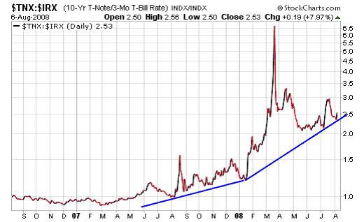
Yet, there are many mysteries about this market that bothers me. I discuss some of them on the charts below. But first, the yield curve — The yield curve and time. The yield curve shown below is simply the difference between the yield on the 10 year T-note and the 91 day T-bill. The larger the spread, the better for the banks. Why? Because the banks can borrow at low rates (near T-bill rates) and put out loans at the higher rates (near or above the yield on the 10 year T-note).
Right now the Fed is holding the Fed Funds rate at an artificially low level of 2% while the yield on the bellwether 10 year T-note is just under 4%. Thus, the spread between the two is around 2%. The wider the spread, the better for the banks.
The current positive yield curve is a plus for the banks and for the economy. The longer the yield spread stays positive, the better for the banks as they are slowly “nursed” back to health and profitability.
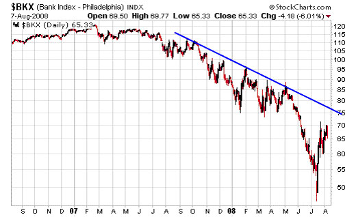
All during 2008 the banks have been battered unmercifully as they choked on AAA-rated collections of toxic mortgages. So where are the banks now? The chart below is the exchange traded fund for the banks. And what we see here is a long decline below the bearish trendline. On July 5 BKX hit a spear-point low and then rallies sharply.
Is this the long-awaited turn for the banks, that spear-point reversal? We can’t tell yet, because BKX has not rallied above its bearish trendline. But we could have seen the low for the banks. It’s possible that BKX will have to test its low, but with the positive yield curve on their side, I’m thinking that maybe, just maybe, we’ve seen the low for the Bank ETF. What the banks need now is time as the positive yield curve does it’s work in reliquifying the banks.
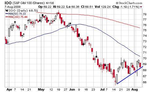
Evidence, evidence — call me Sherlock Holmes, because I keep looking for evidence of a definite trend. IOO is the ETF the follows the hundred largest corporations on the planet. The path of the giants should provide hints of the direction of the world-primary trend. After all, with the arrival of globalization all the world’s economies should be loosely tied together.
Below we see the daily chart of IOO. This looks like accumulation, but it might be a little early to make a decisive call. We’ll keep our eye on IOO. I believe it’s a KEY item. Interestingly, the Dow and the S&P are following almost an identical pattern.
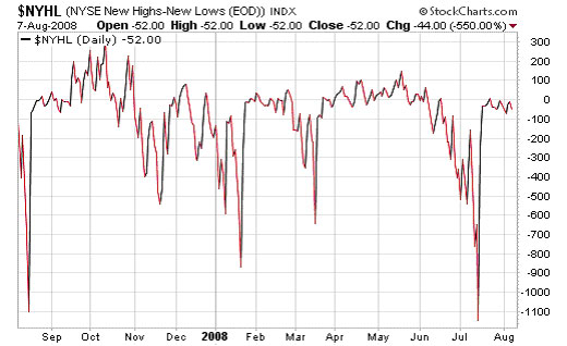
The mystery deepens. Below we see the new high-new low index for the NYSE. At the July 15 low for the NYSE the new lows exploded as you can see on the chart. Yesterday, with the Dow plunging 224 points where were the new lows? Only 113. Maybe new lows will come in if the market heads lower, but new lows sure are scarce now. Quite a mystery.
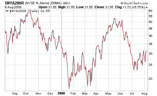
The chart below shows the percentage of NYSE stocks that are above their 200-day moving average. And here’s another mystery — since the trend of the bullish percentage has been up since January (each low has been higher than the preceding.) I want to see if this pattern breaks down or continues higher.
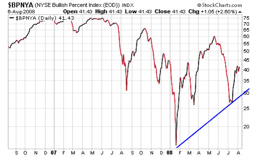
And a third study — the bullish percentage of stocks on the NYSE. And again, rising bottoms, at least so far. Maybe if the market continues lower, this pattern will reverse. All I know is that it hasn’t reversed as of August 8. Which is where we are now.
Richard Russell
Editor-in-chief – DOW THEORY LETTERS
Kyith is the Owner and Sole Writer behind Investment Moats. Readers tune in to Investment Moats to learn and build stronger, firmer wealth foundations, how to have a Passive investment strategy, know more about investing in REITs and the nuts and bolts of Active Investing.
Readers also follow Kyith to learn how to plan well for Financial Security and Financial Independence.
Kyith worked as an IT operations engineer from 2004 to 2019. Currently, he works as a Senior Solutions Specialist in Insurance Start-up Havend. All opinions on Investment Moats are his own and does not represent the views of Providend.
You can view Kyith's current portfolio here, which uses his Free Google Stock Portfolio Tracker.
His investment broker of choice is Interactive Brokers, which allows him to invest in securities from different exchanges all over the world, at very low commission rates, without custodian fees, near spot currency rates.
You can read more about Kyith here.
- My Dividend Experience Investing in UCITS iShares iBond Maturing in 2028. - April 23, 2024
- We Invest into Popular Funds When They Are Popular, Exactly When They Started Turning to Shxt. - April 22, 2024
- Meal Prep 2.0 – Cooking Your “Go-to” Meal that You Look Forward to Eating Everyday. - April 21, 2024