UBS Global Research got a pretty good special taking stock of the global real estate scene.
This covers the REITs in various global markets as well.
A lot of these reports would want to shape our views on where are the attractive investment opportunities. This one is no different but the report does provide a lot of good data that I find will help shape your view as long term listed real estate investors.
If you identify yourself as a long term listed real estate investor or a REIT investor, this article might be suitable for you.
They presented some data that tells you:
- 10-year compounded return of Listed Real Estate versus other asset classes
- Correlation of GDP downgrade and Listed Real Estate performance
- Different layers of Listed Real Estate Valuation Metrics and how the various market rank
- Range of Historical Vacancies in different office markets
- Typical duration of Office Lease Tenures in various office markets
- Correlation between Listed Real Estate company’s EPS and global GDP growth
- Correlation between Listed Real Estate with equity and bonds
- Sensitivity Analysis of Interest Rate changes and Listed Real Estate Returns
- Correlation of Long term Yields and Demographic Changes
- Correlation of Long term yields and CAP rates
- FED Rate Hikes and Listed Real Estate Performances
And much more.
Let us get down to it.
1. Performance of Real Estate Equities Compared to Other Category of Securities

In the past 10 years to May 2020, global listed real estate delivered 6.7% a year. Listed real estate felt the impact of the pandemic more than global equities, who returned 9.8% during this period.
Physical real estate delivered a better return at 8.3% a year to December 2019 (due to the lack of availble data).
You can also compare global REITs return against other asset classes during this period.
2. Performance of Various Listed Real Estate Markets During 2020
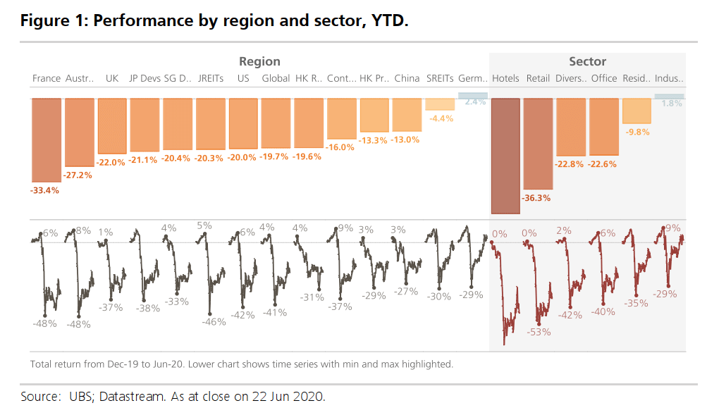
Overall, global listed real estate have fallen by 20% this year. However, we observe that some countries have it worst such as France and Australia. Singapore REITs and Germany listed real estate have recovered relatively better.
On the right side, we also observe that most property sectors were hit but hotel, retail was more hard hit. This is because our movements were restricted to such an extent that overseas travel could not happen. Social distancing have also prevent retail operations.
While the stock prices have fallen, it does not mean that the cash flow of the underlying real estate business has dried up. Property tenants are contratually obligated to pay rent despite not making full use of it. Some tenants were very hard hit as they have no revenue and not enough working capital to fully pay for it.
The share price fell because stock markets are forward looking. The price reflects the uncertainty whether work from home, lower demand would change the long term nature of the rental income.
The uncertainty over rental income will in turn, affect the property values, which in turn, will affect stock prices.
If there is a secondary lesson to learn from this slide, it is that not all property segments are the same.
3. Economic Impact and Listed Real Estate Market Performance

This chart plots the change in year to date performance against the downgrade to a country’s GDP.
We observe a loose correlation between the economic impact (GDP) and performance by region.
Germany is unique in that the economic impact looks better than other countries. This is driven by the resilience of their residential sector, which dominates the market cap in Germany.
4. Valuation of Various Listed Real Estate Market
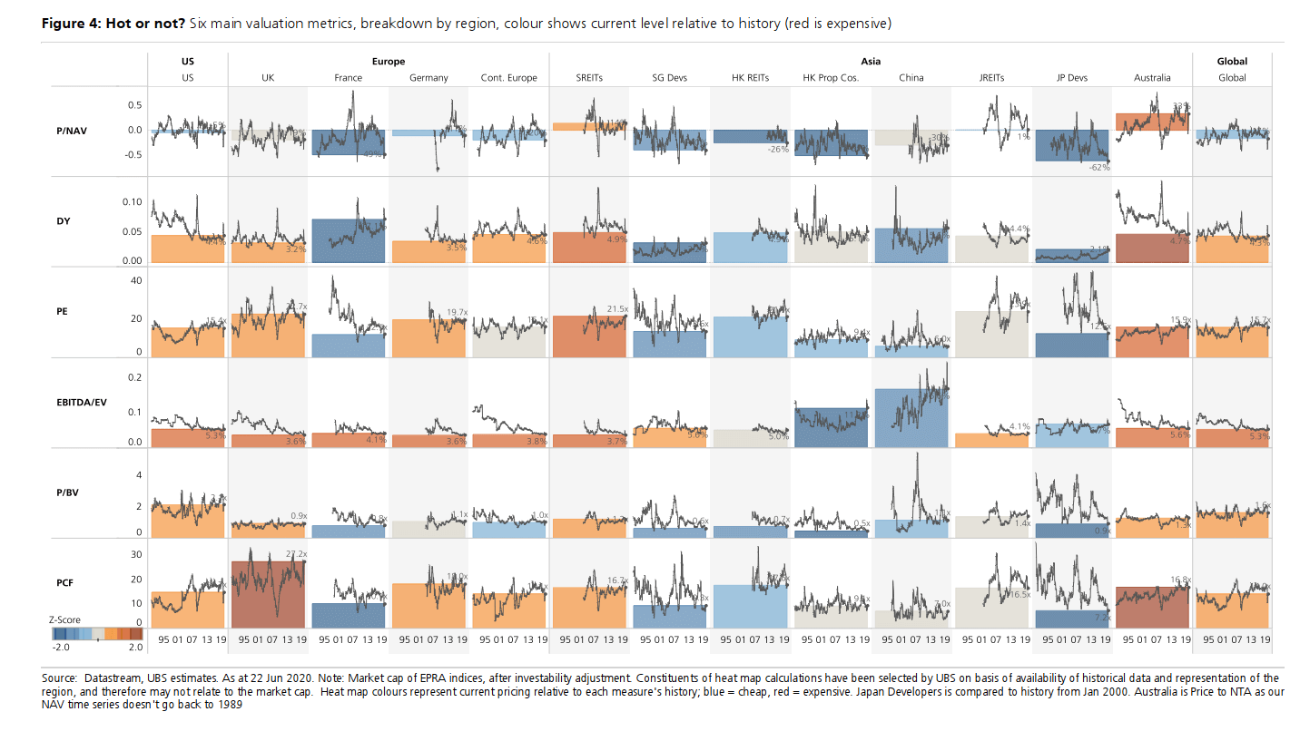
The analysts back tested different valuation metrics over time. They then weigh Price to NAV with a 50% weightage and 10% for the other 5 metrics.
Lower Z-Score reflects that based on that metric, the said market is cheap. (Blue is cheaper, red is expensive).
You can observe HK REITs, HK Property Stocks, China, and Japanese developers are the cheaper ones by all metrics.
The markets that are not cheap are Australia listed property companies and Singapore REITs.
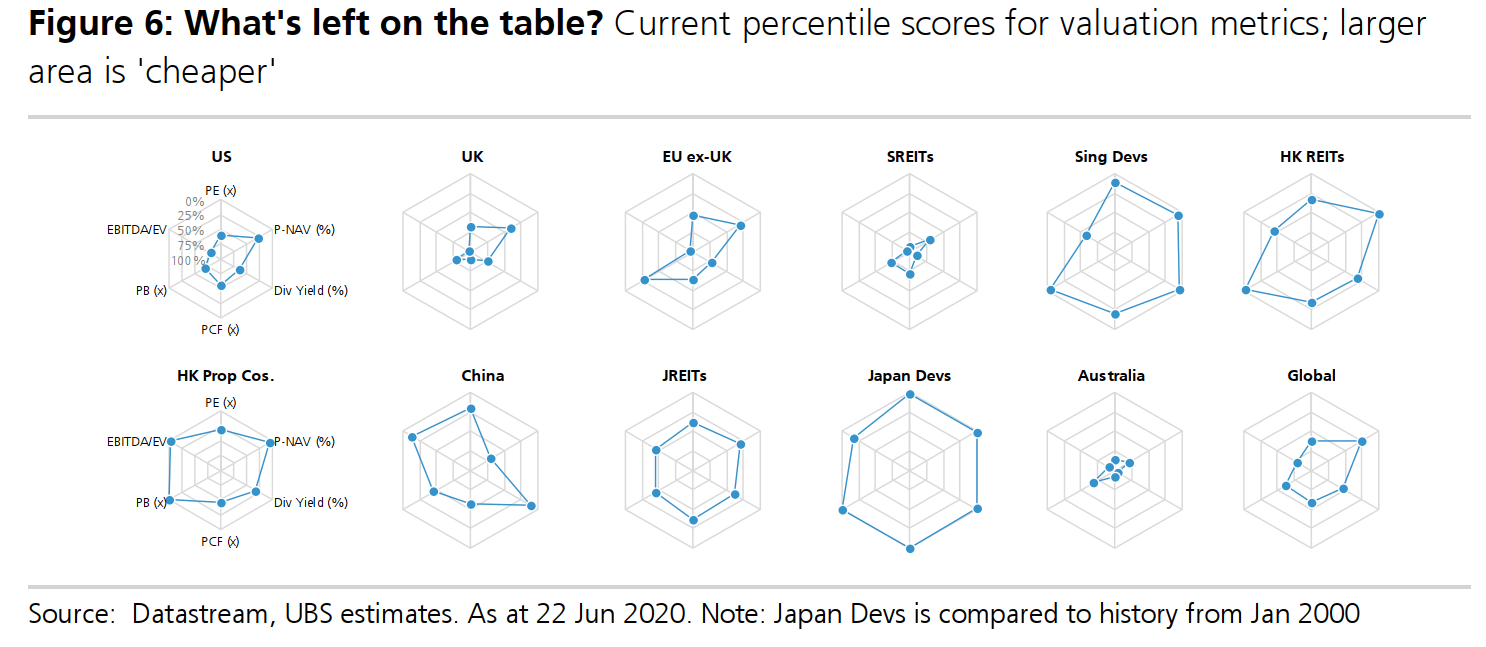
I love spider graphs.
When we play a lot of computer games, this is one graph that shows which character or item is good. This spider graph presents valuation in a different view.
If all the legs of the graph is spread out wide, that region is cheaper.
We can see that Singapore REITs and Australia listed property companies are relatively expensive.
If there is one takeaway here, it is that there is not just one valuation metric.
If you want to have a greater margin of safety, layer price to NAV, PE, dividend yield and EBITDA divided by Enterprice together and you may find some company that is dead cheap based on all metric.
5. What Foot and Transit Traffic Tells Us About the Pandemic Recovery

The analysts trakc a number of unique data sets that can help inform their view of the markets globally during this pandemic.
What you see here is the foot traffic monitor. For most countries they have not recovered.
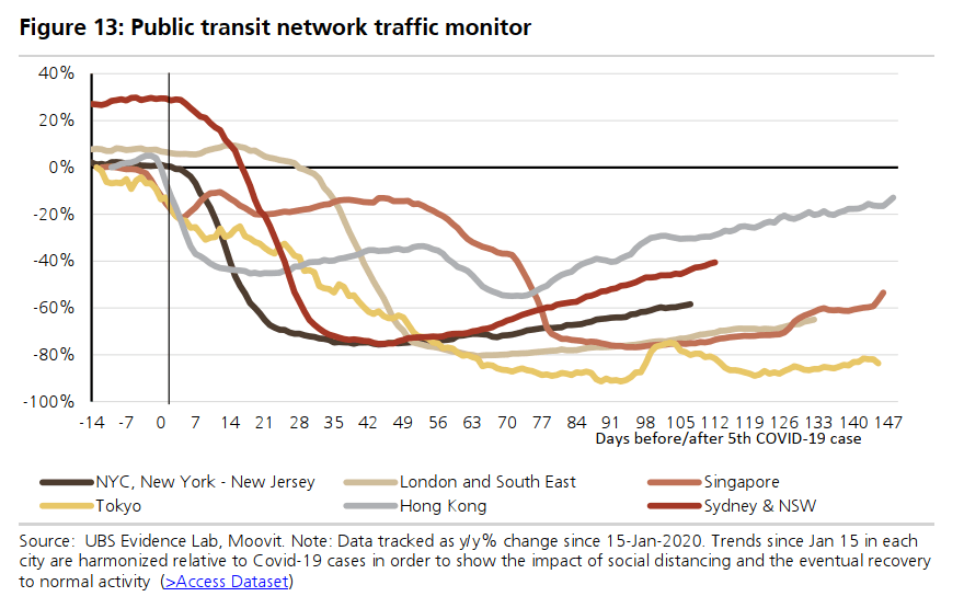
Here is one that monitors the public transit network traffic. Hong Kong did very well but the rest of the other countries were pretty depressed still.
6. Historical Vacancies in Different Markets
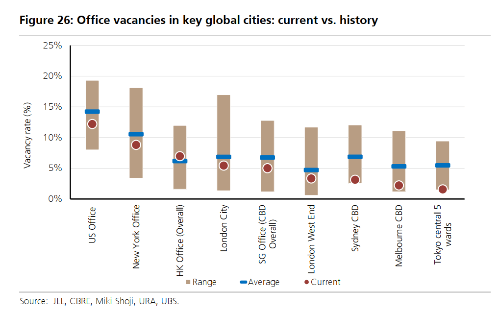
When you invest in a property company, management may update shareholders on the current vacancy rate or the amount of leasable space that are not leased out.
The best case is to have more spaces on lease, but it would be challenging for us to always have the best case.
To find out if this property is performing up to expectations, you can compare against the vacancy rate of the sub-market.
This chart above shows the vacancy rate of various office markets. London city has the wides range. Hong Kong office vacancy has climbed above the average.
Melbourne, Sydney CBD, and Tokyo Central 5 Ward vacancy are still within the historically lowest range.
7. How Different Are the Lease Tenures in Different Office Markets
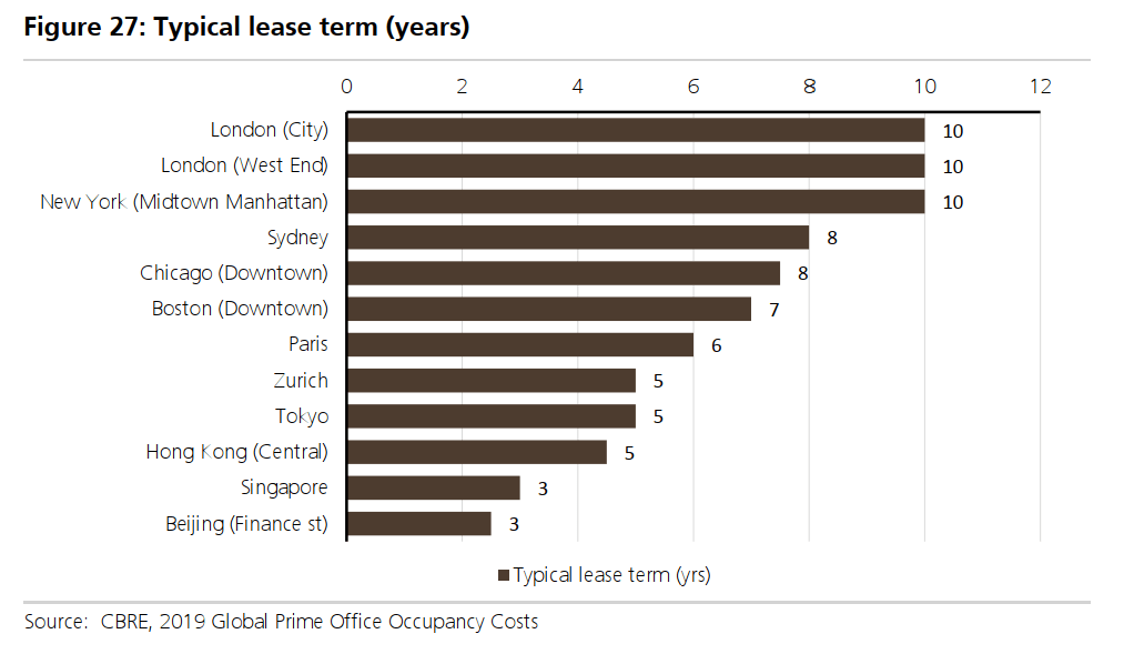
The tenure of office lease term varies in different cities.
The tenure in major Asian cities tend to be shorter. The average tenure in Western cities tend to be longer.
8. CAP Rate Trends
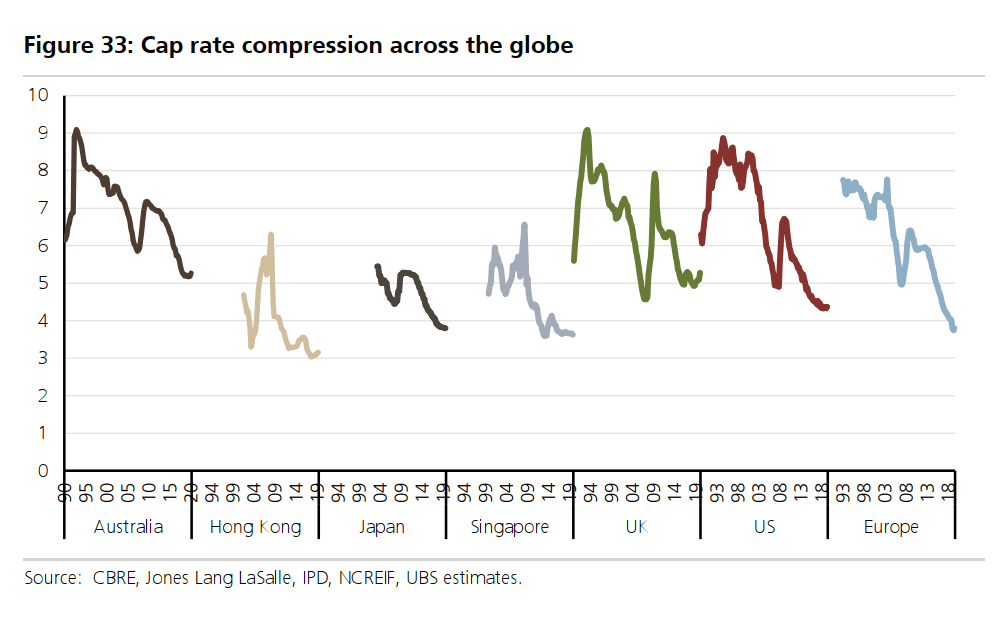
CAP Rate is computed by taking the average net operating income of stabilized properties in that segment divide by the prevailing market value of the properties.
You can infer that this is like the average unleveraged net rental yield of the property segment.
If you rearrange this CAP rate formula, you can work out different things.
For example if your property rent for $10,000 a year and the CAP rate is 6%, if you take $10,000 divide by 6%, this will value your property at $166,666.
The CAP rate is in a way, like how investing people would use the discount rate.
Therefore, a high CAP rate lowers the valuation of your property, all else being equal. A lower CAP rate increases the valuation of your property.
The chart above shows the CAP rate change for different country segment from different time period.
You would observe that the CAP rate trend have been downwards. This reflects average property valuation rising faster than average rent. Most likely, this is due to greater demand for properties.
A lower CAP rate therefore leads to higher property value.s
Appreciate how high the CAP rate for Australia, UK and USA was in the past.
9. The Yield Spread Compared to Historical
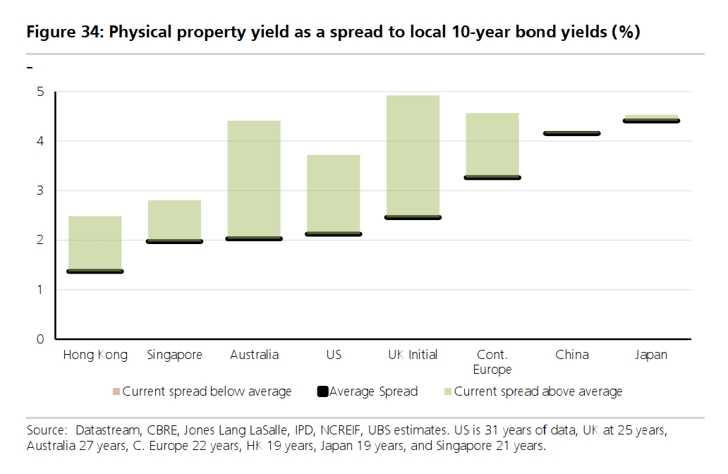
This chart shows the physical property yield as a spread to the local 10-year bond yields. The rate at which the owners of the property lends at typically flows with the local 10-year bond yield.
So a wider spread means greater risk, greater value, possibly greater reward.
The current spread above the historical average for Hong Kong, Australia, UK initial, US, and continental Europe have been wide, indicating potentially greater reward.
10. The Leveraged Net Operating Income Yield of REIT’s Physical Property Indicates Attractive Value Versus Bond Yields
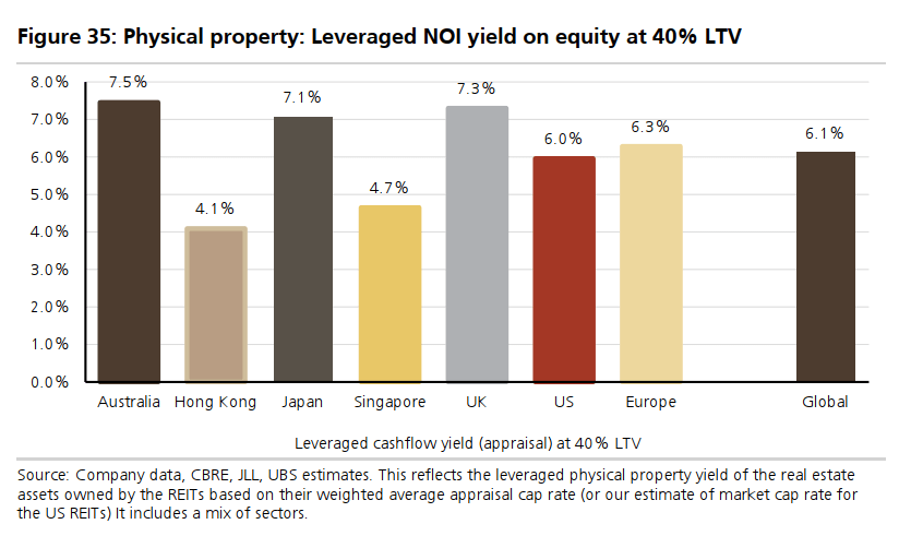
Because the yield spread is wider than the historical (previous chart), investors can possibly get a reasonable return on equity if they invest in REITs.
This chart shows the leveraged NOI yield of the properties belonging to REITs.
- This leveraged NOI yield is based on 40% debt 60% equity (40% LTV).
- NOI is equal to the stabilized rental revenue minus the stabilized cost expenses.
- The analysts assume the investors purchase this property with 40% loan. They then include the interest expense in the NOI computation.
- This NOI is then divided by the equity portion of the property.
What you see is the leverage yield.
I felt that if this is leveraged, an acceptable return with more margin of safety should be higher (perhaps close to 7-8%) in a normal interest rate environment.
However, on average, the leveraged yield is 6% which may mean the unleveraged yield is about 4.2% only. The yields in Hong Kong and Singapore should be even lower.
UBS has the opinion that these yields are attractive because if we compare them to the 10-year government rates for their respective countries, they looked very attractive.
In a yield-starved world, investors are on the look out for yield alternatives.
From this angle, REITs look more attractive vis a vis bonds.
11. The Correlation Between Listed Real Estate Company’s EPS and Global GDP Growth

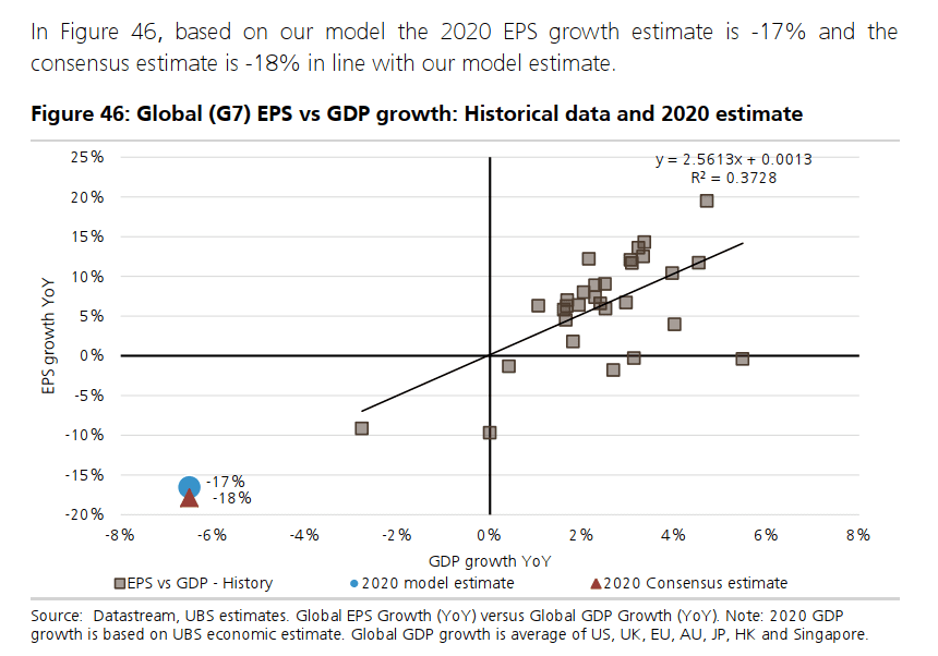
This chart shows us that there is a reasonable correlation between earnings growth of listed real estate companies or REITs and global GDP growth.
By any indication, with the lower GDP growth, we should expect the EPS growth of real estate companies to fall drastically.
But I think, this time is a special situation. We have to wait for the rent collection to stabilize before making judgments if the EPS growth really becomes so negative.
12. Listed Real Estate Has Strong Equity Correlation and Weaker Bond Correlation
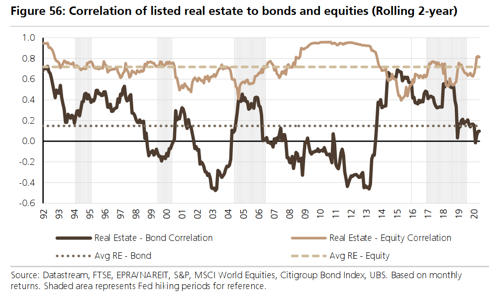

The historical relationship between bond prices (the inverse of bond yields) and listed global real estate is not very strong.
The average correlation is 0.15 since 1993.
However, a strong correlation exists for the relative performance of listed real estate against equities.
Listed real estate tend to outperform when bond yields fall.
Listed real estate companies, are… equities in general. If you are expecting listed real estate to help reduce the volatility of your portfolio, they might disappoint you.
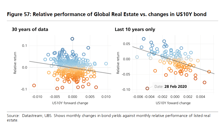
Here is a sensitivity plot that shows the change in return from changes in US 10-year treasury rate.
We observe that when 10-year rate falls, the relative returns tend to be better but that is not always the case.
There are some outliers that, when rates increase, the relative returns were still quite OK.
13. The Correlation of Long Term Yields and Demographic Changes
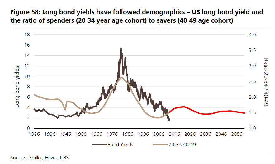
This one is new to me.
The economist thinks that long term interest rates will remain low for some time.
The analysts think there are some structural changes in the economy, including aging populations and persistently high debt levels globally.
This suggests that 10-year treasury yields may trade in a lower range of 2-4$ over the next 20-30 years.
This chart shows the ratio of spenders (those in the 20-34 years old cohort) to savers (those in the 40-49 years old cohort) versus the 10-year treasury bonds.
The relationship looks strong.
This low rates trend looks supportive of listed real estate.
14. Correlation of CAP Rates and 10-Year Bond Yields
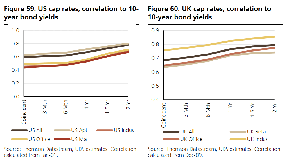
This chart above shows 2 different markets.
It shows that given enough time, there is a correlation between 10-year bond yields and the CAP rate.
Of course, bond yields are not the only influencing factors, with others including:
- rental growth expectations
- risk appetite
- weight of money
What I observed is that
- Office CAP rate correlation with 10-year yields is lower
- Retail CAP rate correlation with 10-year yields is lower
- Industrial and Apartment CAP rate correlation with 10-year yields are higher
15. Relationship Between FED Rate Hike and Equity, Real Estate Performances
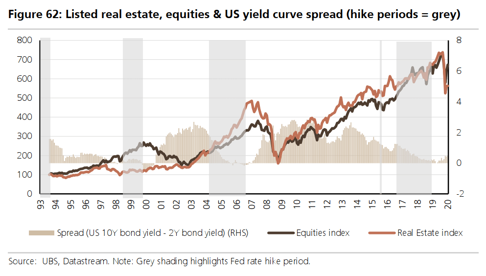
There are 4 things overlayed in this chart.
The light brown line shows the real estate index while the dark brown line shows the equities index.
The light brown bars show the yield spread between the long duration treasury bonds versus the short duration treasury bonds.
This yield spread shows the shape of the yield curve. A region where the spread is high indicates that the yield curve is steep in a positive way. The yield curve narrows over time and then inverts. Correspondingly, we also see the bars becoming shorter and shorter.
Finally, the grey area indicates the period where the FED raised rates.
The grey area is where real estate investors traditionally fear the most because they believe higher interest rates are negative for real estate.
As we see on this chart, the grey areas coincide with the period where the light brown bars are at their lowest. This make sense because as the yield spread narrows and the yield curve flattens, the FED raised rates to make borrowing more expensive, to prevent the markets from overheating.
In the three notable periods where FED hike rates, the real estate and equity index did well together 2 out of three period. During the 1999 period, real estate did not do as well.
The main lesson learn here is that while higher interest rate puts pressure on the real estate business, other factors might matter more than just interest rates.
16. The Explosion of Debt Issuance in Asia and EMEA
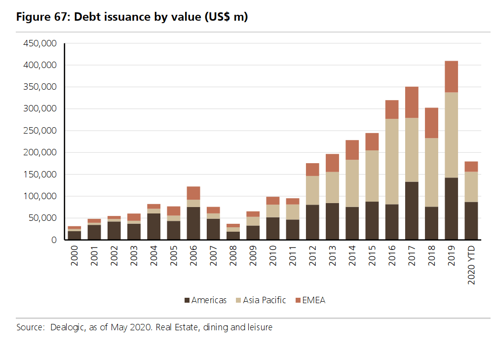
This bar chart shows the debt issuance over time. What fascinates me was that, while more money was raised over time in America, the amount of capital raised in EMEA and the Asia Pacific grew by a crazy amount after 2010.
There is a treasure trove of in-depth REIT knowledge in my Learning About REITs section. You will find articles similar to these but are arranged in such a way that is easier for reading.
It is FREE. No upsell.
Just hope that you can get upskill, invest well, not lose money, make more money.
You can check it out below.
I invested in a diversified portfolio of exchange-traded funds (ETF) and stocks listed in the US, Hong Kong and London.
My preferred broker to trade and custodize my investments is Interactive Brokers. Interactive Brokers allow you to trade in the US, UK, Europe, Singapore, Hong Kong and many other markets. Options as well. There are no minimum monthly charges, very low forex fees for currency exchange, very low commissions for various markets.
To find out more visit Interactive Brokers today.
Join the Investment Moats Telegram channel here. I will share the materials, research, investment data, deals that I come across that enable me to run Investment Moats.


Do Like Me on Facebook. I share some tidbits that are not on the blog post there often. You can also choose to subscribe to my content via the email below.
I break down my resources according to these topics:
- Building Your Wealth Foundation – If you know and apply these simple financial concepts, your long term wealth should be pretty well managed. Find out what they are
- Active Investing – For active stock investors. My deeper thoughts from my stock investing experience
- Learning about REITs – My Free “Course” on REIT Investing for Beginners and Seasoned Investors
- Dividend Stock Tracker – Track all the common 4-10% yielding dividend stocks in SG
- Free Stock Portfolio Tracking Google Sheets that many love
- Retirement Planning, Financial Independence and Spending down money – My deep dive into how much you need to achieve these, and the different ways you can be financially free
- Providend – Where I used to work doing research. Fee-Only Advisory. No Commissions. Financial Independence Advisers and Retirement Specialists. No charge for the first meeting to understand how it works
- Havend – Where I currently work. We wish to deliver commission-based insurance advice in a better way.
Kyith is the Owner and Sole Writer behind Investment Moats. Readers tune in to Investment Moats to learn and build stronger, firmer wealth foundations, how to have a Passive investment strategy, know more about investing in REITs and the nuts and bolts of Active Investing.
Readers also follow Kyith to learn how to plan well for Financial Security and Financial Independence.
Kyith worked as an IT operations engineer from 2004 to 2019. Currently, he works as a Senior Solutions Specialist in Insurance Start-up Havend. All opinions on Investment Moats are his own and does not represent the views of Providend.
You can view Kyith's current portfolio here, which uses his Free Google Stock Portfolio Tracker.
His investment broker of choice is Interactive Brokers, which allows him to invest in securities from different exchanges all over the world, at very low commission rates, without custodian fees, near spot currency rates.
You can read more about Kyith here.
- My Dividend Experience Investing in UCITS iShares iBond Maturing in 2028. - April 23, 2024
- We Invest into Popular Funds When They Are Popular, Exactly When They Started Turning to Shxt. - April 22, 2024
- Meal Prep 2.0 – Cooking Your “Go-to” Meal that You Look Forward to Eating Everyday. - April 21, 2024
Rick Fok
Tuesday 14th of July 2020
Great info on investment.
I guess it is not just head info that you need here.
You also need to have guts to get started to place your orders and to put money into investment.
I am only into some blue chip stocks and REITs, not much venture into others.
lim
Sunday 12th of July 2020
I am really surprised that SREITs did not need to have preferential/rights offerings to raise funds; which was something that a lot of them did during the GFC. In fact, Frasers Centrepoint Trust managed to issue 3 yr bonds at a mere 3.2% (compare to the Frasers retail bonds at 3.65%) this year.
Kyith
Monday 13th of July 2020
You need people demand it to be able to do it. I guess this is also down to maturity.