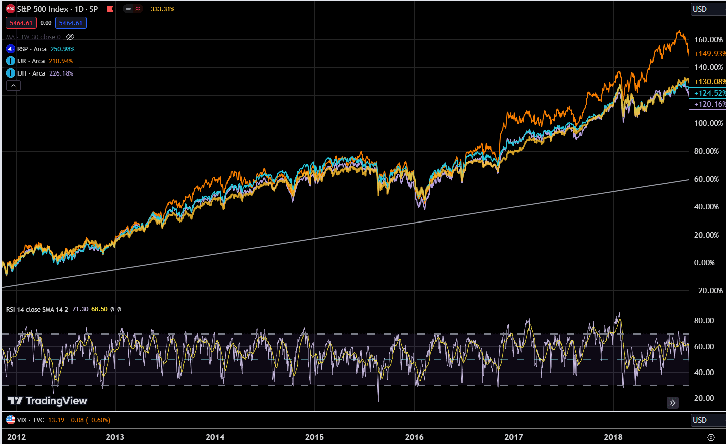
The chart below shows 4 different US indexes, the yellow S&P 500, which represents the large-cap stocks, the purple is IJH or iShares Core S&P Mid-Cap ETF, the cyan RSP or Invesco S&P 500 Equal Weighted ETF, and the orange IJR or iShares Core S&P Small-Cap ETF:
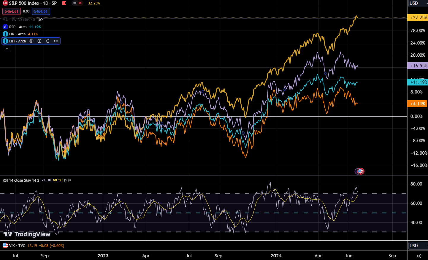
This would allow us to see the performance of the various segments of the US market.
We observe that all 4 were in a tight range, but in recent months, three out of four indexes struggled to go higher. This is similar to other indexes around the world.
Only the S&P 500 was able to power ahead.
The more interesting comparison is the yellow versus the cyan because that measures the cap weighted S&P 500 against the equal weight. The outperformance is likely due to the more heavy focus on Information Technology with the AI theme doing well.
When people say the US is doing better, I am not sure because it would seem most of the large cap, the mid cap and small cap are stalling out.
But in a way, the fundamentals backed it up.
We would often wonder if the market is getting too expensive and the measure of whether value in the market is the price-earnings ratio which is a ratio of taking the price of an index divided by the trailing or forward earnings.
Here is the trailing PE for S&P 500 for the past few months:
- May: 27.5
- Apr: 26.6
- Mar: 27.4
- Feb: 26.6
- Jan: 25.3
- Dec: 24.8
The PE of the S&P 500 definitely expanded, but not so much in the last four months, so why did the price of the S&P 500 run?
I may need to explain the formula behind the PEs so that you can understand them better.
If P/E = PE and PE stays flat, we need both E to go up and P to go up together.
So the question is whether E is going up.
Here is the historical forward earnings of the S&P 500 from Yardeni.com:
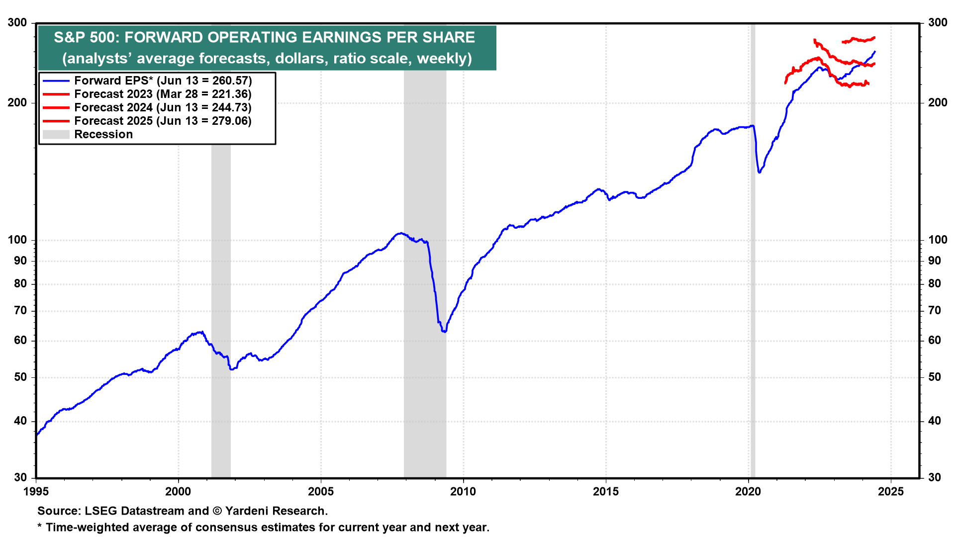
This goes back to 1995 but I want you to see the recent EPS. The recent EPS is trending upwards, above those red lines which are the EPS forecast. The EPS can be said to be surprising more than the estimates and when EPS surprises on the upside, the market reprices to consider this new information.
Here is the forward earnings of the S&P 400 or the Mid-Cap index:
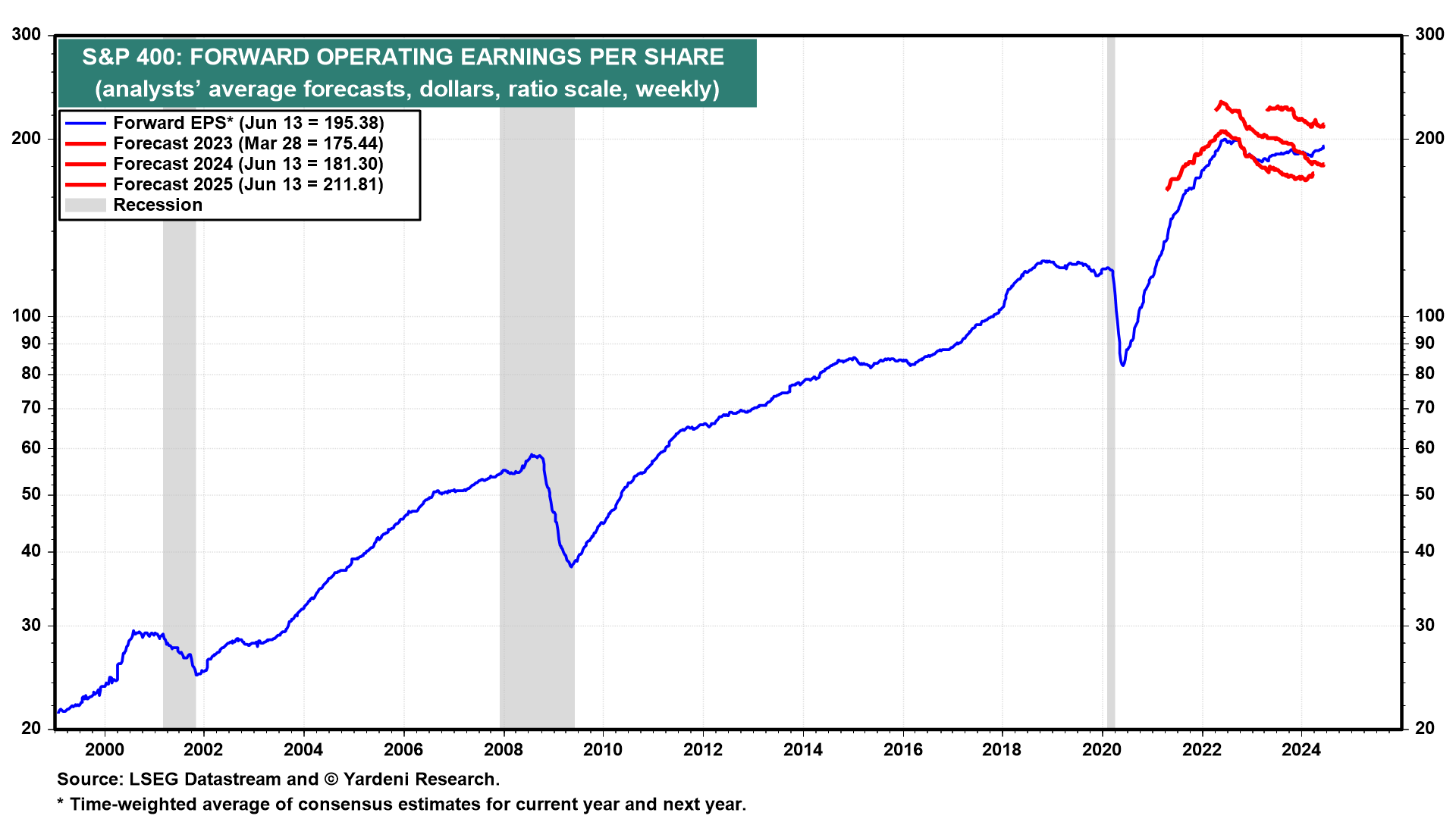
The aggregate earnings per share of the mid-cap companies didn’t hit the all time high like the large-cap.
Here is the forward earnings of the S&P 600 or the Small-Cap index:
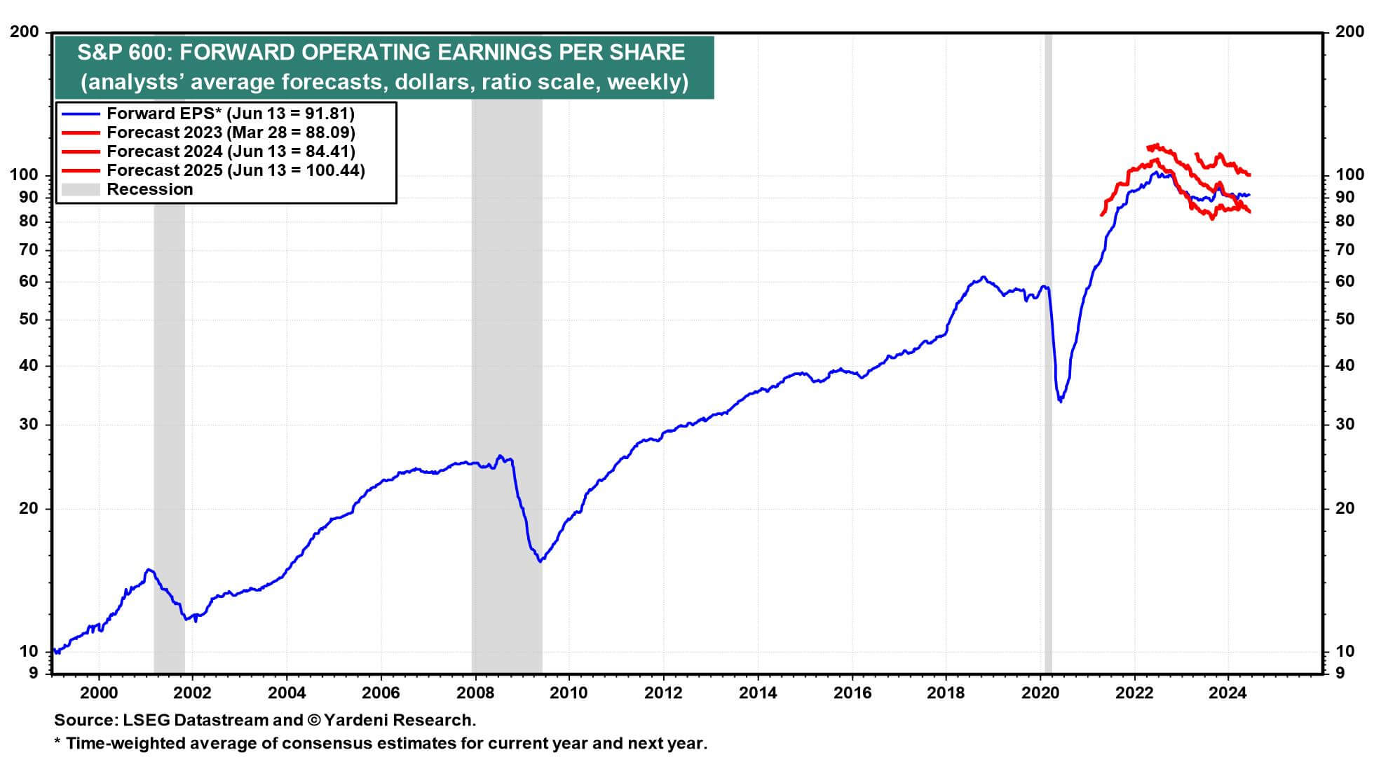
The earnings per share of the small caps is even flatter.
Given what we know about the PE ratio, all else being equal, the EPS of the mid-cap and the small-cap is flat and unless their PE is so cheap relative to history, fundamentally there may not be a reason for the price to follow the fundamentals. In fact, the fundamentals are right where it is currently because the earnings are not doing well.
The large-cap prices are going up because the EPS is growing as well.
Here is a chart from FactSet showing the Q1 earnings growth of the S&P 500 of the top 4 companies versus the other 496 stocks:
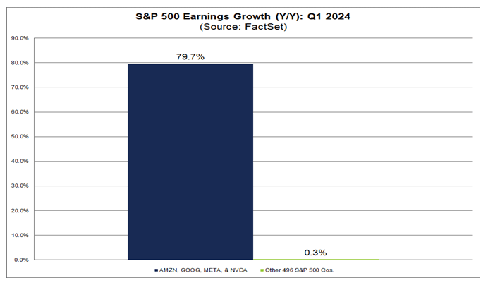
You can see the stark contrast. It explains the difference in performance between the equal-weighted S&P 500 and the capitalization-weighted S&P 500.
S&P Global provides a spreadsheet of the historical EPS going back to 2008 quarter by quarter. I tabulated the EPS, and its growth rate, against the 3 index calendar annual returns in the following chart:
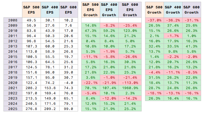
A few things first:
- 2024 and 2025 EPS are just estimates. This is where analysts think they are going and might not happen.
- The EPS growth for 2020 and 2021 for S&P 600 is probably a bit wonky because EPS for 2020 aggregated to be negative. As you can see from the 16 years of earnings data, even GFC the EPS didn’t go negative. The negative was due to the energy sector.
It is hard to tell about the relationship unless I tabulated the EPS of the indexes quarter-by-quarter.
It is important for us to note that… EPS growth is just part of the equation that drives prices.
PE expands and contract as well.
Jurrien Timmer at Fidelity always have a nice charts that illustrates this:
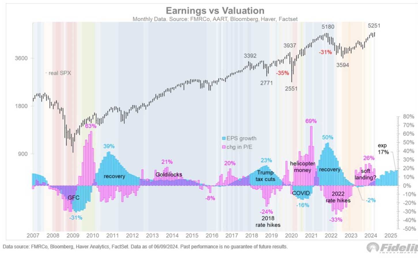
This chart plots the real S&P 500 (that means adjusted for inflation against the EPS growth (cyan) and PE expansion and contraction. There are some periods where the EPS growth slows but PE expands (2019, 2011).
The Stalling EPS from Mid 2018 to 2020
If you review the three EPS chart, you would notice that prior to Covid, there seem to be a period of flat EPS growth from mid-2018 to 2020.
The S&P 500 earnings look much healthier than the mid-cap and small-cap.
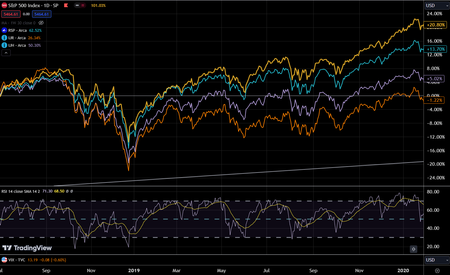
We can kind of review the performance of the four indexes. The performances of the mid-cap and small-cap end up not going anywhere with the S&P 500 equal-weighted and market cap weighted doing better.
When the EPS of all Large-Cap, Mid-Cap and Small-Cap Grow, What happens?
If we shift backwards to the period of 2012 to mid 2018, that is a period where almost all the different segments of US stocks all experience EPS growth.
The EPS Growth from 2012 to 2018:
- S&P 500: 56.6%
- S&P 400: 76.0%
- S&P 600: 80.6%
And here is the stock market performance of the four indexes:
All 4 ended up higher.
Perhaps it is a surprise for many that in this long bull market, it is the Orange IJR or the Small-Cap which did the best.
The small-caps EPS have the greatest growth in 2018 to the mid period and not surprisingly, the small-cap did the best.
Kind of debunk the “small-cap didn’t do well in the last decade” native.
So What Does the EPS Forecast Tell Us?
Here is the forward EPS growth rates that I can gather:
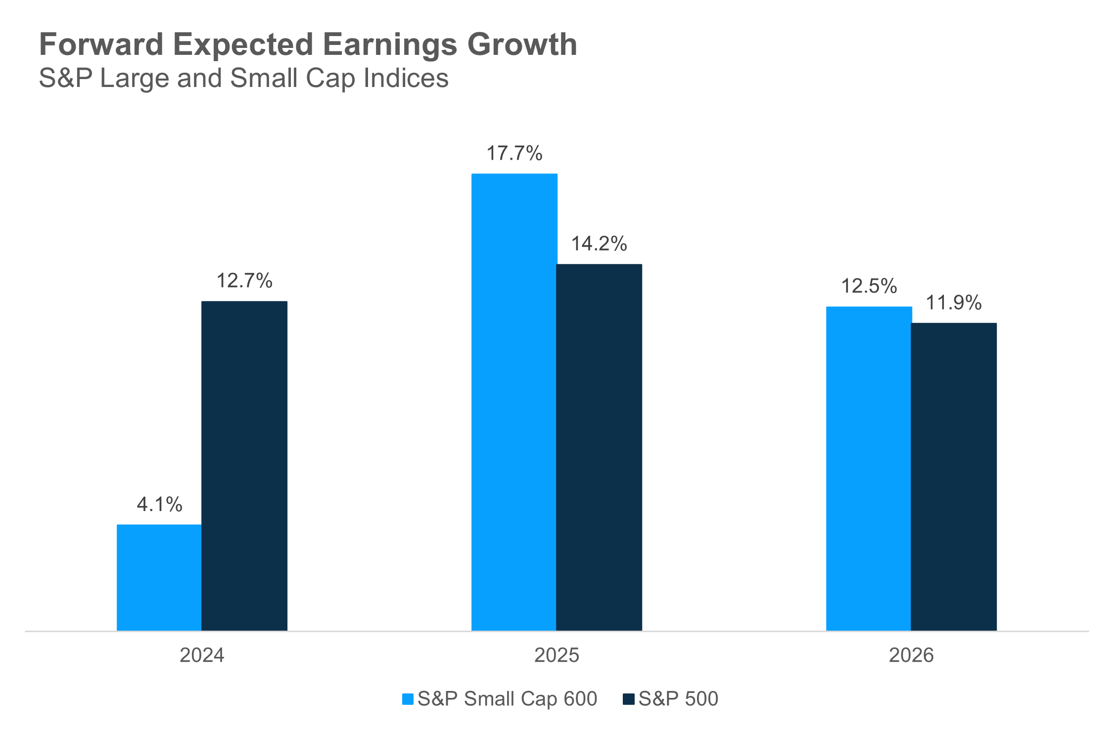
While the EPS of the S&P 500 remain strong, the consensus analyst forecast for the EPS growth of Small-Cap is expected to see strong recovery.
If fundamentals hold true we should see a strong run in not just the small but also in the mid and other large-cap.
But do note, these are just estimates and things could change easily.
If the EPS heads downwards instead of up, I don’t have to tell you what that would do to the stock prices.
Regardless, I think we sort of show that prices are tethered to fundamentals in a way.
If you want to trade these stocks I mentioned, you can open an account with Interactive Brokers. Interactive Brokers is the leading low-cost and efficient broker I use and trust to invest & trade my holdings in Singapore, the United States, London Stock Exchange and Hong Kong Stock Exchange. They allow you to trade stocks, ETFs, options, futures, forex, bonds and funds worldwide from a single integrated account.
You can read more about my thoughts about Interactive Brokers in this Interactive Brokers Deep Dive Series, starting with how to create & fund your Interactive Brokers account easily.
Kyith is the Owner and Sole Writer behind Investment Moats. Readers tune in to Investment Moats to learn and build stronger, firmer wealth foundations, how to have a Passive investment strategy, know more about investing in REITs and the nuts and bolts of Active Investing.
Readers also follow Kyith to learn how to plan well for Financial Security and Financial Independence.
Kyith worked as an IT operations engineer from 2004 to 2019. Currently, he works as a Senior Solutions Specialist in Insurance Start-up Havend. All opinions on Investment Moats are his own and does not represent the views of Providend.
You can view Kyith's current portfolio here, which uses his Free Google Stock Portfolio Tracker.
His investment broker of choice is Interactive Brokers, which allows him to invest in securities from different exchanges all over the world, at very low commission rates, without custodian fees, near spot currency rates.
You can read more about Kyith here.
- New 6-Month Singapore T-Bill Yield in Early-July 2024 to Rise to 3.78% (for the Singaporean Savers) - June 27, 2024
- Why the S&P 500 Should Do Better Than the Other Segments of the Market Fundamentally. - June 23, 2024
- What is There to Like and Dislike about Interactive Brokers Desktop - June 21, 2024