One of my friends was asking me about how I viewed the market.
I have gone through the valuation of the market (and perhaps this post as well) and how we look at things from the fundamental perspective.
The price in the market is an aggregate of the fundamentals and the psychology of the participants.
If we look at the price data from various angles, going through each of them individually but going through enough of them, it gives us a sense of things.
And the market is telling us that the second year after recovering from a big drawdown may be a muddle through the year where things work themselves out.
The main stocks that drive the market are limited to a few companies, but beneath that, as an aggregate, the market is showing weaknesses.
There are also not a lot of bearishness. The absence of bear as a contrarian sentiment indicator seems to be pointing to a lack of cautiousness.
But a lack of expanding group of companies hitting new lows points to a market that is working out the excesses of last year.
Markets can be bullish and bearish and they can also go nowhere.
Going nowhere is a form of correction that may be longer-term investors who buy-and-hold are more comfortable to invest in.
Perhaps a 5% to 15% correction is possible. (Read market declines are frequent) Every year, there is a sizable drawdown and we haven’t had one for some time.
More correction is a more healthy market.
The data that forms the view is below. A huge hat-tip to All-Star Charts.
What the Market Prices and Breadth Tells us about the Market

If we consider that 2020 was a pivotal market drop, 2021 is probably the second year of the bear market. Judging by past experience, the second year is just messy.
And we might be undergoing something similar.
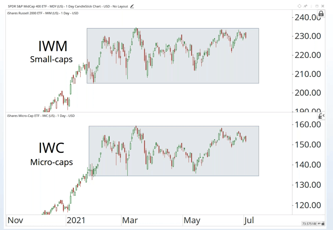
IWM and IWC are the US-listed ETFs that tracks the Russell 2000 and the even small microcap index respectively.
As a cohort, these stocks seem to be trap in a range for some time while the largest US-listed companies have been going up.
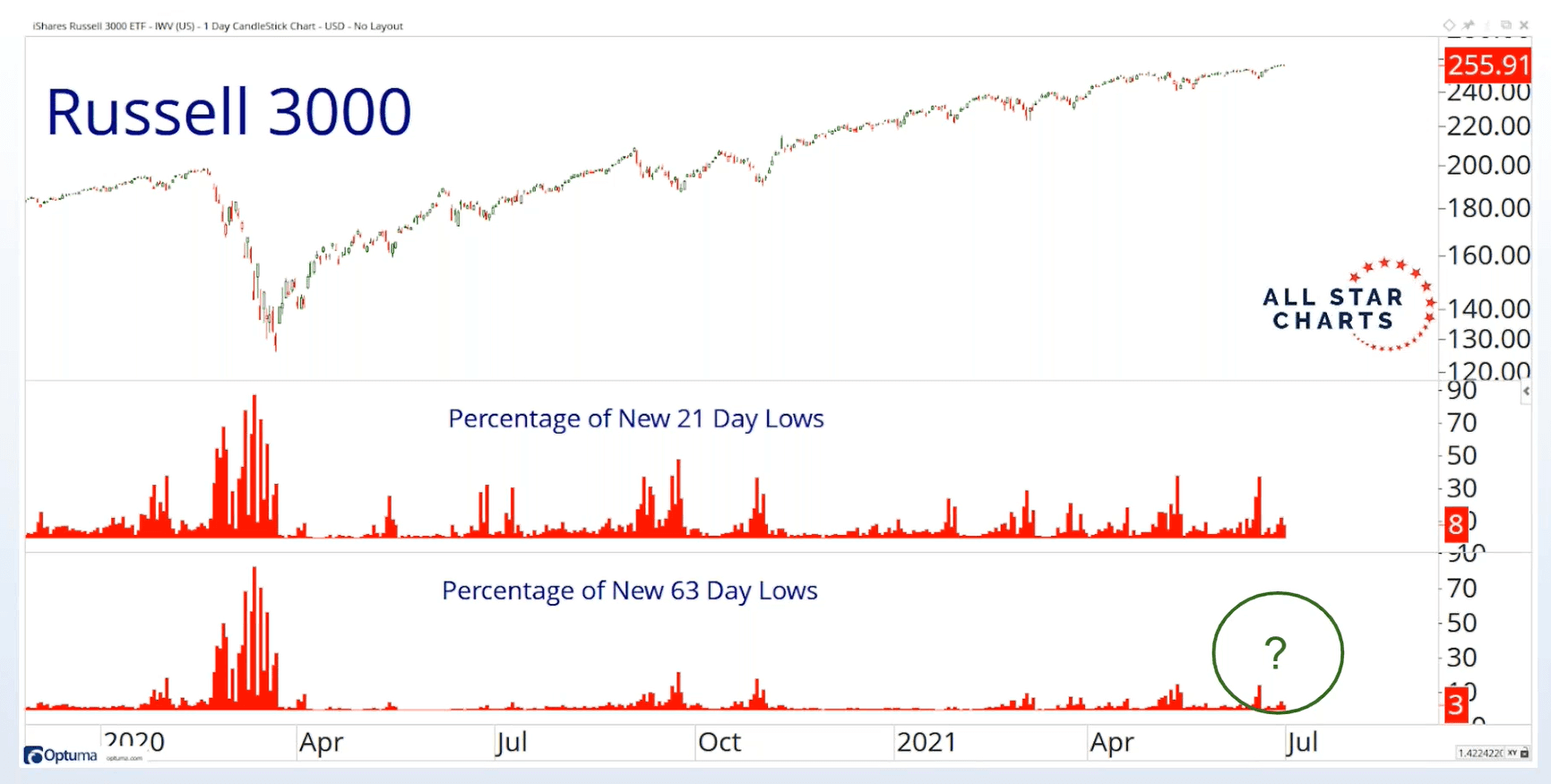
The Russell 3000 index contains the 1000 biggest companies and the 2000 smallest companies. If we observe the Covid period, we can see an expansion of the number of companies hitting a 1-month low (21 days) and 3-month low (63 days). On and off, we tend to see an expansion of a 1-month low but in a secular uptrend, we should not see a large percentage of stocks hitting longer-term lows.
And currently, we are not seeing that expansion in the longer-term lows, which is a longer-term positive.
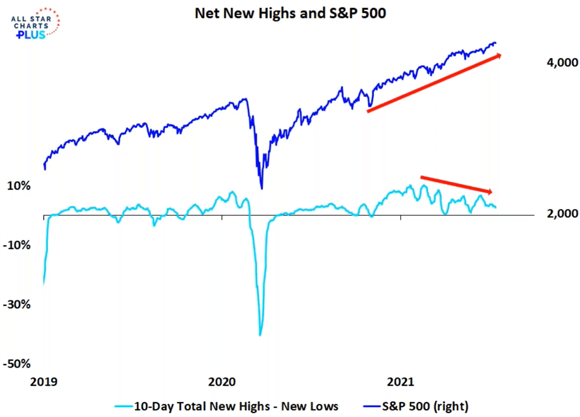
While the Sp500 has been going up, over time, we have less companies making new highs versus companies making new lows.
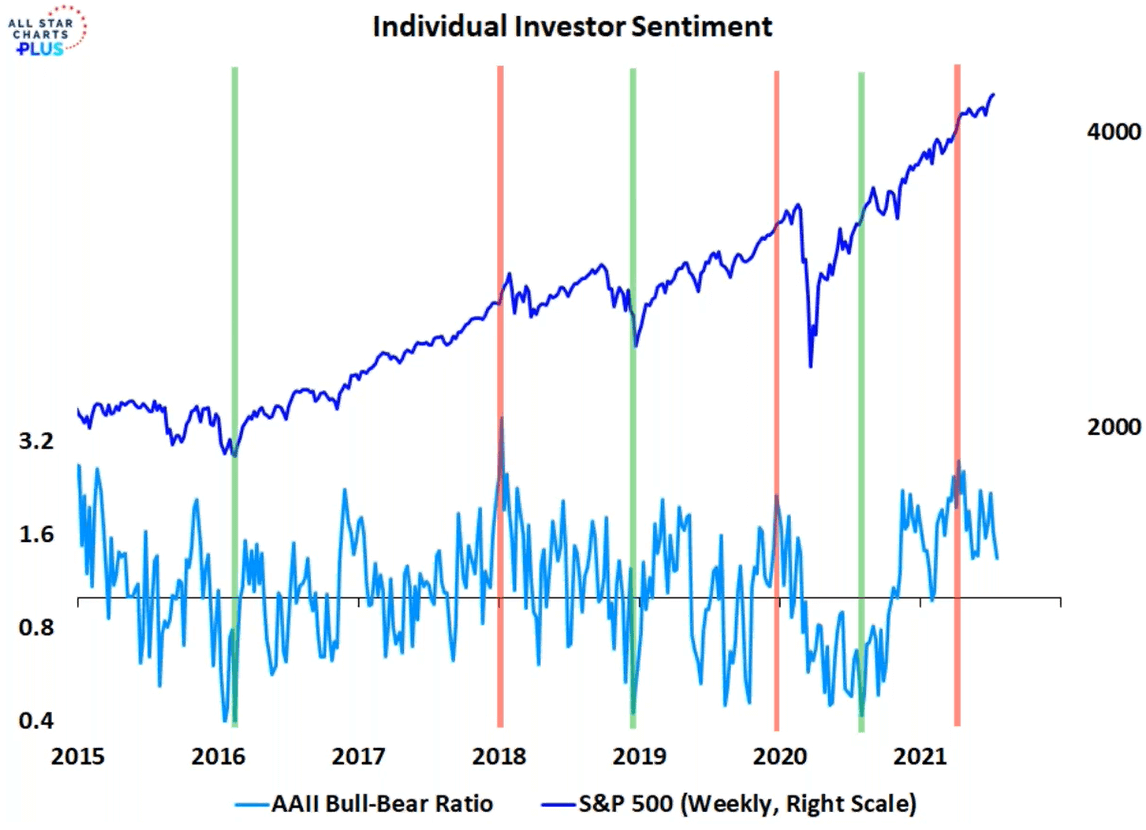
The AAII regular survey how bullish and bearish the investors participating is. This will give investors an idea about how extended the sentiments are to one side.
Currently, we are seeing more bulls than bears but sentiments are coming down.

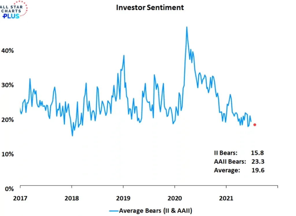
If we just focus on the survey of bearish institutional investors and individual investors, we will notice that in the past there tends to be an oscillation of how bearish investors are. In 2021, there aren’t a lot of bears!
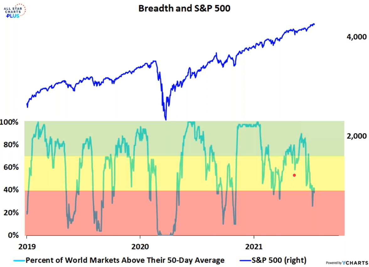
This is probably a favourite breadth of many. A healthy market should have a sizable percentage of stocks above their 50-day moving average. It shows strength if a large percentage is above and weakness if it is less.
While S&P 500 is going up, there seems to be less percentage of world markets above their 50-day moving average.
Kinda indicates a lot of stocks are not as frothy as we think. Weakness also indicates less frothy but less strength.

While S&P 500 is going up, less percentage of companies on the New York Stock Exchange and Nasdaq is breaking new highs.
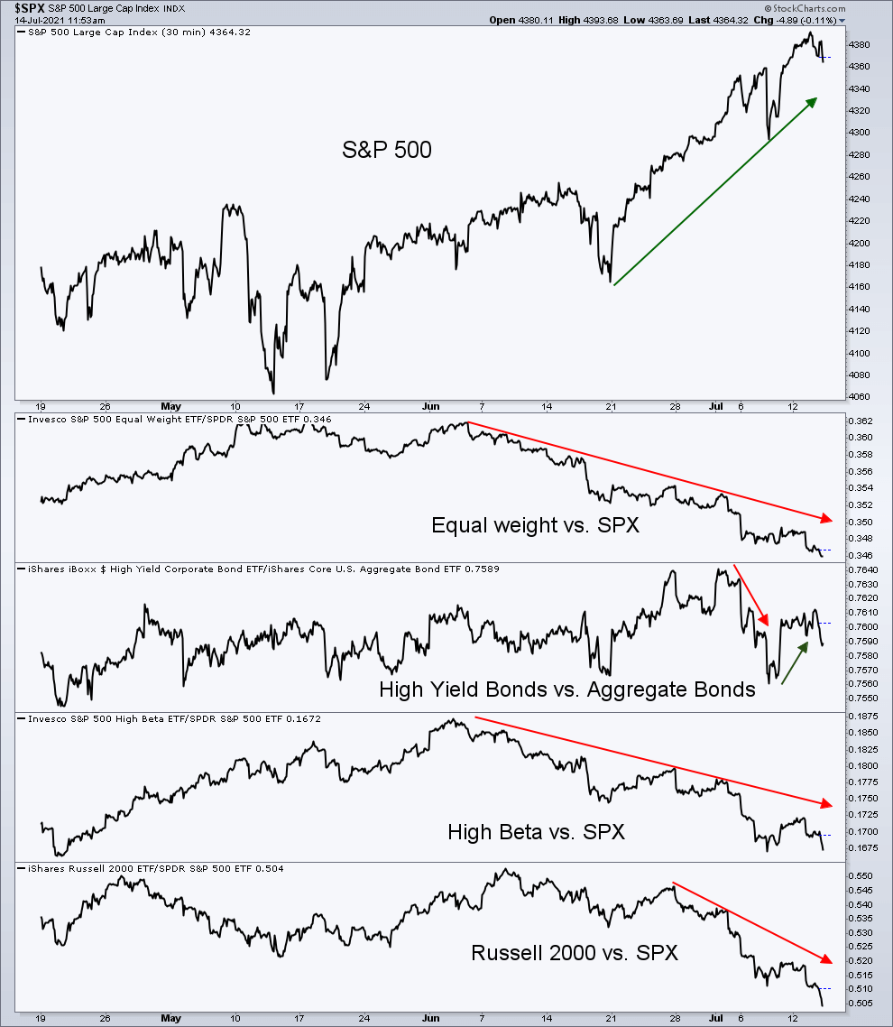
While the S&P 500 is going up, the smaller S&P components, the higher beta stocks are doing worse compared to a market-cap weighted S&P 500.
The Russell 2000, an index of the 2000 smallest US-listed companies, are also doing relatively not as well as the S&P 500.
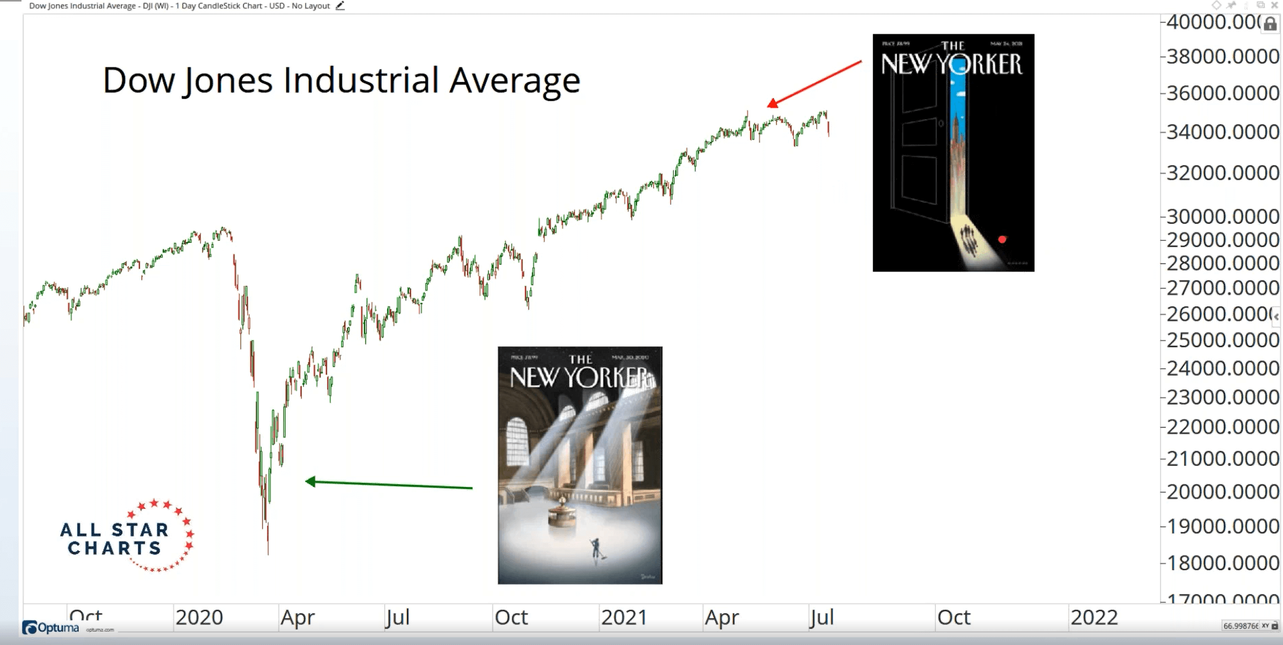
All-Star charts pick out this contrarian indicator that was pretty popular back when most of us were reading Times magazine. The magazine publisher tends to lag in terms of their commentary of financial events.
It remains to be seen whether the recent cover of reopening would mark a trend change in the market.
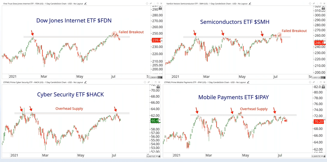
Here are 4 different ETFs that segment the tech industry in different ways.
Almost all of them have not shown the strength to break out from the highs of the price experienced at the start of 2021.
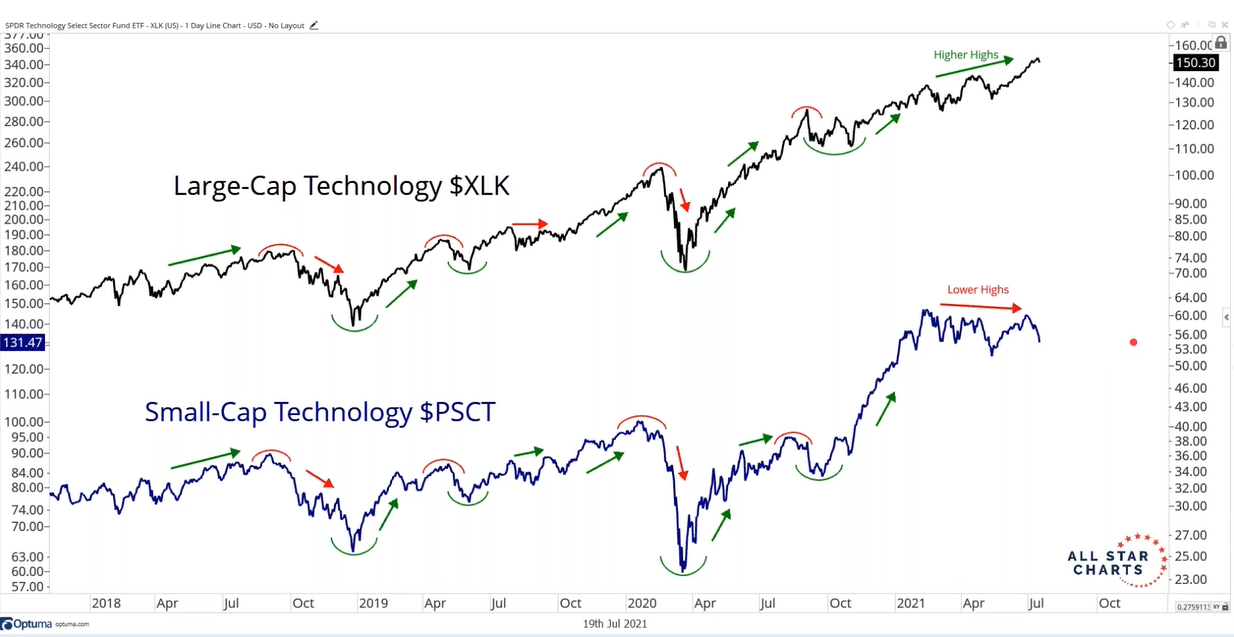
While the large-cap technology companies such as Apple, Nvidia, Microsoft, Visa are doing well, the ETF tracking the smaller tech companies are struggling (Power integrations, Microstrategy, Itron, Viavi Solutions, Advance Energy Industries)
Though I do wonder if PSCT is representative of the smaller technology companies we want to track.
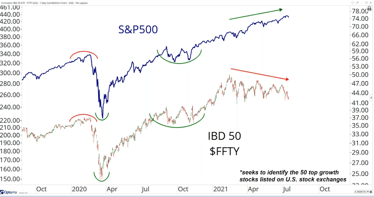
The IBD 50 ETF tracks an index that focuses on the companies generating outstanding profit growth, big sales increases, wide profit margins, and high return on equity. (Moderna, Cloudflare, InMode, Asana, Generac Holdings, Atkore International Group, Freedom Holding, Snap, Global-e Online, Western Alliance Bancorp)
This selected group of high sales growth companies are not showing the same strength as the S&P 500 as well.
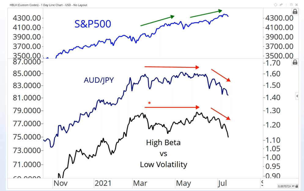
AUD versus JPY is a pair that many watched to detect the health of trade versus cautiousness.
The group of stocks that satisfy the low volatility factor tends to lean towards the utilities, consumer staples, which usually do better when markets are more cautious. This is in contrast to the high beta stocks which are more responsive to the markets.
The relative better performance of JPY and low volatility stocks is one of the few indicators of more cautiousness than risk-taking.
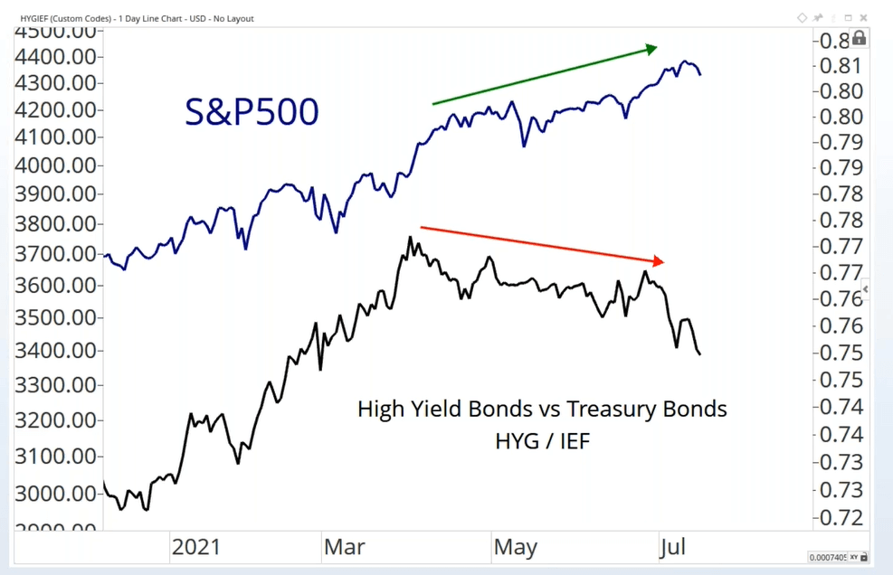
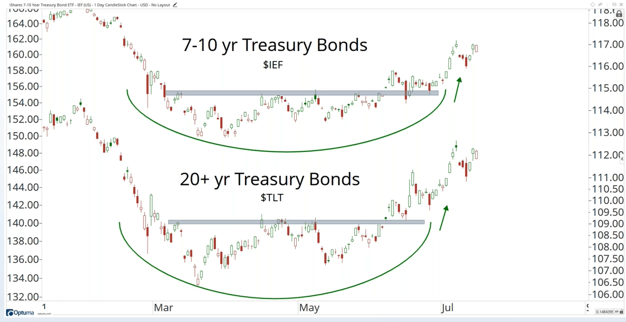
High-yield bonds do well in bullish regimes while investment-grade bonds of 5-7 year duration (IEF) do well during cautious periods.
We are observing divergence here.
While we are here worrying about high inflation, other than the S&P 500, the sector doing well are the defensive and…. bonds.
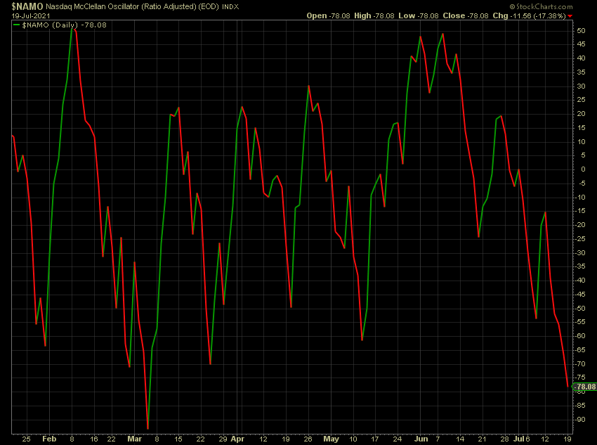
In the last chart, the Nasdaq McClellan Oscillator just show how oversold we are currently.
If this trend continues… and it is less messy, then we might just see a continuation of the technology companies.
I invested in a diversified portfolio of exchange-traded funds (ETF) and stocks listed in the US, Hong Kong and London.
My preferred broker to trade and custodize my investments is Interactive Brokers. Interactive Brokers allow you to trade in the US, UK, Europe, Singapore, Hong Kong and many other markets. Options as well. There are no minimum monthly charges, very low forex fees for currency exchange, very low commissions for various markets.
To find out more visit Interactive Brokers today.
Join the Investment Moats Telegram channel here. I will share the materials, research, investment data, deals that I come across that enable me to run Investment Moats.


Do Like Me on Facebook. I share some tidbits that are not on the blog post there often. You can also choose to subscribe to my content via the email below.
I break down my resources according to these topics:
- Building Your Wealth Foundation – If you know and apply these simple financial concepts, your long term wealth should be pretty well managed. Find out what they are
- Active Investing – For active stock investors. My deeper thoughts from my stock investing experience
- Learning about REITs – My Free “Course” on REIT Investing for Beginners and Seasoned Investors
- Dividend Stock Tracker – Track all the common 4-10% yielding dividend stocks in SG
- Free Stock Portfolio Tracking Google Sheets that many love
- Retirement Planning, Financial Independence and Spending down money – My deep dive into how much you need to achieve these, and the different ways you can be financially free
- Providend – Where I used to work doing research. Fee-Only Advisory. No Commissions. Financial Independence Advisers and Retirement Specialists. No charge for the first meeting to understand how it works
- Havend – Where I currently work. We wish to deliver commission-based insurance advice in a better way.
Kyith is the Owner and Sole Writer behind Investment Moats. Readers tune in to Investment Moats to learn and build stronger, firmer wealth foundations, how to have a Passive investment strategy, know more about investing in REITs and the nuts and bolts of Active Investing.
Readers also follow Kyith to learn how to plan well for Financial Security and Financial Independence.
Kyith worked as an IT operations engineer from 2004 to 2019. Currently, he works as a Senior Solutions Specialist in Insurance Start-up Havend. All opinions on Investment Moats are his own and does not represent the views of Providend.
You can view Kyith's current portfolio here, which uses his Free Google Stock Portfolio Tracker.
His investment broker of choice is Interactive Brokers, which allows him to invest in securities from different exchanges all over the world, at very low commission rates, without custodian fees, near spot currency rates.
You can read more about Kyith here.
- My Dividend Experience Investing in UCITS iShares iBond Maturing in 2028. - April 23, 2024
- We Invest into Popular Funds When They Are Popular, Exactly When They Started Turning to Shxt. - April 22, 2024
- Meal Prep 2.0 – Cooking Your “Go-to” Meal that You Look Forward to Eating Everyday. - April 21, 2024
Sinkie
Thursday 22nd of July 2021
Thanks for the heads up on All Star Charts.
Am familiar with 2004 & 2010, and the narrative that 2021 will be similar.
But wasn't aware that the 70s & early 80s also showed similar behaviour after their big bear markets.
It shows that this 2nd year moribund-ness applies in both cyclical & secular markets.
E.g. The 1976 & 2004 cases were cyclical bulls but in longer-term secular bears. The 1983 case turned out to be the start of a secular bull.
If 2010 was near the start of a secular bull, then it means that any downturns or bear markets should be either relatively short (e.g. Covid), or relatively mild (e.g. 2018). At least for a long-ish 15-20 year period. This gives a speculative 2025-2030 as the ending period for this secular bull.
Which seems to be the case so far. Covid was a massive hit, but was incredibly short in terms of the financial markets. The US NBER just declared the official US recession to be Feb-Apr 2020, the shortest US recession on record.
Kyith
Saturday 24th of July 2021
I think that is a good point out. Perhaps sometimes what they do is not quantitative enough as well. maybe there are some second year that turn out to be real good.