I saw this deck of JP Morgan guide to the markets on Twitter a few days ago and decide to have a cup of coffee and go through it.
JPM periodically do this set of slides and it is always informative.
They cover the current valuation of the equity, bond markets, some investment stuff that is related to financial planning, factor investing, climate change and some interesting data that is less traditional.
In today’s post, I tried to pick out some of them to bring to your attention and give you some of my perspectives.
Prices looked to be at Extreme Levels

The tail end of this chart just show you how compressed this recovery was. JPM layered some valuation metrics together with this chart.
Forward price earnings looked to be on the high side but never as extreme as the 10-year treasury bond.
Forward Price Earnings Now May Point to Very Low Future Longer-Term Returns
Forward price earnings is probably the right way to look at things if we want to value things. We want to value based on flow, since most of the companies do have decent earnings.
Using forward earnings is a bit of a projection, but by and large, if we aggregate consensus estimates, it should be not bad.
If Covid-10 or a GFC is a one-off very poor earnings profile, it might not be great to always base our general valuation on a one-off earnings profile.

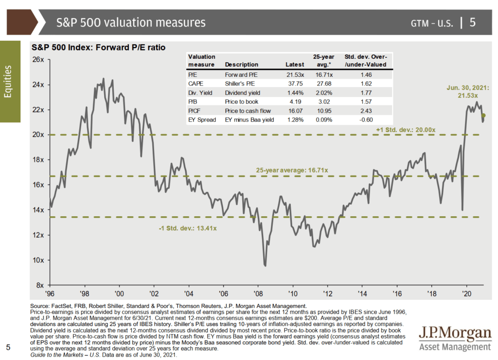
Based on forward earnings estimates, the S&P 500’s price earnings nearly 21 times. This is above 1 standard deviation of the range of 20 times, definitely far from the average.
Based on price-to-cash flow, the markets look very overvalued.
However, if we factor in that the main competiting asset class, which is bonds are even more overvalued (as illustrated by the EY Spread), we are currently trading at below average.
Are we bending the data to fit the narrative? Possibly.
But I think there is enough economic justification that when we value things, it is not just comparing across time (time-series) but also across comparables (cross-section).

In the next slide, JPM tries to relate the forward PE to how the market performs in the subsequent 1 year and 5 years. 5 years is their indication of longterm.
Based on the forward PE, we can observe that the range of return in the past when markets are traded at a PE near 21.5 times is rather mixed. You have 20% returns but also -20% returns.
The picture changes when we take a look at a longer term (on the right).
Notice the R-square is higher for the longer term chart versus the 1-year one, which indicates that forward PE has a higher predictability of longer term returns than shorter term.
There is still a range of return.
We don’t have a lot of instances where the forward PE is less than 10 times, but the subsequent 5-year returns have been better.
Even if you are near 17 times PE, there are some instances that in the next 5-years the total return is still negative.
The worrying thing is that for those periods where PE is higher, the range of returns are close together.
And they all point to a low return environment.
Value vs Growth and Industry Correlation to GDP
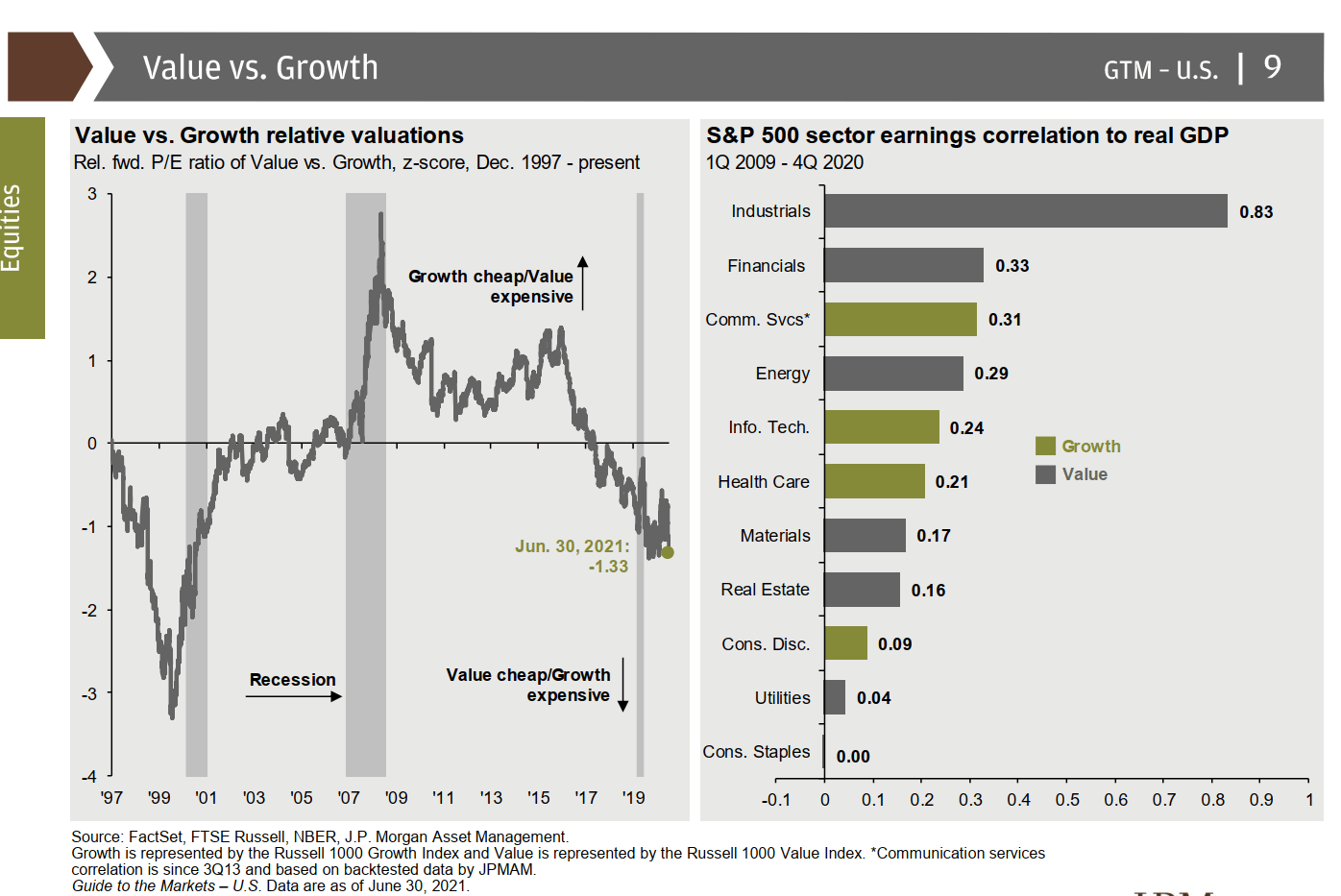
I think I see too much value versus growth at the job that I am just a bit sick of it. But based on the way they phrase it, value is cheap now.
I do get more benefit by seeing how less correlated are some sectors with the GDP.
Utilities, consumer staples and real estate may be the sectors that are tha canary in the coal mine if the stock market is faltering.
The rest of S&P500 is Not Cheap but Not As Expensive

JPM break down the valuation of the top 10 stocks and the remaining stocks. The remaining stocks are not cheap but not as expensive as the top 10 stocks.
One reason may be they may not have the same competitive edge as the top 10 but it also means if you are stock picker, there could be some stocks that you are more comfortable with.
Factor investors could tilt their portfolio to stocks that have a moat but are more fairer in value.
Valuation Dispersion in S&P 500 is Wide
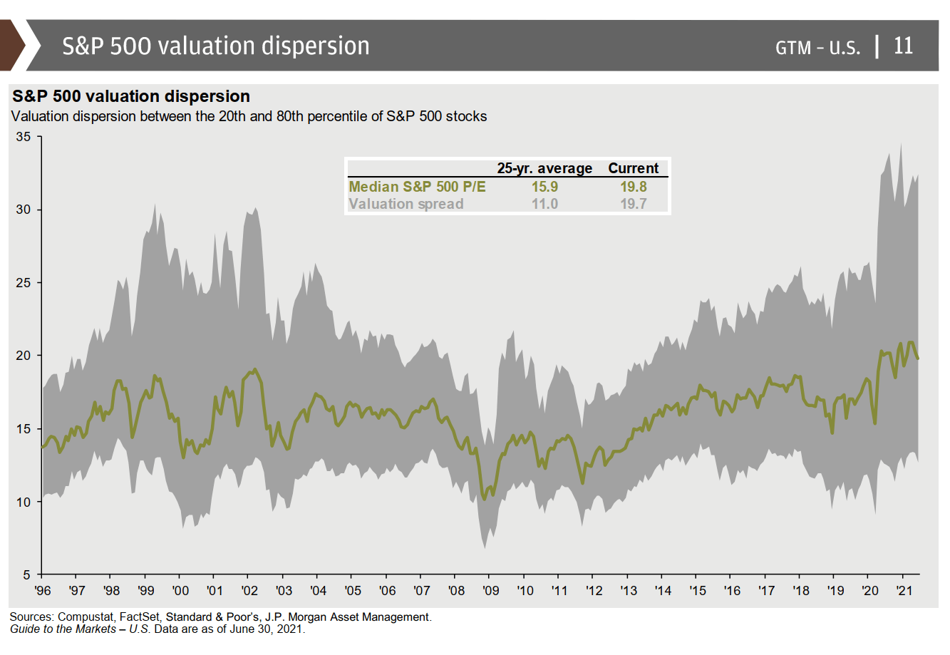
This chart is interesting. The dispersion in valuation currently is very wide. It seems similar to the 1999 to 2003 period.
There are definitely more companies priced more expensively based on PE and the cheaper companies are less cheap compared to historical.
Factor Performance
At Providend, we called this the blanket. It is to illustrate the ranking of returns for different regions, sectors, asset classes.
JPM did it for the different factors that you can invest in.
Quite interesting to see the definition of the factors used:
- MSCI High Dividend Yield Index: Higher than average dividend yield relative to parent index that passes sustainability and persistence screens.
- MSCI Minimum Volatility Index: Optimizes MSCI USA using an estimated security co-variance matrix to produce low absolute volatility for a given set of constraints.
- MSCI Defensive Index: Consumer staples, energy, healthcare and utilities.
- MSCI Cyclical Index: Consumer discretionary, communication services, financials, industrials, IT and materials.
- MSCI Momentum Index: Selected based on 12-month and 6-month price performance.
- MSCI Sector Neutral Quality Index: High return on equity, low leverage, low earnings variability.
- MSCI Enhanced Value Index: Price to book, price to earnings, enterprise value to cash flow from operations.
- Small-cap: Russell 2000
- MSCI Diversified Multiple Factor Index: Value, momentum, quality, size
During this 15 years, momentum did best followed by quality and cyclical.
Minimum volatility is always interesting because it did average but it has the lowest volatility at 13.1%. Value has the poorest return during this period and the second-highest volatility.
Multiple factor did average in both cases.
The Biggest Decline in Each Year

This is always a nice slide to remind all of us that in all up years, there are some rather sizable declines. You just do not know the magnitude and when.
122 years of market bullshit
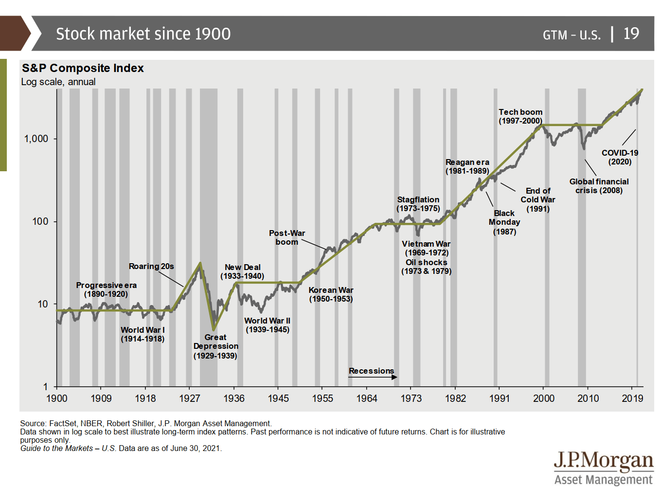
They say markets always climbed a wall of worry.
Notice there were more recessions in the earlier part of history.
Notice that at the start, markets went nowhere for 20 years.
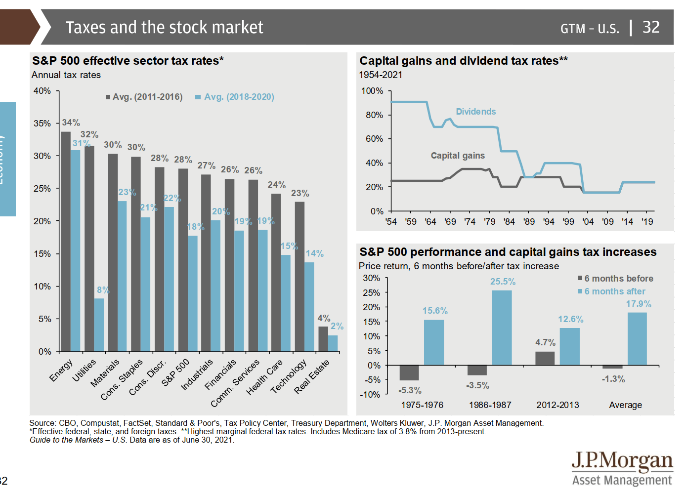
Some Crazy Dividend Taxes in the Past
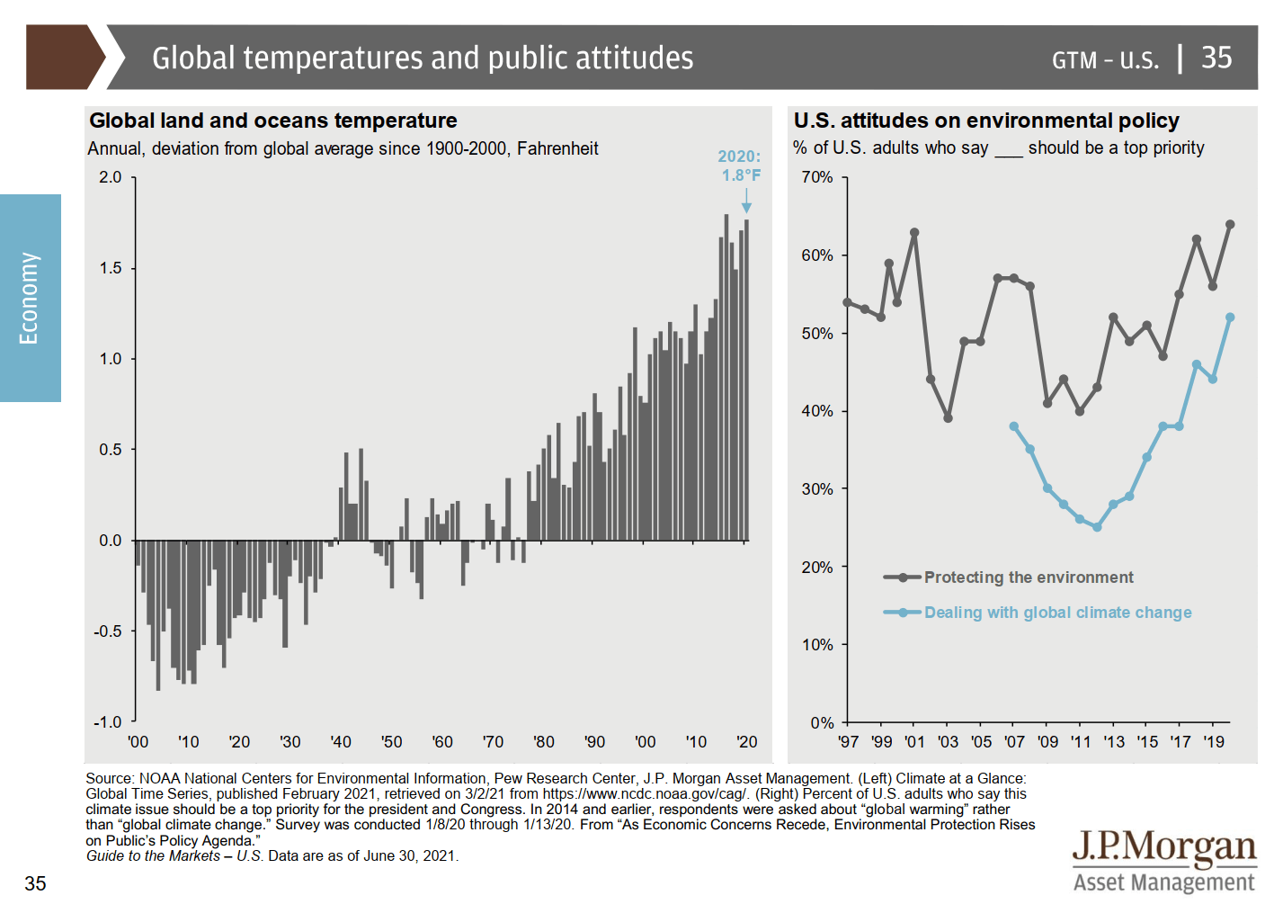
We are heating up too much!
How much would bonds correct with a 1% rise in the interest rate?

In the chart on the right, we can see how sensitive different bonds are to a 1% rise in interest rates.
Bonds are Richly Valued
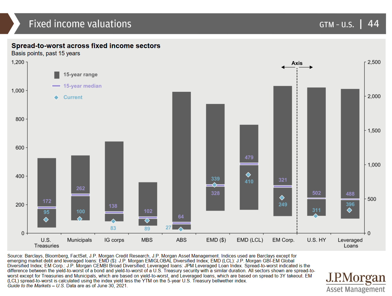
Feels like only emerging market debt is not so expensive.
International Markets Take Turns to Outperform US

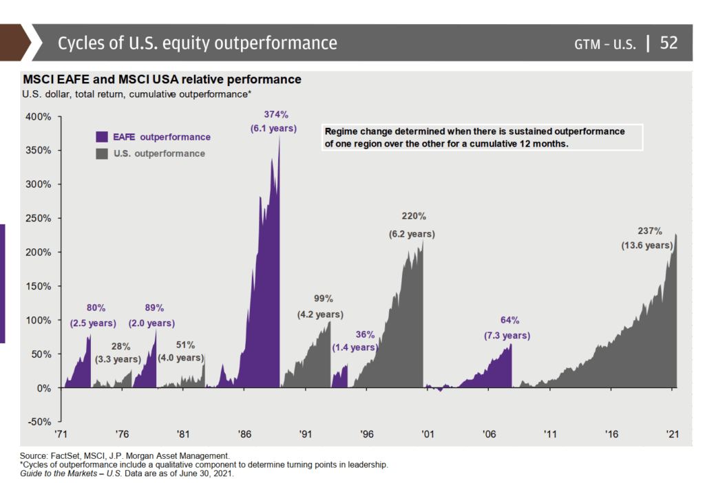
For the past 14 years, US market performed well versus the MSCI EAFE.
But there were some periods where international companies did better.
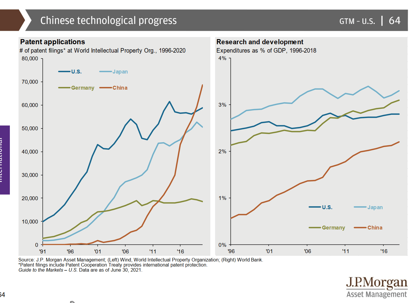
China ramping up their technology leadership
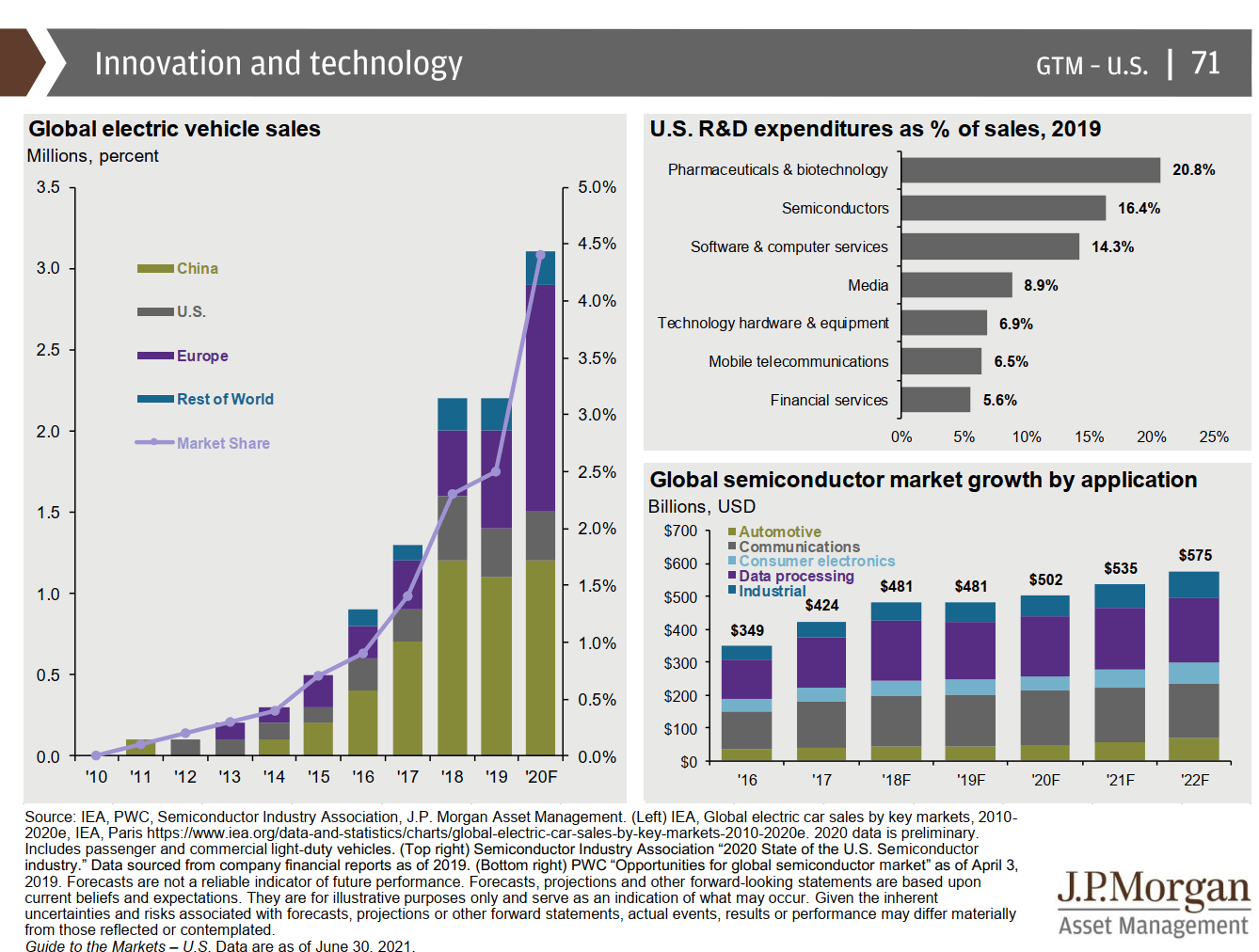
Innovation and Technology
Returns based on Asset Classes

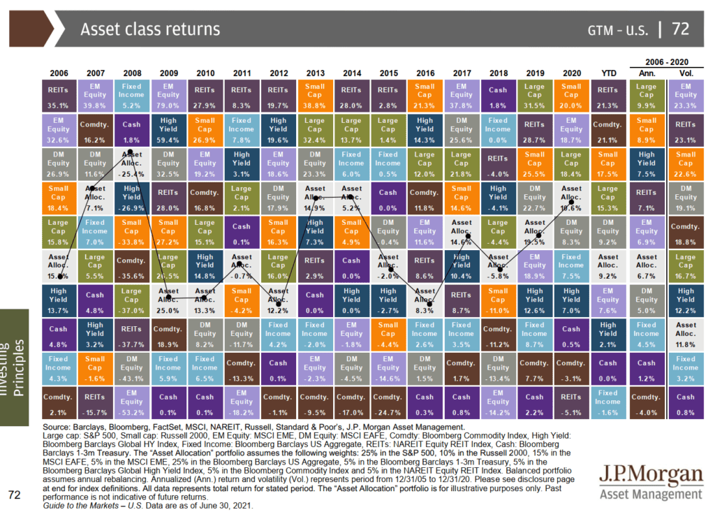
Amazingly, small-cap had less top rank but was second. REITS did very well for a few number of years.
Commodity and cash have been trash for a while.
The 60/40 Portfolio is in a challenging position
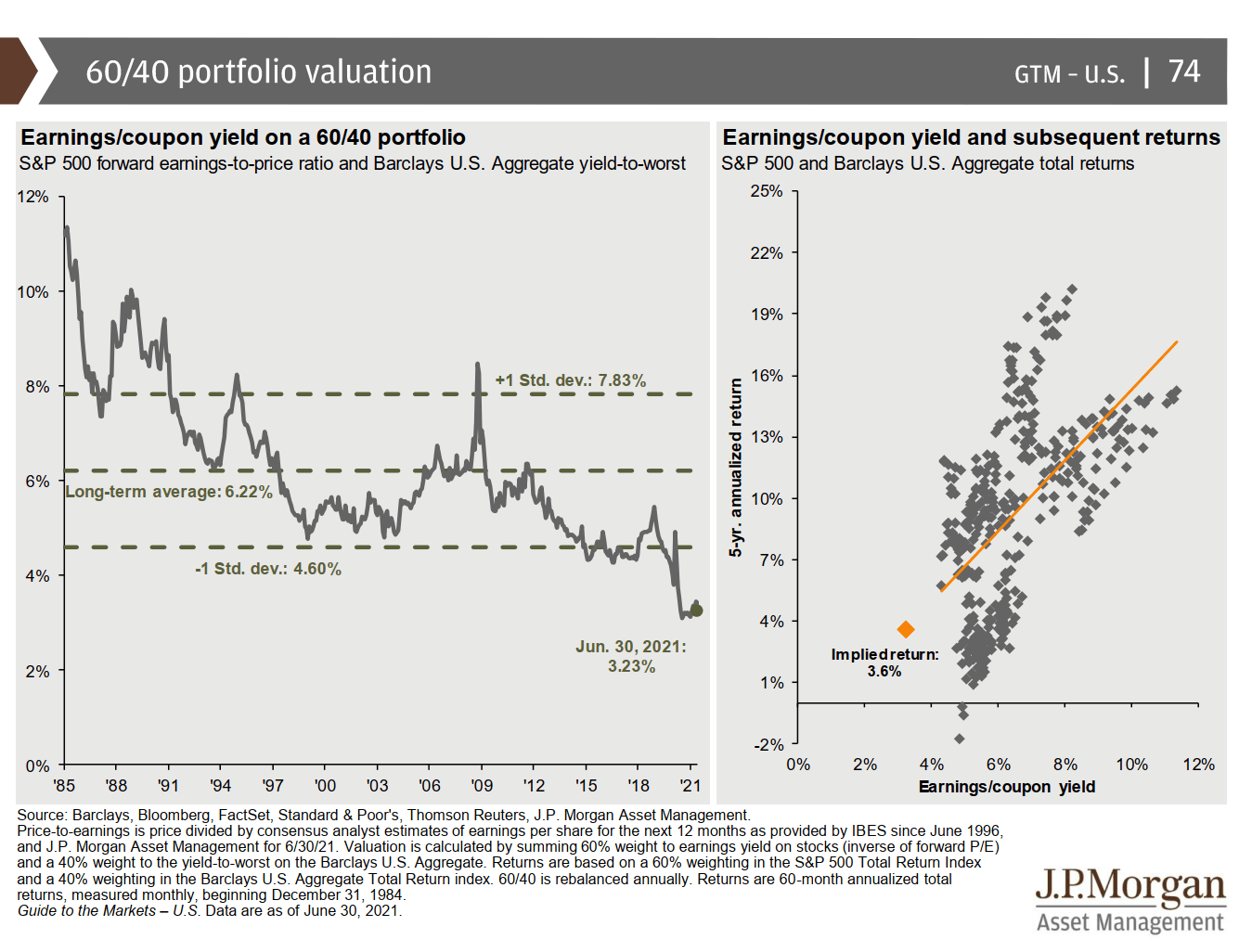
The valuation of both asset classes that formed a 60/40 portfolio puts the valuation at a historic low. But this is not a recent phenomenon.
We had that for sometime. The implied next 5-year return might fall short of financial adviser’s planning assumptions.
The Effect of Time-diversification
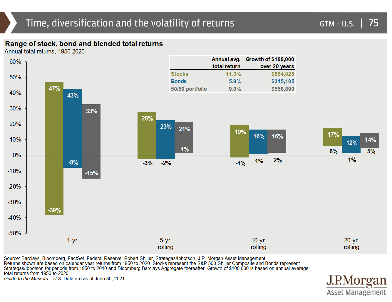
A portfolio is volatile in a year. But if you keep it longer, the range of returns enjoyed would be reduced.
It does not hid the fact that even after 10 years, your stocks may still lose money! (-1% a year for 10 years, 1% a year for 10 years)
If you stay in bonds, there are 20-year sequences where you earn 1% in 20 years.
The Yield Alternatives are Not As High Yielding as You Required

The top charts show the proportion of returns from dividends and capital appreciation by decade. It used to be 5.1% in dividend yield in 1950s.
In the bottom chart, it shows the current yields in different asset class.
If you are a retiree, preferring to only spend on dividends or interest so that you can protect your capital, know that the traditional underlying instruments do not yield much currently.
Probably the highest yielding, which in their previous slide shows the most valued, is emerging market bonds.
High yield, and aggregate bonds, which traditionally forms income solution yields 3.8%(!!!) and 1.5% now.
And there are still folks planning with income solutions using 4% dividend models.
In theory, you could still plan to spend with income only and still get the yield but you would have to be sophisticated to find the misprising versus risk in high yield, corporate bonds, matured dividend companies to achieve this.
Endowments are Less Allocated to Bonds, More Allocated to Alternatives
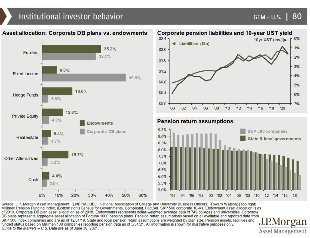
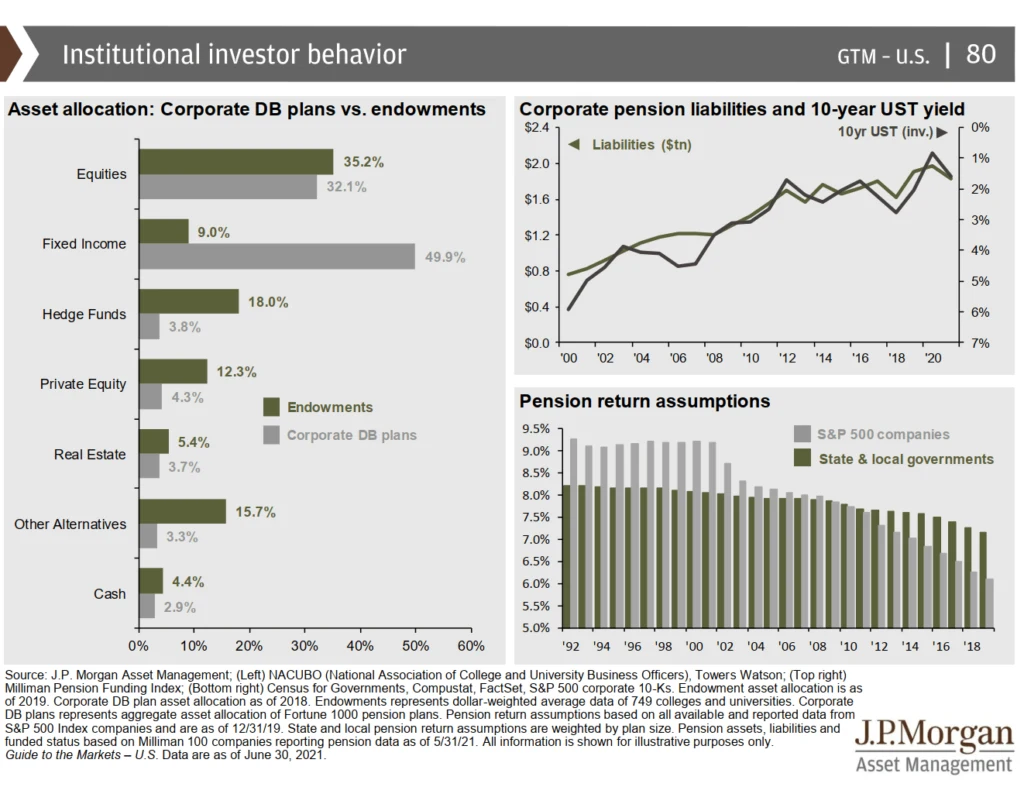
This slide is interesting, at least to me.
It shows the asset allocation of companies define benefits plan, which is their old pension plans they are obligated to employees. They compared this versus the endowments, probably of those universities.
What is interesting is that the endowments have like 40% less bonds than the corporate define benefits plan and they have a higher proportion of hedge funds, private equity and other alternatives.
In a way, the endowment asset allocations are more diversified.
It is quite interesting also to see the disparity in pension returns assumptions between how the government sees it and how the corporates see it.
It feels to me the corporates are more pessimistic, but given their allocation, it is as if they have little leeway to change their asset allocation mix.
The Average Investor Returns Versus the Asset Class Returns

This is the favorite risk coaching slide adviser likes to show their clients or prospect.
It shows the annualized returns of the past 20 years versus how the average investor did.
The average investor’s return is an analysis of net fund flows from unit trust sales, redemptions and exchanges each month carried out by Dalbar.
There are a few debates over Dalbar’s methodology but this is more of a slide to ask yourself.
- How were your returns versus those asset class in the period that you have invested?
- Were you surprised the asset class returns were so good despite a GFC, COVID-19, European crisis, and a bear market in 2000 to 2002?
The top chart is also interesting showing that if you mix bonds with equity, the drawdown is more livable.
However, eventually your returns will weaken versus a pure 100% equity allocation.
Cash Returns

This slide just shows the income generating from savigns account have been very low since the GFC. It is even lower now.
The sad thing is that the savings used to be able to cover inflation. Now, if you do not invest, it is a problem.
Summary
That’s it.
I hope you enjoy looking through the slide deck on a Sunday.
Let me know which slides stand out or you wish to have a further discussion on in the comments below.
I invested in a diversified portfolio of exchange-traded funds (ETF) and stocks listed in the US, Hong Kong and London.
My preferred broker to trade and custodize my investments is Interactive Brokers. Interactive Brokers allow you to trade in the US, UK, Europe, Singapore, Hong Kong and many other markets. Options as well. There are no minimum monthly charges, very low forex fees for currency exchange, very low commissions for various markets.
To find out more visit Interactive Brokers today.
Join the Investment Moats Telegram channel here. I will share the materials, research, investment data, deals that I come across that enable me to run Investment Moats.


Do Like Me on Facebook. I share some tidbits that are not on the blog post there often. You can also choose to subscribe to my content via the email below.
I break down my resources according to these topics:
- Building Your Wealth Foundation – If you know and apply these simple financial concepts, your long term wealth should be pretty well managed. Find out what they are
- Active Investing – For active stock investors. My deeper thoughts from my stock investing experience
- Learning about REITs – My Free “Course” on REIT Investing for Beginners and Seasoned Investors
- Dividend Stock Tracker – Track all the common 4-10% yielding dividend stocks in SG
- Free Stock Portfolio Tracking Google Sheets that many love
- Retirement Planning, Financial Independence and Spending down money – My deep dive into how much you need to achieve these, and the different ways you can be financially free
- Providend – Where I used to work doing research. Fee-Only Advisory. No Commissions. Financial Independence Advisers and Retirement Specialists. No charge for the first meeting to understand how it works
- Havend – Where I currently work. We wish to deliver commission-based insurance advice in a better way.
Kyith is the Owner and Sole Writer behind Investment Moats. Readers tune in to Investment Moats to learn and build stronger, firmer wealth foundations, how to have a Passive investment strategy, know more about investing in REITs and the nuts and bolts of Active Investing.
Readers also follow Kyith to learn how to plan well for Financial Security and Financial Independence.
Kyith worked as an IT operations engineer from 2004 to 2019. Currently, he works as a Senior Solutions Specialist in Insurance Start-up Havend. All opinions on Investment Moats are his own and does not represent the views of Providend.
You can view Kyith's current portfolio here, which uses his Free Google Stock Portfolio Tracker.
His investment broker of choice is Interactive Brokers, which allows him to invest in securities from different exchanges all over the world, at very low commission rates, without custodian fees, near spot currency rates.
You can read more about Kyith here.
- Golden Nuggets from JPMorgan Guide to Retirement 2024. - April 16, 2024
- Be Less Reliant on Banks and Build Stronger Capital Markets by Pushing for Better Shareholder Dividend and Buyback Yield - April 14, 2024
- The LionGlobal APAC Financials Dividend Plus ETF Won’t Give Singapore Investors 5% Dividend Yield Always. Further personal thoughts (with some data). - April 13, 2024
Lalaman
Sunday 4th of July 2021
Hello
I wonder what would it take for the markets (both stock namely S&P500 and Bond namely Treasury) to crash?
Is it the resurgence of covid (heard that there’s a new lambda variant 😷)? Is it the reopening/reflation of economies?
Would it be caused by crypto or meme stock crash? Would the FAANG (now known as FAATMAN) stocks caused a crash? FAATMAN stocks are priced high for a reason as they have high earnings moat, high FCF ... 10Yr
TLT yield has dropped , seems to suggest not everyone is convinced that inflation or permanent employment is here to stay...??
It’s so hard to gauge what the markets next move would be (I sold out tech stocks during the Apr/May earnings season only to see them recover and break new highs!!!)
IMHO, the easy gains caused by covid is over and have to wait for next round or some indication before investing more cash.
Anyway I’m starting to wind down my positions and only HODL the strongest stocks that can withstand the hurricane and volatility that will eventually come.
Ben
Sunday 4th of July 2021
Hi Kyith,
Are you still collecting information about matured insurance policies? I have a 15-16 years insurance that you could review. Sent enquiry to the wealthmentor email but maybe it's defunct now? Let me know if you're interested!
Kyith
Sunday 4th of July 2021
Yes Ben! I am still collecting! you can send to [email protected]
T
Sunday 4th of July 2021
The timeline ranges from 1990 to date.
Just wonder, could the parameters had changed with more adoption of tech to broaden companies' business? I.e, comparing dj in the 1850s and 1950s might be different are industrial revolution.
Kyith
Sunday 4th of July 2021
Hi T, I always wondered about that. It is easy for us to say the periods are different. There are periods like in the 1960s where you see similar tech boom. The challenge often is that valuing companies based on growth rates have been difficult, and they fizzled out faster than in the past. What may be more in play today is the flow of funds affecting the market. This means that despite high valuation, things could go on for longer.
ISAAC GOH
Sunday 4th of July 2021
Hi Good Day Kyith,
Another quality piece written by you!
On the deck that shows pe ratio of 21x, the future returns possibility seems low.
How would you continue to invest your money in the current climate?
Love to hear your thoughts. :)
Revhappy
Friday 6th of August 2021
@Kyith, Would you say you have made your money and thats why you have 50% cash? This cash allocation really baffles me. Why dont you put it to work? There must be something in the bond universe that is relatively safe and gives better returns than cash?
Kyith
Sunday 4th of July 2021
Hi Isaac, I think in terms of financial planning the application is different. If someone has so called "made their money" and can afford not to not need a high required rate of return, the financial planning answer is... be more balanced. The problem is that bonds are not so cheap as well. I tend to favor a shift to the stocks that are not so expensive. not always the best solution but if I am a stickler for valuation I would do that. Of course, for those who are more nimble, they could always use some general rule of thumbs such as reduce your allocation if the main index falls below a 200 day moving average or 10 month moving average (this kind of method is not foolproof and usually subjected to a lot of whipsaws, which is why it is not always recommended)
If someone is still accumulating, they do not have much choice but to be expose to the asset class that give them the greatest probability of highest expected return, which is equity. And since they will have years of $25,000 a year coming into investing, it is always good that the prices are lower. Imagine that if you have 5 years to go, and the markets do not correct here and there. by the time it gets to the time you need to retire, it gets worse because the market would be in a more unsustainable level.
Hope that helps.