A few nights ago, YouTube’s algorithm pushed Fidelity’s head of global macroeconomics Jurrien Timer’s interview on Hedge-Eye to my home screen.
And Jurrien always delivers some really nice charts.
Jurrien is as moderate as you get when it comes to where we are in the stock market cycle. He is data-driven and entirely watchable because of the lack of FED bashing.
Here is his interview:
The interview goes through a bunch of stuff including
- The phase of the market,
- How different economic indicators eventually affects the market
- Why does what we are observing in the markets mimics the past,
- Why inflation is definitely not transitory but the environment is likely to be deflationary.
As to how generally Jurrien sees the market from the lens of a long term investor, here is his tweet thread this morning:
I will highlight some charts that caught my attention:
Risk versus Reward of Various Asset Class Over the past 70 years
The chart below shows the risk versus reward trade-off of different equity, bond and commodities we are familiar with within the last 70 years:
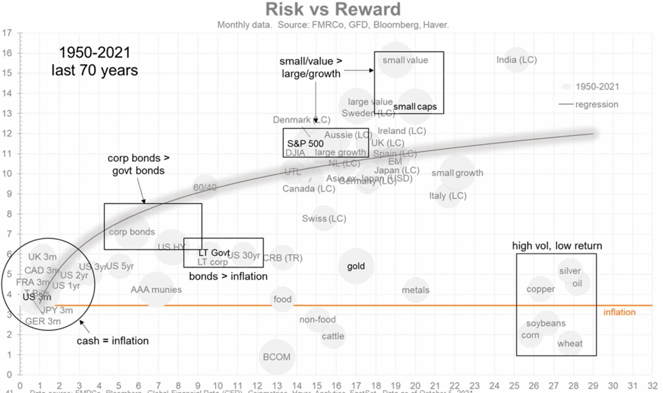
The vertical axis is the compounded return the horizontal axis is the volatility in terms of standard deviation.
You can spot your favourite equity countries, different duration of bonds, different types of commodities.
You will also spot that the inflation rate is drawn as an orange line.
You can spot our favourite sweet spot, which is the 60/40 portfolio having about 9% a year return with 9-10% in standard deviation.
Most equity and bonds are able to produce returns better than inflation.
Commodities have not done well. They have high volatility but the returns, in general, is low.
You will also observe that small-cap value did better than small-caps. Value did better than growth.
Risk versus Reward of Various Asset Class During Financial Repression
Now here is the same risk versus reward chart but focus on the financial repression period from 1942 to 1951:
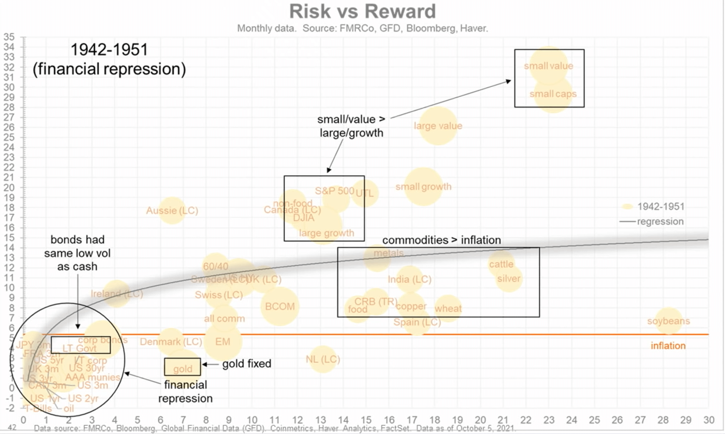
What you will notice is that the whole freaking curve shifts down.
The bond returns during the period are negative AND below the inflation rate.
Surprisingly gold is below the inflation rate.
Commodities in general did quite well against inflation. Jurrien emphasizes that while commodities do perform well in these periods, given what we know from the previous chart, we should not overstay our welcome.
One thing you should notice is that… those equity returns are in the range of 18-24% during those periods. The small-cap stocks are in the 30% range but the volatility is also more brutal.
“From 1942, when the US entered WW2, the FED (who at that time was not yet independent) was tasked to monetize the increase in wartime debt. The debt-to-GDP went from 35% to 116%. The FED’s balance sheet increase 10-fold.
People think that quantitative easing was invented after the GFC but it was invented much earlier.
The FED capped long bonds at 2.5% and treasury bills at 3.5%. The FED funds rate was at 1.1% and inflation was at 5-6% over the decade. Bonds was below the inflation rate and was a tax on the people.
Judging by the past 18 months, we are following in the footsteps of that period. “
Earnings Growth Peaking and Rolling Over
Jurrien provided this long term chart on the performance of the S&P 500 overlayed with the next twelve months earnings per share (NTM EPS), and a few other metrics:
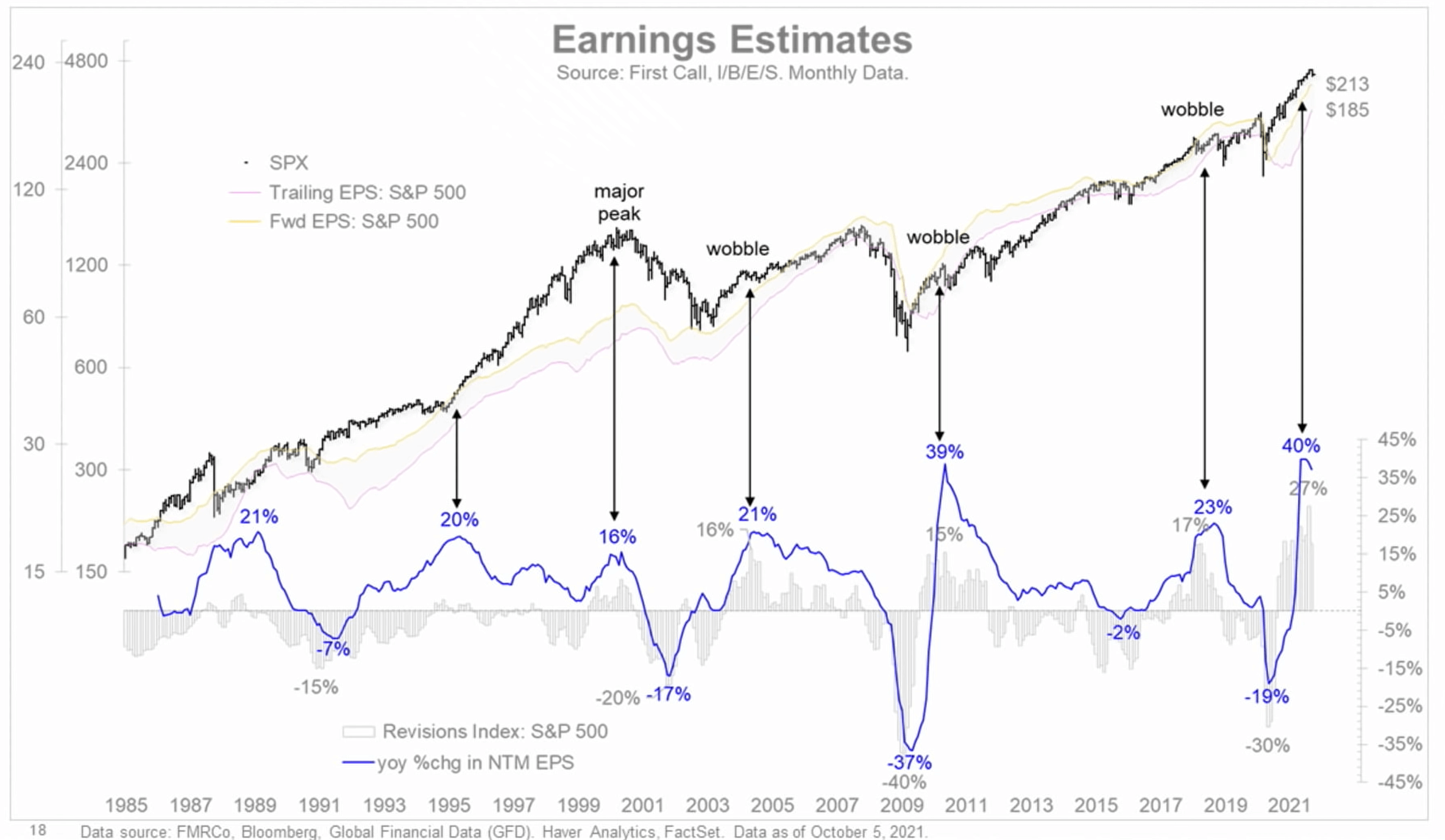
At some point, the growth of the earnings per share is going to slow down. It does not mean that the EPS is not growing but just decelerating.
Jurrien tracked whether the deceleration indicates some market correction of sorts. Out of all of them, there is probably one major market peak and that was in the dot com bust.
A wobble in the market is possible. Jurrien feels that the wobble actually started in April this year during peak reopening, and since then, the market has gone nowhere (not so much the S&P 500 but the breadth of the market) and during this phase, it is quite normal.
S&P 500 Growth Since Earnings per Share Peak
This is not in the slide deck but in his recent Tweet, Jurrien provided this illustration of the US index growth since earnings peak:
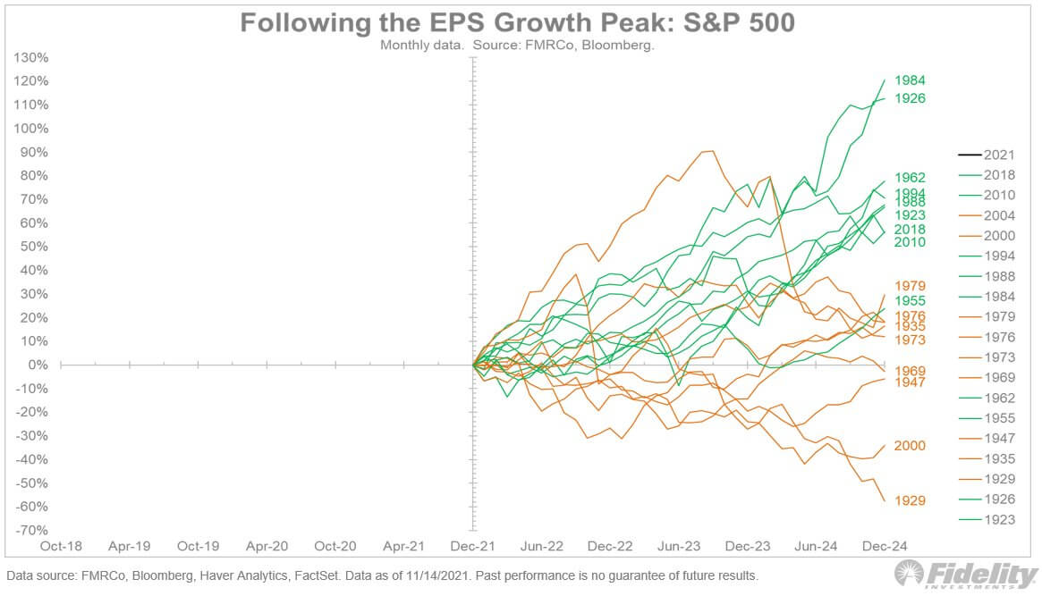
“If we overlay past secular bull markets onto an earnings-growth peak chart, we see that during secular bull markets the peak in earnings growth generally led to a soft landing (i.e. growth deceleration) rather than a contraction (and bear market)
Even though earnings growth is peaking, multiples are compressing, the Fed is starting to normalize, and the market is behind the curve and will need to adjust higher, it is probably too early to bail on equities.
A slow-but-steady Fed seeking to do no harm against a bullish secular backdrop will hopefully be enough for a soft landing for this earnings cycle, and therefore a potential continuation of this bull market.”
How the Stock Market’s Price-Earnings Compression Will Play Out
Given the phase of the cycle that we are in, Jurrien believes that we could be in for a 10-15% price-earnings compression:
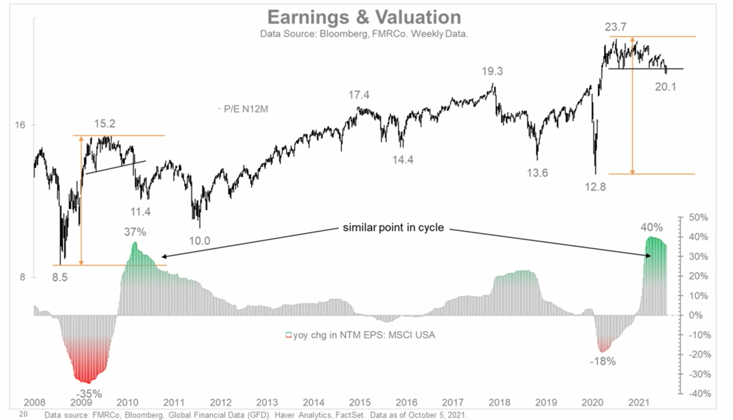
This chart overlays the forward price-earnings and the earnings growth.
In this similar phase, we might be in for some digestion, although we are already in some sort of digestion. Earnings are decelerating but if earnings grow, most likely the share price of the index is not going anywhere.
If the earnings do not grow at all, then it is likely we will see a correction in the share price.
In Praise of the 60/40 Portfolio

This chart plots the S&P 500 and a 60/40 portfolio’s 5-year compounded average growth (horizontal axis) against the drawdown from a 5-year high.
Here are Jurrien’s comments:
If we do not care about volatility, we would just be 100% long equity all the time because they are the absolutely proven money compounders. Stocks only go up 60% of the time but if you wait long enough they are going to compound 10-11% a year and if you do it long enough your money is going to compound like nothing else.
The challenge is that 40% of the time when stocks are not going up, our “fight-or-flight” response will kick in and that is where the appeal of a diversified portfolio is.
What you would notice is that during the time when the market is in a drawdown, there are fewer orange dots compared to grey dots.
Jurrien’s point is that while bond takes away to return, it increases the chances that you will stay in the game.
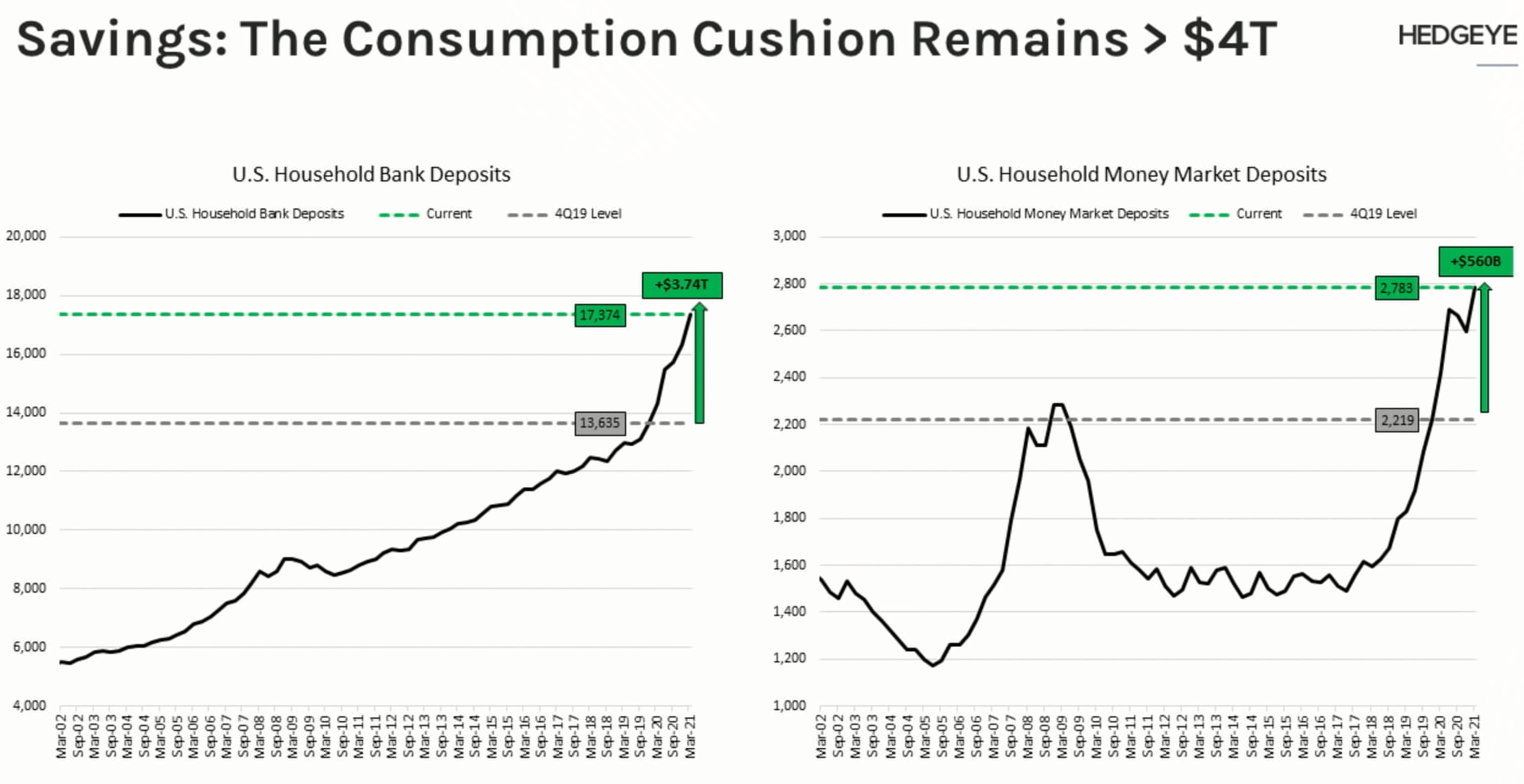
Other Great Charts
Suffice to say, there is too much that I have the time to go through. Do view the video and hear the great interaction between him and HedgeEye’s CEO.

The discussion went into that not all tapering and end of QE affects the market in a very negative manner.
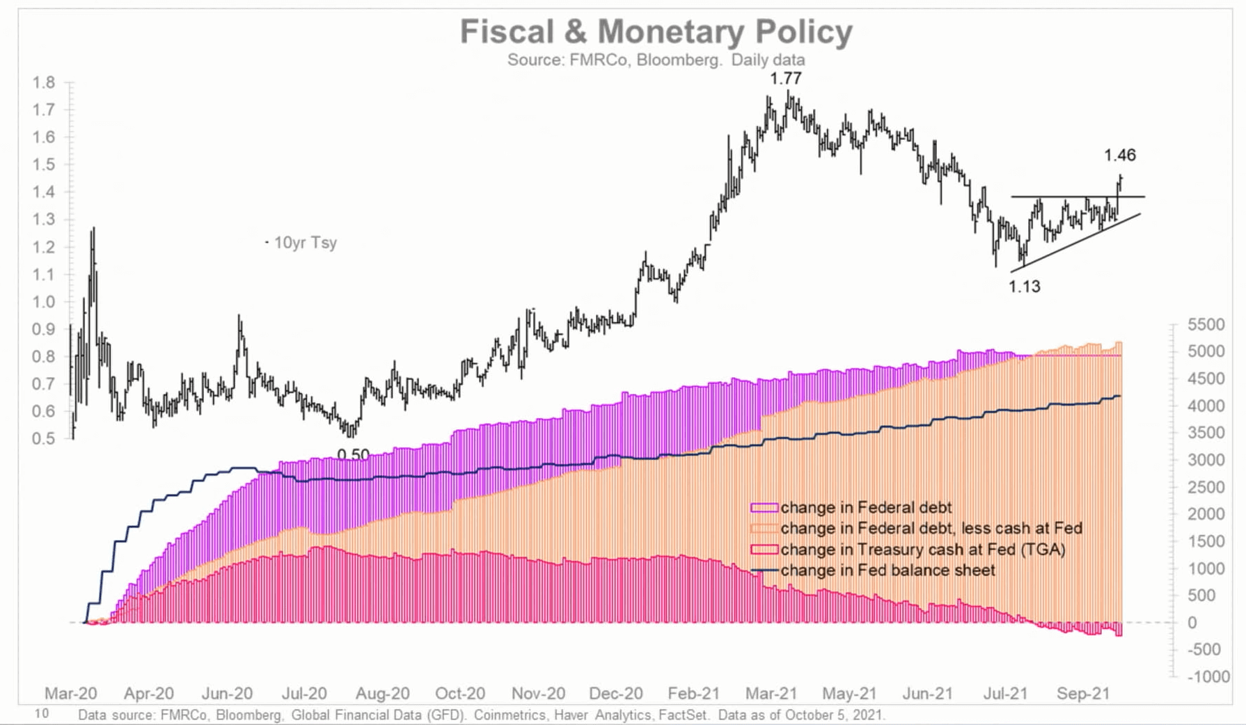
This great chart shows the rate of change in the cash, debt on the FED’s balance sheet.
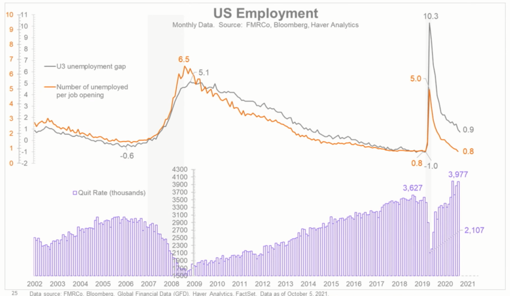
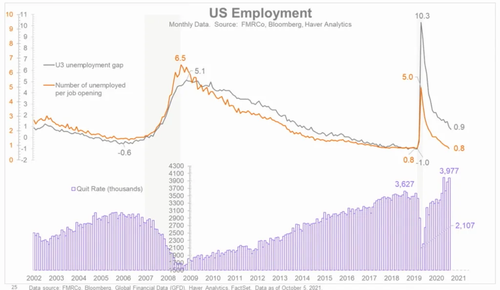
The unemployment rate has come down to a pre-pandemic level but the quit rate is still so high!
I invested in a diversified portfolio of exchange-traded funds (ETF) and stocks listed in the US, Hong Kong and London.
My preferred broker to trade and custodize my investments is Interactive Brokers. Interactive Brokers allow you to trade in the US, UK, Europe, Singapore, Hong Kong and many other markets. Options as well. There are no minimum monthly charges, very low forex fees for currency exchange, very low commissions for various markets.
To find out more visit Interactive Brokers today.
Join the Investment Moats Telegram channel here. I will share the materials, research, investment data, deals that I come across that enable me to run Investment Moats.


Do Like Me on Facebook. I share some tidbits that are not on the blog post there often. You can also choose to subscribe to my content via the email below.
I break down my resources according to these topics:
- Building Your Wealth Foundation – If you know and apply these simple financial concepts, your long term wealth should be pretty well managed. Find out what they are
- Active Investing – For active stock investors. My deeper thoughts from my stock investing experience
- Learning about REITs – My Free “Course” on REIT Investing for Beginners and Seasoned Investors
- Dividend Stock Tracker – Track all the common 4-10% yielding dividend stocks in SG
- Free Stock Portfolio Tracking Google Sheets that many love
- Retirement Planning, Financial Independence and Spending down money – My deep dive into how much you need to achieve these, and the different ways you can be financially free
- Providend – Where I used to work doing research. Fee-Only Advisory. No Commissions. Financial Independence Advisers and Retirement Specialists. No charge for the first meeting to understand how it works
- Havend – Where I currently work. We wish to deliver commission-based insurance advice in a better way.
Kyith is the Owner and Sole Writer behind Investment Moats. Readers tune in to Investment Moats to learn and build stronger, firmer wealth foundations, how to have a Passive investment strategy, know more about investing in REITs and the nuts and bolts of Active Investing.
Readers also follow Kyith to learn how to plan well for Financial Security and Financial Independence.
Kyith worked as an IT operations engineer from 2004 to 2019. Currently, he works as a Senior Solutions Specialist in Insurance Start-up Havend. All opinions on Investment Moats are his own and does not represent the views of Providend.
You can view Kyith's current portfolio here, which uses his Free Google Stock Portfolio Tracker.
His investment broker of choice is Interactive Brokers, which allows him to invest in securities from different exchanges all over the world, at very low commission rates, without custodian fees, near spot currency rates.
You can read more about Kyith here.
- My Dividend Experience Investing in UCITS iShares iBond Maturing in 2028. - April 23, 2024
- We Invest into Popular Funds When They Are Popular, Exactly When They Started Turning to Shxt. - April 22, 2024
- Meal Prep 2.0 – Cooking Your “Go-to” Meal that You Look Forward to Eating Everyday. - April 21, 2024
Sinkie
Friday 19th of November 2021
The high vol low returns of commodities speak to the highly boom & bust cyclical nature. i.e. They are to be traded, not buy-and-hold, if your intention is to grow wealth. Preserve wealth, maybe.
If you notice, the chart shows holding a basket of commodities basically returning around the inflation rate over 70 years. i.e. inflation = commodities.
Not really surprising for gold during 1942-1951, as its price was fixed at US$35/ounce, until the USD went off interchangeability with gold in 1971, and gold's price was allowed to float.
I bet if we measured gold during 1942-1951 in non-USD currency, it will show way above inflation rate returns. i.e. non-US currencies depreciated a lot against USD during those years.
Kyith
Friday 19th of November 2021
Hi Sinkie, thanks for enlightening me on that.