JPMorgan has come up with their third-quarter Guide to the Markets series and out of the slide deck, I think we can take stock of where we are, in terms of market valuation.

Since the start of the year, we have seen the forward price-earnings correct from 21.4 times to 15.9 times currently. Interestingly, this is higher than the peak of the Great Financial Crisis in Oct 2007.
I think forward price-earnings can only be used as a relative measure of how rich the valuation is and not so much as a tactical allocation tool.
Imagine that you are an investor who experienced the 2000 bear and you are in 2007. A forward price-earnings of 15.1 times look reasonable versus the average. Even more so, the forward PE in 2007 is lower than the peak of 2000.
Your brain will be told that there is still some way to go and fundamentally things are sound. Let us not forget that during that period, the USA stocks lagged the international and emerging market stocks.

In this slide, we compare the current markets to various valuation measures. We are able to have a sense of how overvalued or undervalued is based on some stock and flow-type metrics.
Generally, we got back to the 25-year average (Jun 1997 to Jan 2022) for most valuation measures. We are below average for PE, and Earnings Yield spread.
Quite interesting that for the past 25 years, the average CAPE is 28.7 times, which in retirement planning would mean that a retiree should prepare for a larger starting portfolio than in other periods to buffer for high potential bear markets.
The average does not stay constant.

These two charts show the forward PE versus the future 1-year and 5-year returns.
We are probably not too expensive, but as you can see, the range of 1-year returns is so spread out. Using forward PE as a tactical allocation tool does not make sense.
But once we get to the 5-year, you can see the R-square goes up from 3% to 38%, which shows that over a longer time period the dots fit the regression line (orange line) better. However, 38% is still not very close.
If you observe the second chart, at current forward PE, you can still get a 5-year negative compounded growth of 0-1% a year compounded growth but it is also possible to get greater than 10% a year growth.
Even if the forward PE falls to 13-14 times, you would still either get 0-1% a year or 10% a year growth.
There are risks both ways, and you would need to depend on financial planning to manage this. You may be unlucky or unlucky.
Of course, this only shows 5-year and the results for 10-year forward PE may be different.
Based on the chart, I think if we ever get down to a forward PE of 12 times, which is a 30% fall in price, the forward 5-year compounded return will look much, much clearer.
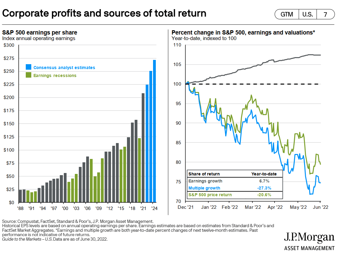
The left chart shows the analyst estimates of the earnings per share. Looks damn power.
The right chart is good to help bring us back that returns are determined by earnings growth and PE expansion and contraction. Earnings growth is still positive but we got more PE contraction.
It will be worse when earnings growth is not there anymore, but the question is whether the current market reflects a lot of the risks already.
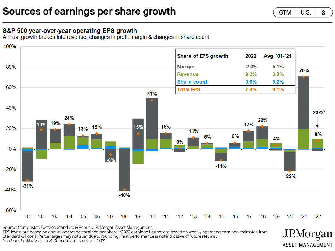
Revenue growth (green) by and large is up except for major recessions. The big shit is the margin changes.

The rest of the S&P 500 stocks are cheaper than the average. The top 10 are still more expensive than the average.
The earnings contribution of the top 10 stocks has been corrected down (right-bottom chart), which is more in line with history.
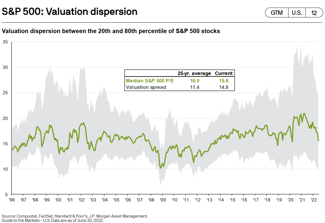
I am trying my best to understand what the number in the Valuation spread means. I think a larger number shows greater dispersion in the top and bottom range, versus in the past.
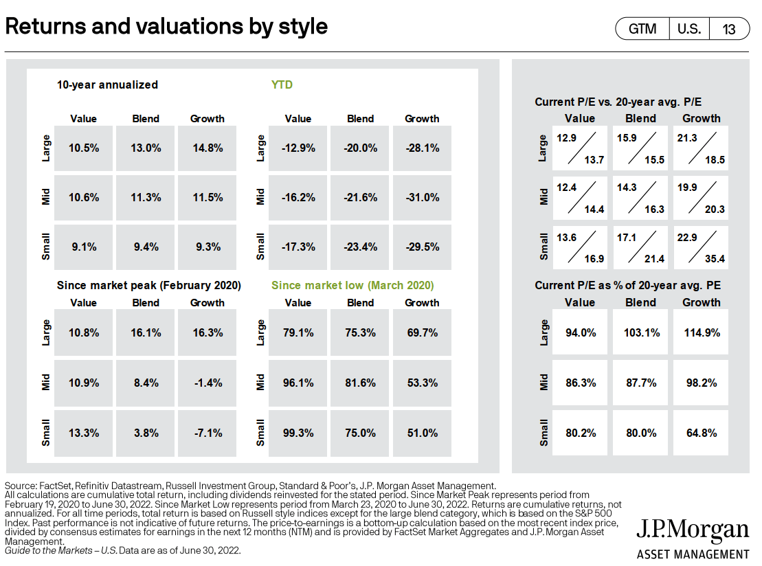
This chart shows the return and valuation versus historical. The two charts on the right (valuation) is more useful.
We can see that Large-cap blend and Large-cap growth are still more expensive than the past 20-year average PE.
If you are buying a multi-factor fund that leans towards large-cap and mid-cap value, investing now means you are investing at a valuation lower than the past 20 years.
Interestingly, by this measure Small-cap growth, value and blend look more cheap, relative to history.

International stocks are relatively cheaper compared to US stocks. This can be seen in the relative chart on the left. Dividend yield can be used as a valuation measure as well and the current dividend yield of international stocks (which in this chart includes emerging markets) is vastly higher than in history.

By all measures, the current valuation of different regions (right side chart) is lower than their historical. This includes the USA.
The left side chart shows the earnings growth, which is interesting because they also include the percentage of cyclical sectors in the region. USA and China have a lower amount of cyclical stocks.
The cyclical info is important because earnings growth is less meaningful or volatile if we are using it on cyclical stocks as oppose to stocks with relatively stable cash flows.
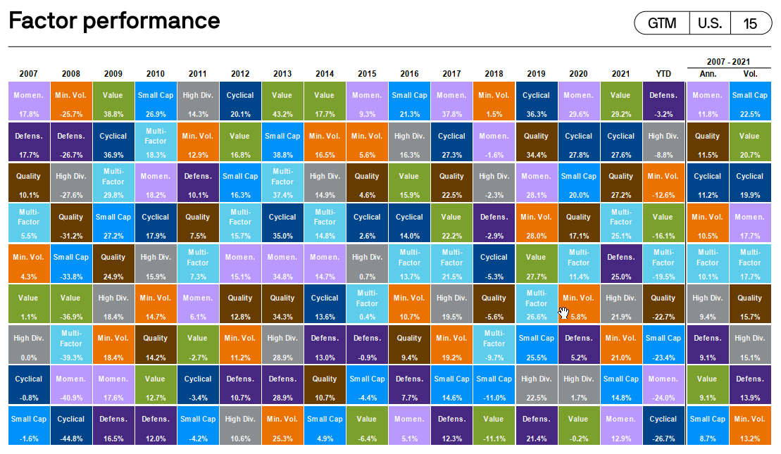
Finally, this is a factor performance “quilt”.
Financial planners like to show these quilts to explain to you it is kind of difficult to time, regions, sectors and in this case factors. Notice the light blue box called Multi-factor. They are usually in the middle. Not the lowest, not the highest. You basically got the average.
That may be what you want.
I observe that in the past 10 years cyclical has been performing very well. This year, most of the defensive kinds of factors are doing better like defensive, high dividend, and minimum volatility.
Okay, I would probably go through some later next week.
I invested in a diversified portfolio of exchange-traded funds (ETF) and stocks listed in the US, Hong Kong and London.
My preferred broker to trade and custodize my investments is Interactive Brokers. Interactive Brokers allow you to trade in the US, UK, Europe, Singapore, Hong Kong and many other markets. Options as well. There are no minimum monthly charges, very low forex fees for currency exchange, very low commissions for various markets.
To find out more visit Interactive Brokers today.
Join the Investment Moats Telegram channel here. I will share the materials, research, investment data, deals that I come across that enable me to run Investment Moats.


Do Like Me on Facebook. I share some tidbits that are not on the blog post there often. You can also choose to subscribe to my content via the email below.
I break down my resources according to these topics:
- Building Your Wealth Foundation – If you know and apply these simple financial concepts, your long term wealth should be pretty well managed. Find out what they are
- Active Investing – For active stock investors. My deeper thoughts from my stock investing experience
- Learning about REITs – My Free “Course” on REIT Investing for Beginners and Seasoned Investors
- Dividend Stock Tracker – Track all the common 4-10% yielding dividend stocks in SG
- Free Stock Portfolio Tracking Google Sheets that many love
- Retirement Planning, Financial Independence and Spending down money – My deep dive into how much you need to achieve these, and the different ways you can be financially free
- Providend – Where I used to work doing research. Fee-Only Advisory. No Commissions. Financial Independence Advisers and Retirement Specialists. No charge for the first meeting to understand how it works
- Havend – Where I currently work. We wish to deliver commission-based insurance advice in a better way.
Kyith is the Owner and Sole Writer behind Investment Moats. Readers tune in to Investment Moats to learn and build stronger, firmer wealth foundations, how to have a Passive investment strategy, know more about investing in REITs and the nuts and bolts of Active Investing.
Readers also follow Kyith to learn how to plan well for Financial Security and Financial Independence.
Kyith worked as an IT operations engineer from 2004 to 2019. Currently, he works as a Senior Solutions Specialist in Insurance Start-up Havend. All opinions on Investment Moats are his own and does not represent the views of Providend.
You can view Kyith's current portfolio here, which uses his Free Google Stock Portfolio Tracker.
His investment broker of choice is Interactive Brokers, which allows him to invest in securities from different exchanges all over the world, at very low commission rates, without custodian fees, near spot currency rates.
You can read more about Kyith here.
- New 6-Month Singapore T-Bill Yield in Late-April 2024 to Drop to 3.70% (for the Singaporean Savers) - April 18, 2024
- Golden Nuggets from JPMorgan Guide to Retirement 2024. - April 16, 2024
- Be Less Reliant on Banks and Build Stronger Capital Markets by Pushing for Better Shareholder Dividend and Buyback Yield - April 14, 2024
Sinkie
Friday 8th of July 2022
Valuation dispersion indicates how fragmented the different sectors/companies are.
It can get very wide, usually during periods of irrational exuberance like 1999-2000 or 2020-2021 where some sectors/companies get huge multiple expansions while other sectors/companies get ignored by investors.
In a healthy market, the dispersion shouldn't be very wide i.e. all sectors should progress together. Dispersion also narrows after a deep bear market obviously, as stocks in general get dissed by people.
Europe looks cheap both on 25-yr range as well as 25-yr average. Good for longer term play. Japan too, but demographics...
China looks good for multi-month trade, possibly even multi-year if willing to hold through corrections along the way.